The Columns block allows you to insert text, media, and other types of content into columns. When used one after another, the columns can create a grid effect.
You can type /columns in the editor and hit enter in a new paragraph block to add one quickly.

Detailed instructions on adding blocks
Once you add the Columns block, you can choose a variation to start with. You can change the number or add more columns later in the block settings. If you select Skip at the bottom, you will start with 50/50 columns by default.

Adding and removing columns
It is possible to add or remove columns in a few different ways:
- Hover between two existing columns and select the Add column + button to add another column in that spot.
- Use the Columns slider or number field in the block settings sidebar to change the number of columns.
Remove a column by selecting the individual Column block, then choosing Delete from the More options menu (three dots) in List View or the block toolbar.
Adding content to columns
Once you have defined the number of columns, you can add content to each column. The amazing thing about the columns block is that you can add other blocks into each of the columns.
For instance, you can use the Columns block as the structure and add an image, heading, and paragraph block to create a grid of services.

Or you can use the Cover block inside a Columns block to create a row of visual cards.

You can also use the Columns block with Buttons block to show a small set of related actions side by side. To make the buttons the same width, add one Button block to each column and set each button to 100% width.

Block toolbar
Most blocks have their own block-specific controls that allow you to manipulate the block right in the editor.
The Columns block shows the following buttons:
- Transform to
- Move controls
- Change alignment
- Change vertical alignment
- More options

Transform to
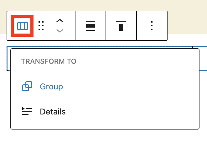
Select the Columns icon at the left side of the block toolbar. This opens the Transform menu, where you can change the Columns block to the Group or Details blocks.
A common reason to place a Columns block inside a Group block is to create a section with its own background color and spacing. To ungroup the blocks, select Ungroup in the Transform to menu.

Moving handles

The dotted icons can be used to drag and drop a block to the place of your choosing. The up and down arrow icons can be used to shift a block up and down in your document.
Get more information about moving a block within the editor.
Change alignment

Use the Change alignment button from the toolbar to modify the width of the Columns block. Select the button and pick one of the following alignment options:
- None – Leaves the block the current size.
- Wide width – Increase the width of the block beyond the content size.
- Full width – Extend the block to cover the full width of the screen.
Change vertical alignment

Use the Change vertical alignment button to control how content lines up inside the columns. This is most noticeable when columns have different amounts of content. Select the button and pick one of the following options:
- Align top – Make the block vertically aligned top.
- Align middle – Make the block vertically aligned middle.
- Align bottom – Make the block vertically aligned bottom.
Inner Column blocks include vertical alignment options too. Stretch to fill is the default behavior and makes the column fill the available height of the Columns block.

This option is useful when columns have borders or background colors and you want them to appear equal in height.
More options
The controls give you additional features to customize the block, like the ability to duplicate, copy, rename, hide, and more.
Read about these and other settings.
Block settings

Every block has specific options in the editor sidebar in addition to the options found in the block toolbar. If you do not see the sidebar, click on the Settings button next to the Save/Publish button.
The Columns block settings panel is divided into two tabs – Settings and Styles. It contains the following sections:
Settings
Open the Settings tab to change the number of columns from 1 to 6. Use the up and down arrows, drag the slider, or type a number in the input field.

The Stack on mobile setting is enabled by default. When enabled, columns stack vertically on smaller screens instead of remaining side by side. This helps layouts stay readable and responsive across screen sizes.
Styles
Open the Styles tab to change color, typography, dimensions, and border options. Your theme may also include style choices you can apply to the Columns block – these options vary by theme.

Color
With Color settings, you can change the color of the text in your block, the color of links, and the background color of your block. For the Columns block, this means that you can style each column individually or both columns for consistency.
Learn more about changing colors.
Typography
The Columns block provides typography settings to change the font family, appearance, line height, letter spacing, decoration, letter case, and font size.
For details, refer to this support article: Typography settings overview
Dimensions
The Columns block provides dimension settings options to add padding, margin, and block spacing.
For details, refer to this support article: Dimension settings overview
Border & Shadow
The Columns block provides border settings options to add border color, style, width, and radius.
For details, refer to this support article: Border settings overview
Advanced
The Columns block provides the following Advanced settings options: HTML Anchor, Additional CSS Class(es), Additional CSS, and Styles.
Learn more about advanced settings
Column width

To change the width of one column, select the individual Column block and adjust the width in the block settings. You can use px, %, em, rem, vw, or vh values. To make it easier to find and select the Column Block, it’s recommended to use List View.
For details, refer to this support article: Layout settings overview
Changelog
- Updated 2026-07-15 (props to @kjoyner)
- Update some images for 7.0
- Fix block settings heading levels
- Updated 2026-07-05 (props to @kjoyner @kanrup @anujrathore24 @zunaid321 @abhanonstopnewsuk @estelaris @awetz583 @mpiccorossi
- Updated screenshots and video
- Added links to Cover, Group, and Details block pages for further reading
- Added information about Stretch to fill alignment
- Removed mention of deprecated unwrap feature
- Removed italics from block name
- Updated 2022-05-09
- Content, screenshots, and video updated for 6.2
- Updated 2022-12-12
- Content, screenshots, and video updated for 6.1.
- Added block settings for Column block
- Updated 2022-11-21
- Aligned screenshots for mobile view
- removed redundant content
- Added alt text to some images
- Updated 2021-07-09
- Updated screenshots.
- Added in context around styling individual columns.
- Added information about spacing and width options for individual columns.
- Updated 2020-08-24
- Added “Go back to the list of Blocks” to the top of the page
- Updated 2020-08-21
- Screenshots and videos as per WordPress 5.5
- Added feature changes in Block Toolbar
- Added feature changes in Block Settings
- Created 2019-03-07
Was this article helpful? How could it be improved?
Log in to submit feedback. If you need support with something that wasn't covered by this article, please post your question in the support forums.