The Group block allows you to group different blocks together and customize them to your liking, including setting custom background colors, spacing, and more.

Adding a Group block
To add a Group block, click on the Block Inserter icon.

You can also type /group and hit enter in a new paragraph block to add one quickly. Accordion, Buttons, Row, Stack and Grid are also types of Group blocks, they just have a different layout style by default.

Block variations
When the Group block is created, you will find different variations to choose from: Group, Stack, Row, and Grid.

Converting multiple blocks to a Group block
You can create a group by selecting multiple blocks in several ways. One way is to drag your mouse to highlight the blocks you want to group. Alternatively, you can hold down the “Shift” key and use the arrow keys or click on each block to select multiple blocks. Once the blocks are selected, group icons will appear. You can click on these icons or use the “More Options” button to combine the blocks into a single group. For a quicker method, use the keyboard shortcut (Ctrl + G on Windows or ⌘ Command + G on Mac) to instantly group the selected blocks. Check the video below for a demonstration.
Detailed instructions on adding blocks
Block toolbar
Most blocks have their own block-specific controls that allow you to manipulate the block right in the editor. The Group block offers standard block options as well as full-width and wide-width options, if the theme supports these alignment styles.
The Group block shows three buttons in addition to the “Group” block icon.
- Moving handles
- Change alignment
- Align items justification
- More options
Moving handles
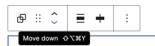
The up and down arrow icons can be used to shift a block up and down in your document.
Detailed instructions on moving a block within the editor can be found here.
Change alignment

None – Is the default width, the same as the main content.
Wide width – Increase the width of the post beyond the content size.
Full width – Extend the block to cover the full width of the screen, if supported by your site’s theme.
Items align justification

The three options to justify the items inside the Group block are left, center and right.
More options
These controls give you the option to copy, duplicate, and edit your block as HTML.
Read about these and other settings.
Editing the block
The nice thing about the Group block is that you can add any other blocks inside the group block and create a layout of your own. To add blocks to the Group block, click on the inserter icon inside the Group block.

Adding content
Inside the Group block, you can add a columns block, cover block or any other available block to create the layout of your choice.
The Group block shown here has columns, heading, paragraph, image and button blocks.
Note that since the Group block has the ability to embed other blocks, if you click specifically on one of the blocks, the settings in the sidebar will change according to the block you added to the Group block. For example, if you added an image inside the Group block, when you click on the image the sidebar will display the options from the Image block settings.
Every block has specific options in the editor sidebar in addition to the options found in the block toolbar. If you do not see the sidebar, simply click the ‘Settings‘ icon next to the Publish/Update button.
Group block settings
Alignment
There are four alignment options for the Group block:
- Default
- Row (Horizontal)
- Stack (Vertical)
- Grid
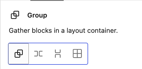
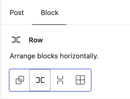
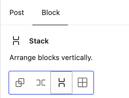
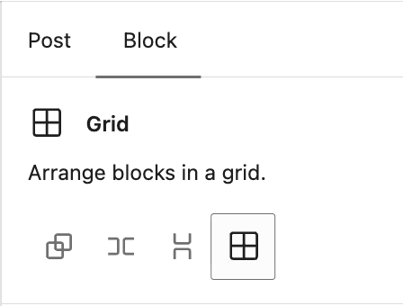
Once you choose one of the other group blocks, like Row, Stack or Grid, the settings change to those of each block.
Styles
You can modify the block styles by choosing the Default or Style 1 to Style 5 buttons in the Styles settings panel. Hover over the Default or Style buttons to get a preview of the styles.
The style options may vary based on your theme.
Typography
This option allows you to set the font, color, size, line height and other typography-related settings for the block.
Learn more about typography settings.
Background
The Background settings allow you to customize the appearance of supported blocks using background images, colors, and gradients.
For details, refer to the Background Settings Overview.
Layout
This is an advanced option that allows you to add custom content widths to the overall Group block for all blocks assigned to the center or wide columns. In many cases, you won’t need to use this option. When you toggle this option on, it allows the Group block to inherit the options set by your theme. When it’s toggled off, you can customize to your liking.
This article provides details about layout settings.
Dimensions
The option to control block spacing and padding is enabled for the block.
Learn more about dimension controls.
Border & Shadow
This option allows you to set a border around the block, including the color, the width, radius, and the style of the border.
Learn more about Border & Shadow settings.
Elements
The Elements settings allow you to customize the appearance of links, buttons, headings, and heading levels H1 through H6.
Position

The “Position” group setting allows you make a group block stick to the top of the viewport instead of scrolling, as seen in the demo below:
Please note that only “top level” Group blocks can be set as sticky. If a Group block is embedded inside any other block, the “Position” setting will not be available in the settings.
Advanced
The block provides the following Advanced settings options: HTML Anchor, Additional CSS Class(es), Additional CSS, HTML Element, Styles, and Allowed blocks.
Learn more about advanced settings
Changelog
- Updated 2026-09-06 (props @atachibana)
- Rearrange the Styles sections for WordPress 7.1 and add explanatory text.
- Updated 2026-08-23 (props @estelaris, @jdy68)
- Updated images for “adding a new block”, “block variations” and “block toolbar”, added keyboard shortcuts to group blocks, typography settings sections + link
- Updated 2026-05-25 (props @kjoyner @awetz583)
- Updated “Advanced” section to refer to new overview page
- Updated 2023-11-21
- Capitalization of headings to sentence case
- Updated 2023-04-04
- Added link to the list of blocks
- Updated 2023-03-29
- Updated to reflect the 6.2 changes
- Updated 2022-11-25
- Removed redundant content
- Added alt text to the some images
- Updated to include Dimension controls for WP 5.9 2022-01-17
- Updated with new images for WP 5.6 2020-11-27
- Created 2020-09-21
Was this article helpful? How could it be improved?
Log in to submit feedback. If you need support with something that wasn't covered by this article, please post your question in the support forums.