You can use the typography settings in your block to change the font and appearance of your texts. These settings include font size, line height, font style, font weight, text transform, letter spacing, font family, and text decoration. When combined, they allow you to have new ways to differentiate your content.
The typography settings are available when you use the block editor. If you are new to the block editor, this guide will show you how to work with blocks. You can read more about the new block editor features and improvements in this article.
How to access typography settings
The typography settings can be found in the Block Settings sidebar of a block under the section Typography.
If you don’t see the Block Settings sidebar, select the block you want to customize, then click the settings icon that is to the right of the Publish or Update buttons in the WordPress Editor.
In the Typography section, some options may be hidden. Click on the Typography options three-dot menu (also known as an ellipsis) to explore all the typography settings that are not visible by default.

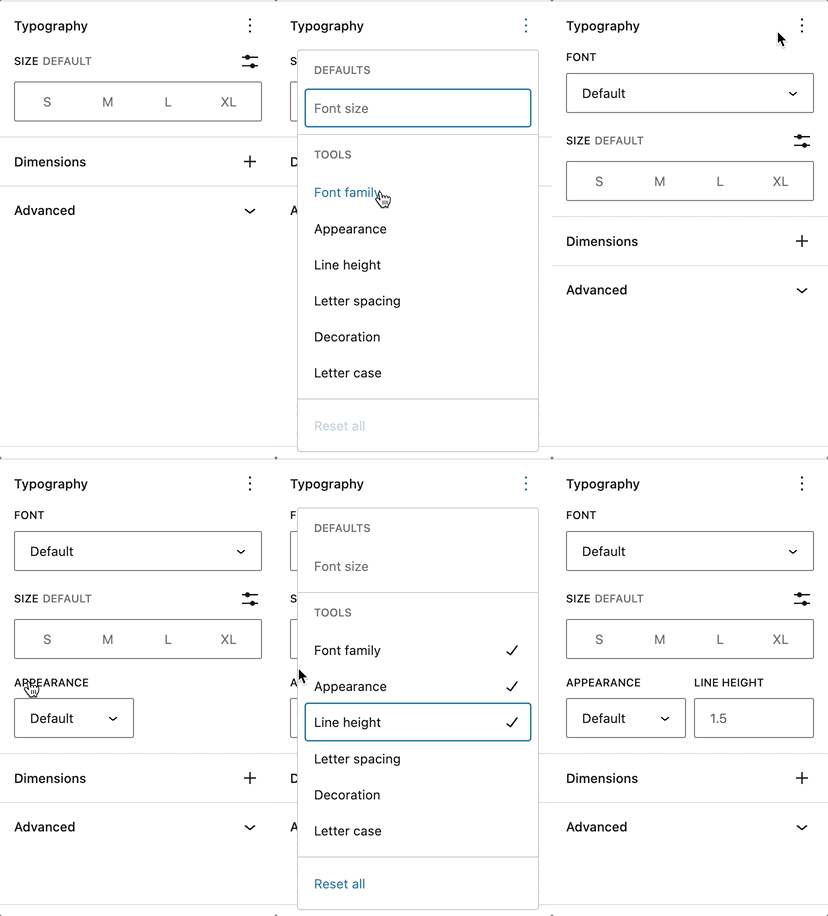
Displaying additional typography settings
From the drop-down menu, select the typography setting that you want to add to the Typography section. You can add as many settings as you like.
The full list of the different types of settings is listed below.
If you make customizations to these settings and want to revert back to the original settings quickly, you can do so by selecting the three-dot menu icon and clicking Reset All as shown in this article. This resets the settings and removes all of your changes.
Type of settings
Every supported block comes with different typography settings.
Font family
This option allows you to change the font family for your text, with a preview of the fonts available in the drop-down menu. The list of available fonts depends on your theme.


Font size
Font size allows you to adjust the size of your text. You can choose from preset sizes like (S)small, (M)medium, (L)large and (XL)extra large. You can also set a custom value by clicking the slider icon directly above the default selections.


You can change the unit of the font size by clicking the px icon on the right. You can choose between px, em, rem.
Line height
This setting sets the spacing above and below each line of text within a given paragraph. The default line height for most themes is 1.5. You can use the Line height settings to increase or decrease it to your liking. You can also add a custom number for the line height.

Letter case
This setting allows you to set text in a block to three casing options: all caps (AB), all lowercase (ab), or the first letter capitalized (Ab).

Letter spacing
This setting allows you to set the space between each individual character. You can also change the units from the default (px) to %, em, rem,vw and vh.
Learn the difference between these units here.

Decoration
The decoration setting allows you to add an underline or a line-through in the text. The line through is also known as strikethrough.

Appearance
The Appearance setting allows you to change the text’s weight from Thin to Extra Bold and Black. You also have the option to italicize your text from Regular Italic to Extra Bold Italic and Black Italic.

Blocks that have typography settings
- Archives
- Button/Buttons
- Calendar
- Categories
- Code
- Column/Columns
- Comment Author Name
- Comments Content
- Comment Date
- Comment Edit Link
- Comments Reply Link
- Comment Template
- Comments
- Comments Pagination
- Comments Pagination Next
- Comments Pagination Numbers
- Comments Pagination Previous
- Comments Title
- Cover
- Group
- Heading
- Home Link
- Latest Posts
- List & List Item
- Media & Text
- Navigation
- Navigation Link
- Page List
- Paragraph
- Post Author
- Post Author Biography
- Post Author Name
- Post Comments Count
- Post Comments Form
- Post Comments Link
- Post Content
- Post Date
- Post Excerpt
- Post Template
- Post Terms
- Post Title
- Post Navigation Link
- Preformatted
- Pullquote
- Query No Results
- Query Pagination
- Query Pagination Next
- Query Pagination Numbers
- Query Pagination Previous
- Query Title
- Quote
- Read More
- Search
- Site Title
- Site Tagline
- Table
- Table of Contents – not available in 6.2
- Tag Cloud
- Term Description
- Verse
The difference between px, em, rem, %, vw, and vh units
Pixel (px) is not a scalable unit, it is an absolute unit. The px unit does not change based on any other element and hence px units are not responsive. They are useful for maintaining consistent sizing for some elements. If you have elements that should not be resized, then using px unit is a good option.
Element (em), root element (rem), %, viewport height(vh) and viewport width(vw) are relative units. They are suited for responsive designs because these units scale up and down based on other elements size. They also get interpreted into the equivalent px unit by the browser.
em: Relative to the parent element
rem: Relative to the root element (HTML tag)
%: % relative to the parent element
vw: Relative to the viewport’s width
vh: Relative to the viewport’s height
Demonstration
To see the power of these settings in action, here’s an example of using them to personalize a button.
Changelog
- Updated 2025-06-28
- Updated font-family with preview feature
Updated screenshot and add new showcasing the font-family preview
- Updated font-family with preview feature
- Updated 2023-04-03
- Updated list of blocks that support typography settings
- Updated screenshots
- Created 2022-11-01
Was this article helpful? How could it be improved?
Log in to submit feedback. If you need support with something that wasn't covered by this article, please post your question in the support forums.