matazone
Forum Replies Created
-
Forum: Themes and Templates
In reply to: Resizing the custom header image on mobileHi,
I’ve just tried that, and it really doesn’t solve the problem. The Twenty Seventeen theme recommends 2000×1200 for the Header Media size. When I upload an image that’s 350px tall, it automatically scales it up to be 1200 pixels tall, with the edges of the text far off the sides of the screen.
The problem here is that, unlike other media in the Twenty Seventeen theme, the CSS for the Header Media doesn’t appear to be responsive in the same way – so the width and height of what’s displayed on the screen doesn’t adjust to the size of the uploaded image. It’s very frustrating, but I can’t find what’s causing the problem, which is why I’m on here. It doesn’t seem to make sense that the theme makers would have done it two ways (one for Header Media, another for everything else), but that’s the way it is.
Thanks for your continued efforts, but it’s still not resolved 😮
Forum: Themes and Templates
In reply to: Resizing the custom header image on mobileHi,
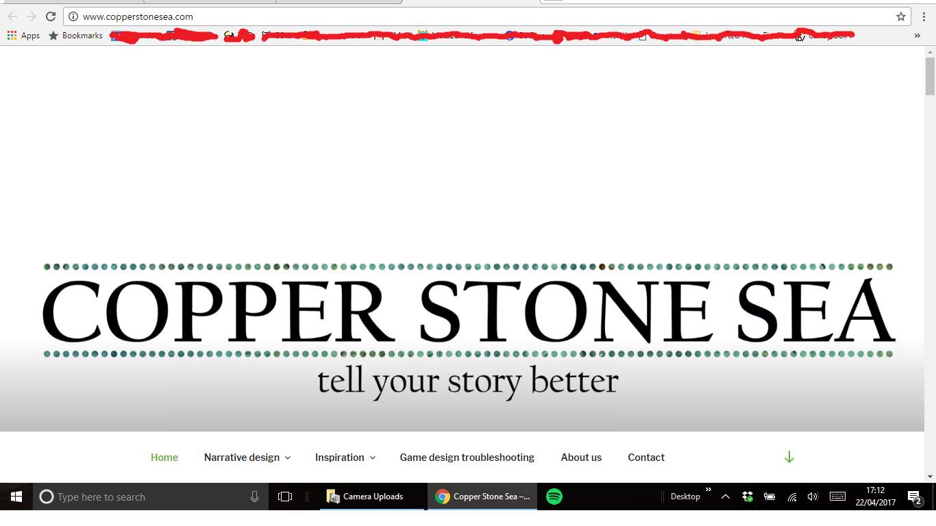
I’ve finally grabbed a comparison screenshot. This is on a medium-resolution laptop – it looks okay, not perfect, but definitely adequate:
http://www.copperstonesea.com/wp-content/uploads/2017/04/Screenshot-2.png
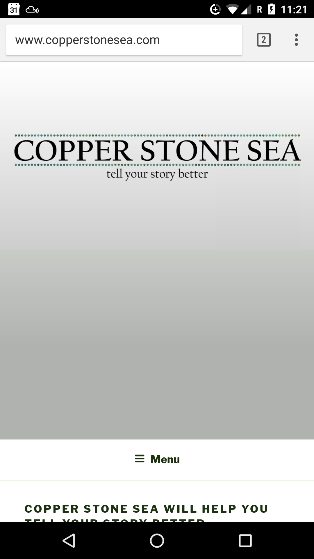
And this is on a mobile phone – you can see the logo is right at the top and the white background + CSS-added fade dominates the screen:
http://www.copperstonesea.com/wp-content/uploads/2017/04/Screenshot_20170420-112150.png
I’d like it so that the image is centred on desktops, no matter the resolution, and that it would be displayed at scaled-down full width and height on mobiles and then go straight to content below it, without the user needing to scroll past lots of white background to get there.
Does anyone know how to do this please?
Forum: Themes and Templates
In reply to: Resizing the custom header image on mobileOo, that’s much better, thanks! We’re not quite there though…
The first code snippet works really well to make sure that the text on the logo image is always readable because it adjusts to be the width of the display screen).
The second code snippet seems to set the height of the image for all versions, no matter the width that is being displayed, meaning the image gets cropped on desktop views. Without the second piece of code there is a lot of white space under the image on mobile views.
Is there a way to make sure that the logo image is always 100% of the display width and shown at 100% of its height please?
It seems strange that this isn’t the default behaviour for the logo, because it’s the behaviour for all of the other images on the front page (the ones that are associated with posts – they all adjust to be 100% width and the right height without cropping or any custom code).
If this isn’t clear I can put images online next week to explain – I’m travelling at the moment and it’s not so easy to share screenshots to illustrate my point.
Thanks for your help so far 🙂
Forum: Themes and Templates
In reply to: Resizing the custom header image on mobileThanks for the reply, but no, I’m referring to the width. For example, my site header looks good on a laptop, where the text ‘COPPER STONE SEA’ fills the screen, but on a mobile you see the middle letters on the logo ‘ER STO’.
The other images on the front page adjust their width, but the header does not.
- This reply was modified 9 years, 2 months ago by matazone.
Forum: Themes and Templates
In reply to: Resizing the custom header image on mobileI’m also looking for this answer. Did you find a solution please?
Forum: Plugins
In reply to: [Comic Easel] Unexpected T_Function fix for Comic Easel version 1.91My host is not always very fast at updating PHP versions, and I didn’t know if you were fast at updating the plugin. Clearly you really are very fast!
Thanks for the quick reply and for the awesome plugin – I’ll use that page in future if I find similar problems 🙂
I’m having no luck with posting to Facebook or Twitter.
My site is http://comic.matazone.co.uk
The site is using the Comic Easel plugin, which might be causing the problem, and all posts are scheduled rather than live, but the sidebar of the posts does say that they will be shared to Facebook. I suspect that it’s probably Jetpack having the problem, not Comic Easel, given that there are numerous other people having the same problem.
Is there anything I can do to help you diagnose the issue?