Hi Nick,
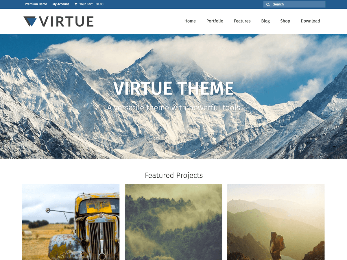
I’m seeing your logo to the left of your social links. Looks like you were able to figure this out?
Hannah
Hi Hannah,
Thanks for reaching out. Well, yes I figured some workaround, although when the window of the browser is narrower or on the mobile version toolbar again looks messy.
But I guess I’ll have to read a lot more to make it decent and responsive there. If you have tips for that, they are more than welcome 🙂
N.
Try adding this to your custom css:
@media (max-width: 767px) {
#topbar .kad-topbar-left, #topbar .kad-topbar-left .topbarmenu {
    float: right;
}
.col-md-6.col-sm-6.kad-topbar-right {
    width: 50%;
}
.col-md-6.col-sm-6.kad-topbar-left {
    width: 50%;
}
}
.topbar-widget {
    display: flex;
}
Let me know how that works for you!
Hannah
Hey,
With some additional twaking now it is starting to take shape. Currently it contains quite some lines, guess some of them are now useless, but I’ll clean them up later:
.topclass {
position: fixed;
z-index: 1000;
width: 100%;
}
.topclass .icon {
float: left;
}
.topbarmenu ul li {
float: left;
display: flex;
}
.topbar-widget {
float: left;
display: flex;
}
@media (max-width: 767px) {
#topbar .kad-topbar-left, #topbar .kad-topbar-left .topbarmenu {
float: right;
}
.col-md-6.col-sm-6.kad-topbar-right {
width: 35%;
}
.col-md-6.col-sm-6.kad-topbar-left {
width: 65%;
}
}
.so-widget-lsow-icon-list {
float: left;
padding-top: 5px;
}
.virtue_social_widget.clearfix{
float: right;
padding-top: 10px;
padding-bottom: 10px;
}
.kad-cart-total {
float: right;
display: flex;
}
Anyway thank you for the quick support!
Best,
N.