Hi,
Can you explain that?
Are you referring to the featured pages? Or posts/pages?
Hi,
I’m referring to the recent posts blogroll on the homepage.
When you view the homepage on a big screen, you see a list of your most recent posts in 2-4 columns, depending on your settings.
However, if you view your homepage on a small screen, it shows 1 column of your recent posts only.
Example:
Homepage on a desktop:
header
post1 post2 post3 post4 sidebar
post5 post6
footer
Homepage on a mobile device:
header
post1
post2
post3
post4
post5
post6
sidebar
footer
Is it possible to make it show 2 posts side-by-side (2 columns) like this:
header
post1 post2
post3 post4
post5 post6
sidebar
footer
on a mobile device?
There must be some way to control the number of columns using CSS and media queries…like:
@media (max-width:500px){
.post-width:250px;
}}
Or something like that. I just don’t know what CSS selectors to use.
Any advice?
Maybe http://presscustomizr.com/snippet/creating-a-column-layout-in-customizr/ will help. At least as a starting point.
The posts will not go left-right-left-right this way. But you will have columns.
btw: Are you really sure, 2 columns on a mobile are a good idea?
_________
*** Ups … I didn’t read the
“I’m referring to the recent posts blogroll on the homepage.”
Sorry.
By recent posts blogroll, do you mean the post list grid? Or is it the recent posts widget on the sidebar?
Hi,
I mean the post list grid. I want to make it only show 2 columns on mobile devices.
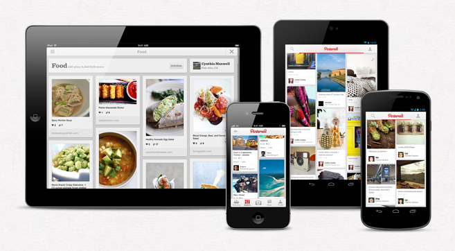
For example, look at this image:
http://www.takeflyte.com/wp-content/uploads/2012/08/Pinterest-mobile.png
See how on a tablet, Pinterest shows multiple columns (3-4)? But on a mobile, it only shows 2?
How do I do that with Customizr? I’m sure it can be done via CSS somehow.
After playing around with the CSS, I could get the posts to only take up half the screen. The problem is, the next post doesn’t move up to fill in the other half!
So now it looks like this:
|post1 <empty space> |
|post2 <empty space> |
I need it like this:
|post1 post2|
Any ideas on how to get it to work?
^^ I did the same and have no idea how to fill (auto move) that <empty space> and gave up because of to understand bootstrap layout. (was in headache of errors with theme that time).
I am trying to get full featured image in mobile view. as |post1| or |post1 post2|.
If only 1 post, the image goes half / rectangle. not square or auto size of image size to fit the screen. if 2 post row, stuck with empty space on right side.
In mobile or tablet (i tested on) which is 720p resolution landscape or portrait mode, having half featured image doesn’t look very good.
it will be really helpful if they added this option because even the very simple designed theme have this feature.
hope someone reply with working codes. 🙂
