mobile menu doesn´t work on iPad landscape
-
Hello,
I have now made several websites with the OceanWP theme. It is a very flexible and adaptable.
Unfortunately, I recently noticed that on an iPad in landscape, the desktop menu is displayed instead of mobile. Since there is usually not enough space, the main menu is broken into two lines, which looks very ugly.
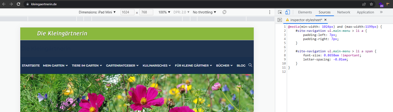
Here an other example:
juwelier-happe.deThe media query break point is set to 959px by default, but if I change the setting there no longer shows the mobile menu at all. No matter what other plugins are installed, it will not work in tablet landscape.
The page I need help with: [log in to see the link]
Viewing 1 replies (of 1 total)
Viewing 1 replies (of 1 total)
The topic ‘mobile menu doesn´t work on iPad landscape’ is closed to new replies.