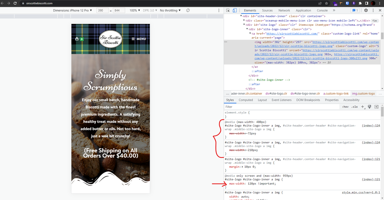
• I’m trying to increase the size of the logo on mobile. I’ve tried what I thought would do it, but the size is still very small. It’s fine when the phone is held horizontal, but when vertical goes back to tiny. Here is the CSS I have tried:

    @media only screen and (max-width: 959px) {
    #site-logo #site-logo-inner a img {
    max-width: 120px !important;
    }
    }

    The page I need help with: [log in to see the link]

Viewing 1 replies (of 1 total)
  • Hello @lswebs,

    I saw you write some CSS, which all overrides the previous CSS.
    Please check this screenshot: https://i.postimg.cc/28JqLWzF/image.png.

    In this case, to set custom sizes for the vertical and horizontal devices, you should find the correct media query and write a specific CSS for those sizes.

    For responsive sizes, put your CSS on custom screen size:

    @media only screen and (max-width: 480px) {
        /* put your custom CSS here*/
    }

    Or use between sizes:

    @media (max-width: 960px) and (min-width: 481px){
        /* put your custom CSS here */
    }

    For more information about media queries, please read this article:
    https://www.w3schools.com/css/css_rwd_mediaqueries.asp

    For instance, these sizes: https://postimg.cc/gallery/pKfm3Gw. Only use the screen width and set your media query between sizes.

    I hope that helps.
    Best Regards

Viewing 1 replies (of 1 total)

The topic ‘Mobile Logo Size’ is closed to new replies.