Header Changes
-
Greetings,
I’m looking to make a few changes to my page inspired by Givenchy and Chanel’s websites.
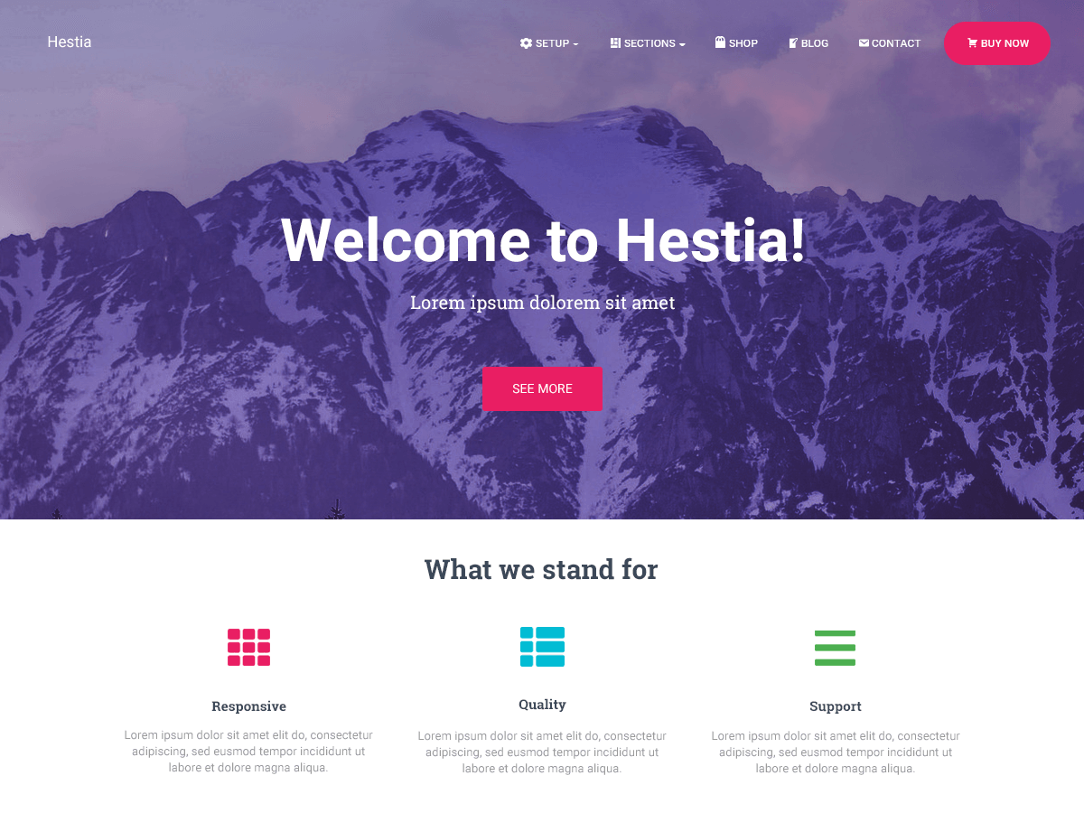
1. I would like to add additional space between all of the categories in the header on the desktop version of the website.
2. I would like to add a cart icon to the header on the left-hand side on mobile devices.
3. On the desktop version I would like to be able to add search and cart icons in line with the logo, to both the far right and left.
4. I would like to be able to add a little more space in between the logo row and the row with the categories in the header on desktop.
5. When I scroll down on desktop I’d like for the row with the logo to be visible, not the row with the categories.If I didn’t do well enough a job of explaining what I’m looking for please view the sites above as reference or just let me know and I’ll try to re-explain.
Thank you in advance.
The page I need help with: [log in to see the link]


The topic ‘Header Changes’ is closed to new replies.