Hey, Is this in landscape mode or portrait?
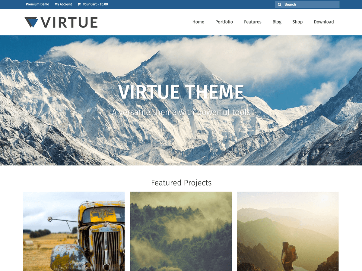
In your theme options > logo settings you have the logo set to take up half the header, you might want to change that to 1/4 so you leave room for the menu as a screen size gets smaller.
Kadence Themes
Landscape. That fixed the problem of the Main Nav showing up on two lines but still not going to the mobile nav option. That’s at least better. I’m also having trouble with my logo looking good on high-res screens such as my ipad.
Ok if you want the mobile when your in landscape mode on the ipad you can use this css in your theme options > advanced settings:
@media only screen and (device-width: 768px) {
    #nav-main ul.sf-menu {
        display: none;
    }
    #mobile-nav-trigger {
    display: block;
    }
    header #nav-main {
    margin: 0;
    }
}
Logo, hmm, try adding this:
@media only screen and (device-width: 768px) {
#logo .kad-standard-logo {
display: none;
}
#logo .kad-retina-logo {
display: block;
}
}
Kadence Themes
oh missed one thing, you will need to change the menu css out for this, not what I posted above:
@media only screen and (device-width: 768px) {
    #nav-main ul.sf-menu {
        display: none;
    }
    #mobile-nav-trigger {
    display: block;
    }
    #kad-mobile-nav {
    display: block;
    }
    header #nav-main {
    margin: 0;
    }
}