Styles is a feature that allows you to set the overall aesthetics and layout of your site at a global level, instead of editing individual blocks or pages. It is included in block themes and requires WordPress 5.9 or higher.
You can set the colors, typography, layout, spacing, and more across the entire site, giving your website a cohesive look that showcases your brand.
You can also edit the default appearance of blocks to streamline the look and feel of your website — add your unique colors to create a branded Button block, or adjust the Heading block to your preferred font size.
How styles work
The styles you set from within the Styles interface impact your entire site. For example, if you change the background color here, it changes the background color of all your posts, pages, and templates.
In the Styles panel, you will find the styles and default settings provided by your theme and the ones that come with WordPress.
You can override these settings with your own choices from the Styles panel. For example, you can add your own custom colors to the color palette, change the layout dimensions, and more.

You can also customize the appearance of specific blocks for the entire site. For example, you can choose a background color and set the font size and line height for all the Quote blocks on your site.
How to use the styles panel
To access this feature, you will need to install and activate a block theme and be using WordPress 5.9 or higher.
Go to Appearance > Editor. Select the half-shaded circle icon at the top right-hand corner of the screen, above the block settings sidebar, to access the Styles panel. The Styles icon is available in the Site Editor, and when editing the template or template parts.
In the Styles panel, you will see sections for Typography, Colors, and Layout. Any changes made from here will affect the entire site.
You will also find a section for Blocks. Clicking on the Blocks section will show you a list of all the blocks. You can select any block type and customize the appearance of that particular block across the whole site.
The Styles welcome guide
When you open the Styles panel for the first time, you will be taken to a Welcome Guide dialog. You can click through the guide using the Next and Previous links at the bottom or close the dialog by clicking the X icon at the top right corner of the dialog.

If you want to access the Welcome Guide in the future, you can find it by clicking on the three vertical dots icon in the upper right-hand corner and selecting Welcome Guide.

Style variations

Style variations are a new feature of block themes that were introduced in WordPress 6.0.
With these style variations, you are presented with alternate versions of your block theme with different combinations of colors, fonts, typography, spacing, block settings, and more. You can easily swap the style variations and change the look and feel of your site without changing your theme.
- In the Styles panel, you can find a screenshot of the Style variation that your site is currently using.
- Select Browse styles at the bottom of the screenshot to explore the different style variations available with your block theme. From the available choices, you can pick a different style combination and instantly see how your site looks with this style variation in the Editor.
- Click the left arrow icon to go back to the Styles panel.
Color and typography style variations
Color and typography variations are subsets of the existing global style variations system that were introduced in WordPress 6.6. Color and typography variations are limited in scope to—as their names imply—colors and typography.
When they are available, these variations appear as new options in the Appearance > Editor > Styles sidebar panel and elsewhere:
Typography
This section allows you to manage the various typography settings for the different elements – text, links, headings, and buttons – for the entire site.
- Click Typography to open the Typography panel. Select the element you want to customize, and it will open up the Typography panel for that element.
Preset typography options are now available in the Styles interface. These presets, defined by the theme, provide a curated set of font sizes, line heights, and other typographic values that help maintain consistency across your site.

- You can change the typography settings, including font type, font size, appearance, line height, and text decoration. As you pick your choices, you can see a preview of how it looks.

- As you attempt to change the font type, each option in the dropdown shows a preview of the font.

- You can choose a font size from the preset options: S, M, L, XL, and XXL, or define a custom size using units like px, em, or rem.
- You can change the typography settings for heading elements from
H1throughH6.
- You can customize typography settings for heading elements from H1 to H6, including:
- Font Family: Choose from a range of available fonts, each with a live preview.
- Font Size: Select from preset sizes (S, M, L, XL, XXL) or define custom values and units.
- Font Style: Choose from Default (inherited from general typography settings), Regular, Bold, Italic, or Bold Italic.
- Line Height & Letter Spacing: Adjust both with customizable units.
- Text Decoration: Apply styles such as None, Underline, or Strikethrough.
- Text Orientation & Letter Case: Modify text direction and transform casing as needed.
Font size presets
Font size presets provide a set of predefined size options that can be applied consistently across blocks and elements. These presets are defined by the theme and appear in the typography controls as labeled choices such as Small, Medium, Large, Extra Large, and Extra Extra Large, making it easier for users to select appropriate font sizes without manually entering values.

You can modify a font size preset by clicking on the one you want to change. In this example, we’ll adjust the preset named Small. You’ll see a live preview along with options to set a custom size using various units such as px, em, rem, vw, and vh. You can use the slider to adjust the value or enter a specific size manually.

Note: The standard size input will be disabled if you enable Custom fluid values.
When using custom fluid values, you can define both a minimum and maximum size, with the same range of supported units as the standard size option.

Colors
This section allows you to manage the color palettes and the default color of different global elements on the site. This includes your site’s background color, and the colors for texts, links, headings, and buttons.
- Click Colors to open the Color panel. At the top, you will find the color palette used by the style variation of your active block theme. You will also find the list of elements whose default global color can be customized through the Color settings panel.

NOTE: In case your theme doesn’t have any color palettes, you will see the Add custom colors button. Click on it to start creating your custom palette.

Customize the colors in the theme palette
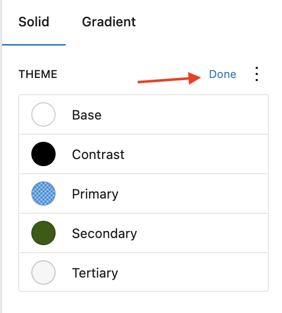
- From the Color settings panel, click Palette to open the Palettes panel. Here you can set the color options that are available by default for blocks across your website. The Theme colors under the Solid tab can be used throughout your theme’s settings. The Default colors can be used in the blocks you use on your pages and posts.

- Click the three vertical dots icon in the top right corner of Theme or Default and select Edit colors to change the color of each circle.

The Default colors will not be shown if your theme specifically opts out of it.
- A list will appear that includes all the colors currently in that palette. Click on one to edit it.

- You can either choose a color from the color picker or enter the HEX, RGB, or HSL color values based on your brand. Click the two rectangle boxes next to the color slider to copy the HEX, RGB, or HSL color values.

- Once you are done picking the colors, you can click Done in the upper right corner to save the color choices.
- To revert the changes you made, click the three vertical dots icon and select Reset colors. This will reset the color palette to the theme’s original style variation choices.

Add custom color to the theme palette
You can also create a custom palette from the Custom section in the Palette panel.
- Click the + icon in the upper right corner in the Custom section to add a color.
- You can give a name to the new color.
- You can either choose a color from the color picker or enter the HEX, RGB, or HSL color values for the new color.
- Click the – icon to the right of a color to remove that color from the custom palette.
- Click Done once you are done adding custom colors.
- Click the three vertical dots icon in the upper right corner and select Remove all colors to remove the colors from the palette.
Preset Color Palette
Starting with WordPress 6.7, the Color interface introduces a new preset color palette that provides a curated set of default colors designed to complement your theme’s design. These presets serve as a consistent foundation for applying color across blocks and global elements, helping to maintain visual harmony and accessibility throughout your site.

Customize the theme gradients
The Palette panel opens to the Solid tab by default. You can click the Gradient tab to add gradients to your theme. From the Palette panel, you can edit the Default gradients that came with the theme or add Custom gradients.
- Click the three vertical dots icon in the upper right corner in the Default section and click Edit gradients to start customizing the gradients in the theme.

- A list of all the gradients will appear. Click on any one of them to edit it.

The Default gradients will not be shown if your theme specifically opts out of it.
- A slider will appear that shows the two color points that make up the gradient.

- You can click on any of the two color points to display the color picker for changing the color value. You can either choose a color from the color picker or enter the HEX, RGB, or HSL color values.
- You can add additional color points if you like by clicking the + icon that appears when you hover over the gradient slider.

- Under Type, choose from Linear (transitions in a straight line) or Radial (transitions in a circle). You can also edit the angle of your gradient.
- Once you are happy with your color choices for the gradient, click Done in the upper right corner.
- To revert back to the colors that came with the theme, click the three vertical dots icon in the upper right corner and click Reset gradient.
Add custom gradient
You can add custom gradients from the Custom section in the Gradient tab.
- Click the + icon in the upper right corner to add a new gradient.
- Click on the gradient in the list to set the two color points, add additional color points, and set the Type and Angle for the custom gradient.
- You can change the name of the gradient to make them more intuitive.
- Click the – icon next to the gradient in the list to delete a custom gradient.
- Click Done once you are happy with the custom gradients you created.
- Click the three vertical dots icon in the upper right corner and select Remove all gradients to delete all the custom gradients with one click.
Customize the color of elements
From the Colors panel, under Elements, you can change the color of your site background, text, links, headings and buttons.
- Click on the element you want to edit to open a new panel with the color options for that element.
- As you make changes, you will see the design of your site update on the left.
- You can click the Clear link at the bottom right corner in the element’s panel to clear the color choices you made for that element.
- For the Background, you can set a solid color or gradient.
- For the Text, you can set a default color that will be used across the entire site. You can either choose a color from the color picker or enter the HEX, RGB, or HSL color values for the new color.
- For the Links, you can set the default color for links across the site. You can also set the hover state for the links.
- For the Headings, select the heading level-
H1,H2,H3,H4,H5andH6and then you can set the default color for that level across the site. You can also set the background color for the selected heading level to a solid or gradient color. Choosing All in the heading level tab will make the changes for all the heading levels at once.
- For the Buttons, you can set the default text and background color for buttons across the site.
Layout

This section allows you to set the width of the main content area of your website globally.
You can set the content width and wide width in PX, %, EM, REM, VW and VH units. The content width set here will be the default width of the blocks when they set Align to None in the Block Toolbar. The wide width set here will be the width of the blocks when they set Align to Wide width in the Block Toolbar.
To reset the values for Content and Wide, click the three vertical dots icon and select Content size or Wide size, and the changes you made are reverted.

You can also set the Padding or the blank space around your website from the Layout panel.
- You can set the padding on the four sides: top, right, bottom, and left.
- By default, Padding is locked, which means that when you adjust the padding value, it applies to all four sides. If you click the link icon, it unlinks the sides, and you can set the Padding on each side individually.


- Padding can be set in PX, %, EM, REM, VW, and VH units.
- You can add values to the text box or use the slider to adjust the values for Padding.
Built into the Styles experience are preset spacing values for padding. Your theme author can set baseline values for spacing, and when you use the Styles’ padding preset slider, you can create consistent spacing across the elements within the site.
- Clicking the black slider icon in the right corner (next to the link icon) will show the padding space preset slider.

- To reset the values for Padding, click the three vertical dots icon and select Padding, and the changes you made are reverted.
In the Layout panel, you can also set the Block spacing, which is the vertical spacing between the blocks.
- Block spacing can be set in PX, %, EM, REM, VW, and VH units.
- You can add values to the text box or use the slider to adjust the values for Block spacing.
Similar to padding, WordPress comes with preset spacing guidelines that your theme author can set baseline values for, and when you use the Styles block spacing preset slider, you can create consistent block spacing between the blocks.
- Clicking the black slider icon in the right corner (next to the link icon) will show the block spacing preset slider.
- To reset the values for Block spacing, click the three vertical dots icon, select Block spacing, and the changes you made are reverted.
Background
The Background section in Styles allows you to upload and apply a background image to your site.
Blocks
In the Blocks panel, you will see a list of all the blocks that can be customized for the whole site. You can also search for a block by its name in the search box. Click on a block from the list to see the available options for that block.
The changes you make to the blocks’ appearances in the Styles panel affect every block of that type on your site unless they are customized individually on your post or page. For example, if you set a custom color for a Button block on your Home page, the color set in the Styles panel for the Button block will be overwritten by the color you choose on the Home page.
As you make changes, as of WordPress 6.2, you will see a live preview of the impact of those changes you’re making, as shown below:
Each block has its own set of options to customize. For example, you can customize the border, radius, duotone, etc. for the Image block or change the paddings, margins, colors, and fonts for the Heading block.
Margin settings for blocks
Padding is the space between a block’s content and its border, whereas Margin is the space outside the border of a block.
The following blocks have Margin controls for Top, Right, Bottom, and Left in the Blocks section under Layouts.
- Paragraph
- Heading
- Gallery
- List
- Archives
- Audio
- Categories List
- Media & Text
- Social Icons
- Table
- Tag Cloud
- Poetry (formerly Verse)
- Video
- Site Logo
- Site Title
- Site Tagline
- Avatar
- Post Title
- Post Excerpt
- Post Featured image
- Post Date
- Post Author
- Comment Author
- Comment Date
- Comment Edit Link
- Comment Reply Link
- Comment Title
- Term Description
- Query Title
- Post Author Biography
The following blocks have a Margin control for Top and Bottom only in the Blocks section under Layouts.
- Buttons
- Code
- Cover
- Group
- Columns
- Separator
- Spacer
- Read More
By default, Margin is locked, which means that when you adjust the margin value, it applies to all sides. If you click the link icon, it unlinks the sides, and you can set the Margin on each side individually.


Your theme author can set baseline values for spacing, and when you use the Styles’ margin preset slider, you can create consistent spacing across the elements within the site.
Clicking the slider icon in the right corner (next to the link icon) will switch the Margin controls from the preset slider to the text box view. You can add values to the text box or use the slider to adjust the values for Margin. Margin can be set in PX, %, EM, REM, VW, and VH units.

To reset the values for Margin, click the three vertical dots icon and select Margin, and the changes you made are reverted.
Border and radius settings for blocks
The following blocks have a Border and Radius control in the Blocks section under Layouts.
- Image
- Code
- Columns
- Group
- Pullquote
- Search
- Avatar
- Post Featured Image
- Read More
- Comment Title
Using the Border controls, you can set the border around a block. You can choose the border color from the color picker. You can set the border width in PX, %, EM, REM, VW, or VH by entering the width in the text box or using the slider to adjust the values.

By default, border width is locked, which means that when you adjust the value, it applies to all sides. If you click the link icon, it unlinks the sides, and you can set the Border on each side individually.

Using the Radius controls, you can round the corners of a block’s outer border. You can also set the border Radius in PX, %, EM, REM, VW, or VH by entering the value in the text box or by adjusting the slider.
By default, border radius is locked, which means that when you adjust the value, it applies to all four corners. If you click the link icon, it unlinks the corners, and you can set the radius on each corner individually – Top left, Top right, Bottom left, and Bottom right.

Horizontal block spacing settings for blocks
The following blocks have Horizontal Block spacing control in the Blocks section under Layouts.
- Columns
- Social Icons
By default, the Block Spacing control is locked, which means that when you adjust the value, it applies to both the horizontal and vertical. If you click the link icon, it unlinks, and you can set the Block Spacing for vertical and horizontal separately.
Editing block variations
Some blocks come built in with variations, different options of the same block. When that’s the case, as of WordPress 6.2, you will see the option
Adding box shadows to button block
With WordPress 6.2, there are four shadow presets you can choose from by default. The following come by default for you to use:
- Natural
- Crisp
- Sharp
- Soft

Styling the site tagline
The Global Styles section lets users set and unset the Site Tagline. Users can also update the font and color of the site tagline through this section. This is an optional setting which the users can utilize as per their needs.

Preview your changes with style book
When making changes to the styles of your site, whether changing to a different style variation or tweaking an individual block, it’s imperative to see the cascading impact. You can see all of your blocks on your site as you make changes with this view that you can toggle on and off as you would like. This includes showing individual block variations that you can then customize, which are visible when you turn the style book on from the overall Styles view.
Applying Custom CSS
The Site Editor seeks to enable customization at every level across your site. In some cases, as features are being built, there are gaps in what’s possible. As a result, it’s recommended to start with the options available in Styles before adding custom CSS. For any current gaps, you can add Custom CSS. Note that any CSS changes you make won’t be overwritten by a theme update, but they will be cleared when you switch themes.
Site-wide Custom CSS
A site-wide custom CSS editor is built into the Styles interface, as of WordPress 6.2. Click the three dot menu and select “Additional CSS.” Any CSS added here is applied across the entire site.


In 6.9, Additional CSS controls have been moved into the ellipsis menu in the header of the Styles page on either side of the screen

Per-block CSS
As you navigate to each individual block under Styles > Blocks, you’ll find an “Additional block CSS” section. When you add CSS here, it applies only to that specific block type throughout the entire site.

Because CSS added here is for a specific block type, you should not add a selector or curly braces. Follow the property: value format.
For example, if you wanted to display the quotation portion of the Quote block in italics, you could add this in the Quote block’s CSS editor:
font-style: italic;Here’s how that looks in the editor:

And this is how the CSS is output on the front end:
.wp-block-quote {
  font-style: italic;
}
Notice how WordPress automatically adds the property: value pair to the block’s selector.
By using CSS combinators like spaces and < or pseudo-classes and -elements, you can create more complex effects, including hover states. You can also use the ampersand (&) as in SASS/LESS, to target a nested element.
For example, here’s some CSS you could add in the Button block’s CSS editor to create a hover state for the Button block:
:hover {
  background: #bb00bb;
}
Note that in this case, you do need to include curly braces in the code. The resulting CSS on the front end is:
.wp-block-button .wp-block-button__link:hover {
  background: #bb00bb;
}
Reset your changes
To revert back to the theme styles you had before making changes, click on the three vertical dots icon in the upper right-hand corner of the Styles panel, and select Reset to defaults.

Changelog:
- Updated 2025-07-20
- Updated to include color palette presets and typesets
- Updated font size presets and how to modify or customize them
- Updated to include background support
- Updated 2025-06-28
- Updated content for 6.8 adding font-family preview
Updated content for typography settings for heading elements
Updated screenshots including showcasing the font-family preview
- Updated content for 6.8 adding font-family preview
- Updated 2024-09-05
- Added Color and typography style variations section.
- Updated 2023-03-27
- Removed references to 6.1
- Removed references to “beta” for the site editor.
- Updated content for 6.2 adding in Custom CSS, in-line block preview, and Style Book.
- Updated 2022-10-15
- Added screenshots and videos for 6.1
- Updated content for 6.1
- Created 2022-01-05
Was this article helpful? How could it be improved?
Log in to submit feedback. If you need support with something that wasn't covered by this article, please post your question in the support forums.