Thread Starter
 blueb
blueb
(@blueb)
Hi weblizar, thank you so much; I’ve already read the thread you suggest, but I couldn’t find the solution to my problem.
Hi,
OK, then share the website URL.
Thanks
Thread Starter
blueb
(@blueb)
Hi, thank you so much
http://www.zwicktraining.it (mobile)
Hi,
Your site at under construction.
So i can’t view anything.
Thanks.
Thread Starter
blueb
(@blueb)
Hi,
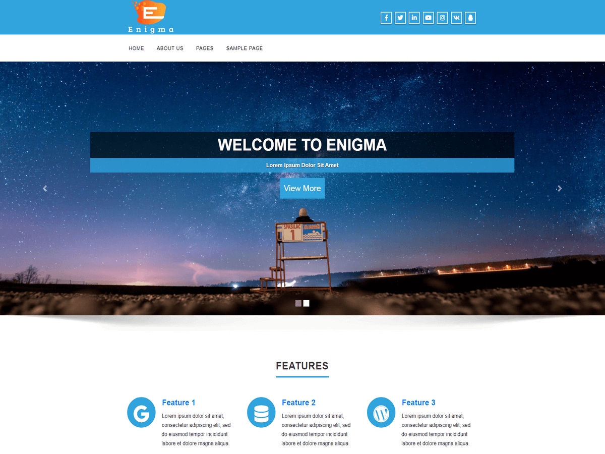
now is available, the problem is the one shown in the pic postes above. 🙁 Thank you so much in advance
Hi,
Write below CSS rules into custom CSS editor :
.carousel-text h1 {
font-size: 10px;
padding: 2px 0px;
}
.carousel-list li {
font-size: 8px;
margin-bottom: 0px;
}
.carousel-text .enigma_blog_read_btn {
font-size: 8px;
margin-bottom: 0;
padding: 4px;
}
Now save the changes.
Thanks
Thread Starter
blueb
(@blueb)
Hi weblizar, thank you so much for your help.
Now there are no problems with the mobile version, but you can not read the text from the desktop because it’s too small.
If I try to insert a readable font size for the desktop version, then the mobile version becomes all messed up. 🙁
Hi,
My apologies.
Now try this :
@media only screen and (min-width: 200px) and (max-width: 480px) {
.carousel-text h1 {
font-size: 10px;
padding: 2px 0px;
}
.carousel-list li {
font-size: 8px;
margin-bottom: 0px;
}
.carousel-text .enigma_blog_read_btn {
font-size: 8px;
margin-bottom: 0;
padding: 4px;
}
}
Save the changes.
Thanks
Thread Starter
blueb
(@blueb)
How can I thank you??? Infinite gratitude!!!
Thank you soooo much, now it works well. 🙂