Hi Scott, this is what I see on an iPhone 6:

Could you clarify a bit more specifically what you want to change so I can better lend a hand?
For example, do you want to make the tagline text (“Music & More 4 Mind, Booty & Soul”) smaller so it’s more likely to fit onto one line on a small phone size?
I see it messed up in both Samsung Galaxy S7
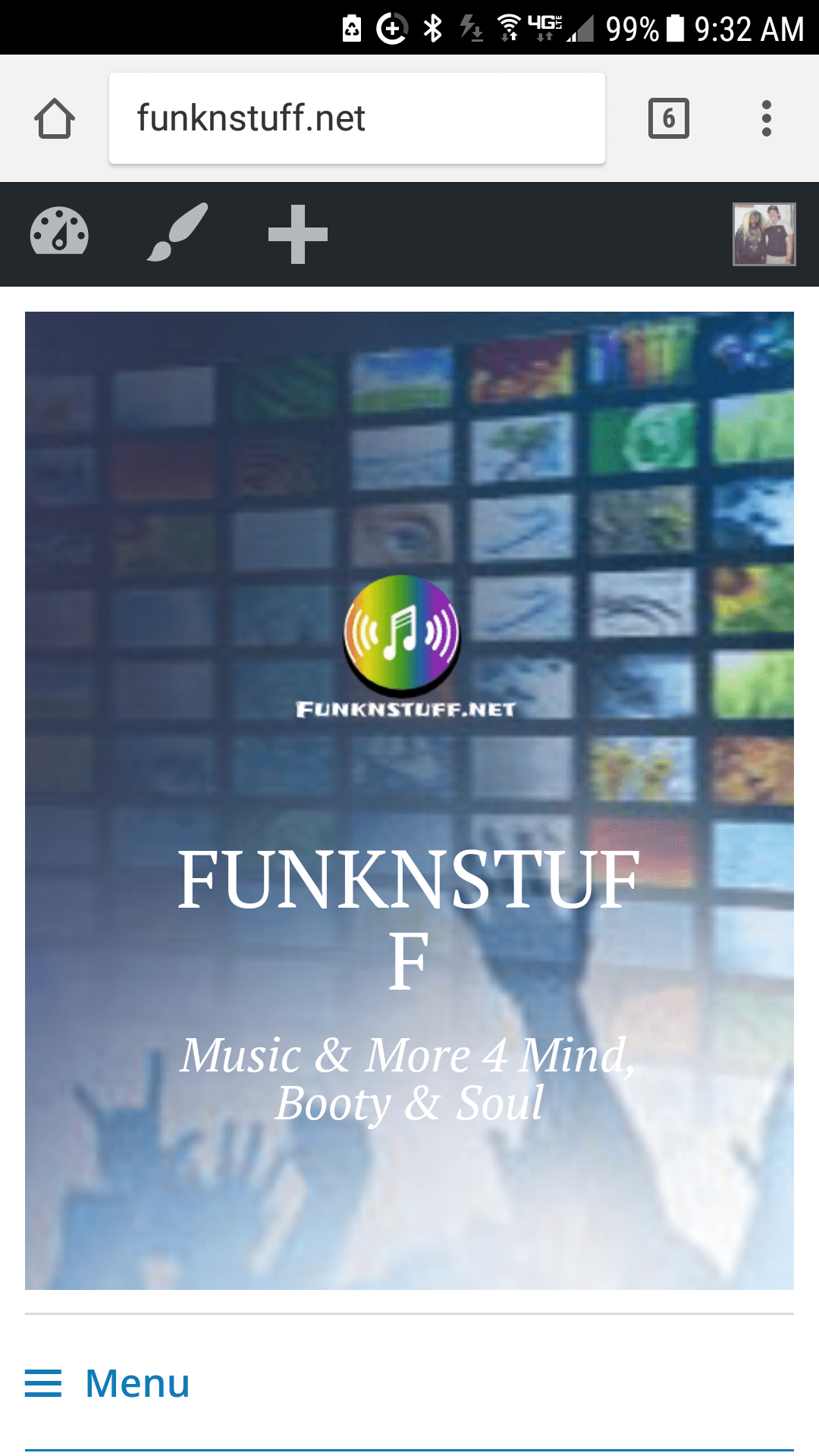
and also on an Apple iTouch 5

Any ideas? Thanks
Ah, I see what you mean on smaller phone sizes. You can try some custom CSS to decrease the font size on smaller screens.
@media screen and (max-width: 380px) {
  .site-title a {
    font-size: 28px;
  }
}
That would make the site title smaller on screens below 380px, which is where the trouble seems to be.
Don’t edit the theme files directly, otherwise your changes will be overwritten every time the theme is updated.
An easy way to add custom CSS is to use the CSS editor included in the Customizer as of WordPress 4.7. Head to Appearance > Customize > Additional CSS to add your custom CSS.
That worked, you are amazing 🙂
THANK YOU
Scott
My pleasure, glad that did the trick!
