Hello,
bjbaron
go to Dashboard->Appearance->Themes->Customize->Theme Options->Theme General Options->Custom CSS
in Custom CSS option put below code and save
.navbar-default .navbar-nav > li > a
{
  padding: 10px 12px !important;
}
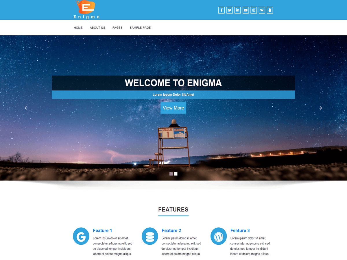
It’s still wrapping. (LINK). Is there no way of making the navigation the full width of the screen?
Also on a mobile device the header looks so wide and the search box is cut off. Is there a fix for that? Thanks for your support!
Hello,
remove previous code insert new code
@media(max-width:480px){
.input-group {
    float: left !important;
}
img#fsb_image{
display:none !important;
}
}

.navbar-default .navbar-nav > li > a {
  padding: 10px 12px !important;
}
Thank you for the code but the nav menu is still wrapping. (LINK)
Hi is there any solution to making the nav bar full width? If not I will have to figure out an alternative for my additional links. Thanks.
Hello,
go to Dashboard -> Appearance -> Themes -> Customize -> Theme Options -> Theme General Options -> Custom CSS
put below code in Custom CSS option
.nav.navbar-nav {
    display: inline !important;
    text-align: initial !important;
}
Thanks.
My links are still wrapping. Here is all the custom code that has to do with the nav bar. Perhaps one is conflicting with another?
.navbar-nav {
float: center !important;
}
.collapse.navbar-collapse {
margin-top: 3px !important;
margin-bottom: 0 !important;
}
.nav.navbar-nav {
height: auto !important;
}
@media(max-width:480px){
.input-group {
float: left !important;
}
img#fsb_image{
display:none !important;
}
.navbar-default .navbar-nav > li > a {
padding: 10px 12px !important;
}
.nav.navbar-nav {
display: inline !important;
text-align: initial !important;
}