Hey,
This is a responsive theme. You can’t set a fixed width with this. It will always realign to fix on the screen it’s viewed on. You can see it in the demo here: http://themes.kadencethemes.com/virtue/
If you post a link to your site I might be able to give you some help in setting up your content for a mobile friendly site.
Kadence Themes
paglci.org
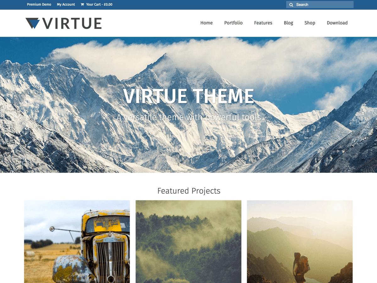
I want the three pictures underneath the slider to NOT be in the slider, but I’m frustrated by how they don’t respond the way the slider does. Do you have a suggestion for how I can fix this?
add this in your custom css box in the theme options > advanced settings:
.homecontent a {
display: block;
float: left;
width: 33.33%;
padding: 0 10px;
}
Tell me if that is what you were thinking.
Kadence Themes
Yes! Thank you very much.
If I come across this problem on a page is there a way to customize the CSS to include that?
Emily
http://www.paglci.org/?page_id=6
On this page there are two lines taking up space underneath the header, I’d like to get rid of these (the title is supposed to be between them) so that the search bar on the right is up against the header.
oops, wrong window sorry!
You can just surround your images in a div with this style. like this:
<div style="width:33.33%; padding:0 10px; float: left;">
// Image goes here
</div>
Kadence Themes