 Andrew Nevins
(@anevins)
WCLDN 2018 Contributor | Volunteer support
Do you have Google Chrome?
Thread Starter
 Ratmak
(@ratmak)
I do, as a matter of fact.
Andrew Nevins
(@anevins)
WCLDN 2018 Contributor | Volunteer support
Thread Starter
Ratmak
(@ratmak)
Familiar with them, but I didn’t realize I could use them to actually edit the breakpoints in the theme. I go back and forth between Chrome’s dev tools and Firefox with the Chris Pederick’s Developer Toolbar.
Andrew Nevins
(@anevins)
WCLDN 2018 Contributor | Volunteer support
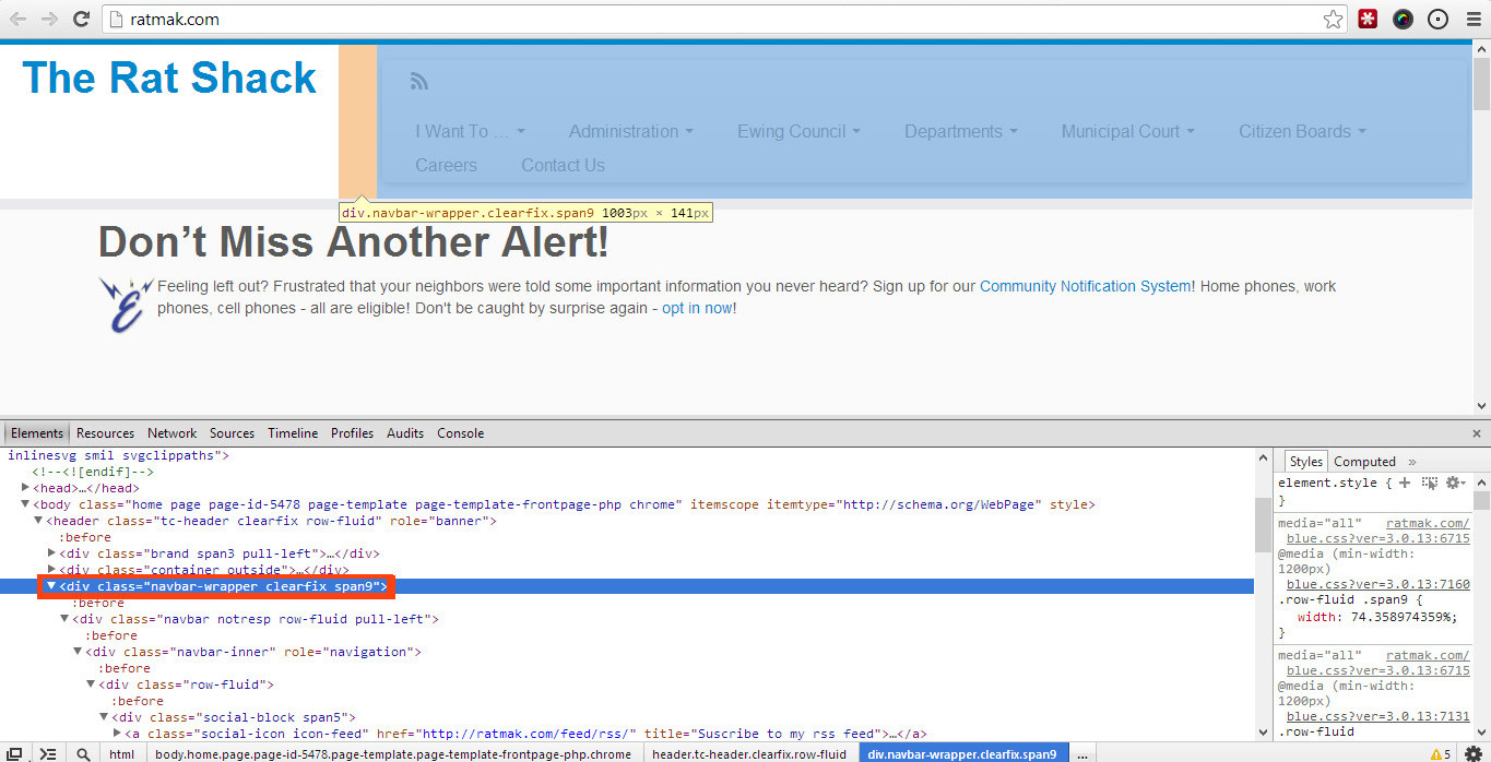
I think this containing element:
<div class="navbar-wrapper clearfix span9">
Is the one that has the most breakpoints applied to it, resize your screen to find them out – the developer toolbar will show them.
Thread Starter
Ratmak
(@ratmak)
Ah, thank you. I’ll check that out in a second! So once I find them, where will I change them? If I recall correctly (which is not always a sure bet :P), the Customizr CSS only contained 1 or 2 media queries. Are they wrapped into LESS files or something, or are they readily accessible? I’ll dive in and double check after I submit this … you know, the reverse of the way I should do it 🙂
Wow – you’ve got a lot of stuff going on there. If you can’t be persuaded to combine some menus (add Departments under Ewing Council and maybe Citizen Boards under Administration – or even put Ewing Council + Departments under Administration), you might get some relief by playing around with this snippet:
/* change menu margins + nowrap */
.navbar .navbar-inner {
  margin: 15px 20px 10px 0px;
  padding-left: 5px;
white-space: nowrap;
  max-width: 97%;
}
That might delay your line wrap a little longer. Alternatively, you can force the 3-bar menu to kick in at a bigger media size but someone more capable than me will have to chime in with that. Here again, the 3-bar menu will be happier/more graceful with fewer parent menus.
Andrew Nevins
(@anevins)
WCLDN 2018 Contributor | Volunteer support
Sorry to clarify you select that element in the HTML section of the toolbar as so: http://snag.gy/ng33R.jpg (outlined in red)
Then look on the right-hand side for the media query: http://snag.gy/cpHY6.jpg (outlined in red)
When you resize the screen it should automatically update the CSS on the right-hand side with the relevant media query, e.g: http://snag.gy/CHNKa.jpg
It’s all based on Twitter Bootstrap 2.
I’ve extracted all the @media’s used in the (color).css so you can see what is used:
@media print {
}
@media (min-width: 768px) and (max-width: 979px) {
}
@media (max-width: 767px) {

@media print {
}
@media (min-width: 1200px) {
}
@media (min-width: 768px) and (max-width: 979px) {
}
@media (max-width: 767px) {
}
@media (min-width: 480px) and (max-width: 767px) {
}
@media (max-width: 480px) {
}
@media (max-width: 979px) {
}
@media (min-width: 980px) {
}

/* Media queries */

@media (max-width: 1200px) {
}
@media (max-width: 979px) {
}
@media (max-width: 767px) {
}
@media (max-width: 480px) {
}
@media (max-width: 320px) {
}
Thread Starter
Ratmak
(@ratmak)
@chappie – No kidding. I wish I could combine some of these things, but the powers that be are pretty tight on what can be listed under what, because it implies control. For example, you’d think the Court would be a Dept., but no. I actually took things out of the nav completely to try to shave it down, hence the Calendar only appearing in those big circular callouts. At any rate, thanks for that snippet! I think I might use it (or some iteration thereof) along with changing the @media queries.
@andrew – AHA! Thanks for that – I see exactly what you mean now. So, just to be sure (I’m obv new at these), I should be able to override those in the Custom CSS field, yes? Or even just directly in the style.css of my child theme? Or is there a better way to accomplish this?
Again, thanks so much, guys!
Thread Starter
Ratmak
(@ratmak)
@dave Bardell – Thanks! Very helpful, especially for us noobs 😛
Andrew Nevins
(@anevins)
WCLDN 2018 Contributor | Volunteer support
o, just to be sure (I’m obv new at these), I should be able to override those in the Custom CSS field, yes? Or even just directly in the style.css of my child theme? Or is there a better way to accomplish this?
I think @rdellconsulting will be better to answer you that, but note that not using any media query in your Child Theme or Custom CSS plugin will/ should override all media queries.
I recommend you test in CustomCSS and when happy, move it to a child theme style.css.
Thread Starter
Ratmak
(@ratmak)
So I’m gonna have to ask you guys another potentially silly question.
I’ve found that we start wrapping to two rows at about 1680px. That’s really quite wide, I know, but I don’t really know as there’s much else I can take out of the nav. I’ve poked around the internet, but I haven’t found an answer: Can I add an additional @media query to Bootstrap’s layout system, or is that not an option? I tried using one of the collapsing queries as a template and changing the max-width value, but it didn’t seem to have any effect at all.
Even just a shove in the right direction for a good, clear source on this would be awesome. Thanks again!
Tom.
You can add @media statements to work at any point you choose. So you could adjust the CSS to change the font-size, for example, when greater than 1680px.
You can have as many @media as you like but
a) don’t overbloat your css
b) remember to use a sensible order so different @media’s don’t conflict with each other.
Try it in CustomCSS to get a quick success/fail.
