Hi akanelittle, thanks for the link.
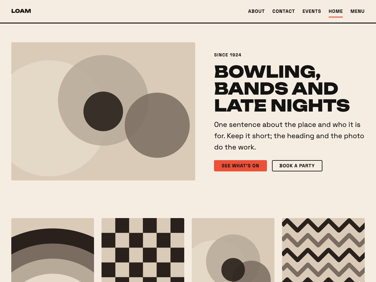
Both problems come from the same block. The image and the text on that page are inside a Row block, and the Row’s “Allow to wrap to multiple lines” setting is switched off. On a phone that forces the picture and the text to stay side by side, and the text column cannot get narrower than your email address, so the text pushes off the screen and the image is squeezed down to nothing.
To fix it:
- Open the page in the editor and click the Row block that holds the image and the text (the List View in the top toolbar makes it easy to find).
- In the Settings sidebar, under Layout, turn on “Allow to wrap to multiple lines”.
The image will now sit above the text on phones and stay beside it on larger screens.
If you want more control over how the two stack, a Media & Text block does the same side-by-side layout and has a “Stack on mobile” option built in.
I also found a small theme issue while looking at this: a long unbreakable word like an email address inside a Row can still stick out past the edge of the screen by a few pixels. The next Loam update lets it wrap properly.
Thank you so much, this all resolves the issue! I really appreciate the help!