So right now I have this problem with my footer that it isn’t responsive as I thought. The Problem shows when you switch to your phone. On Desktop vision it looks how it should. I have done some research but I can’t really find a solution for my problem to get the footer responsive over CSS. For a better look of the Problem this is the CSS code that i aded for the footer so far:
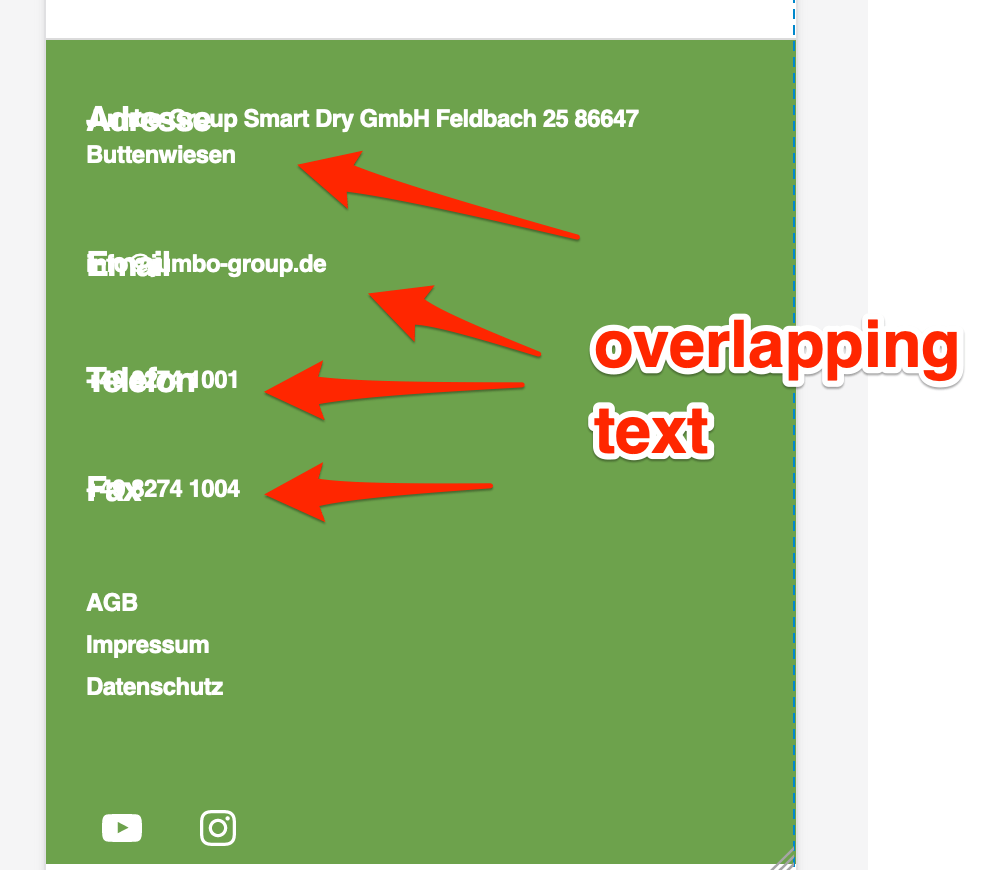
Hey there @kulius – it looks like your custom CSS is causing text in the footer to overlap on top of each other on mobile, so I would start by removing that altogether. 🙂
With your custom CSS:
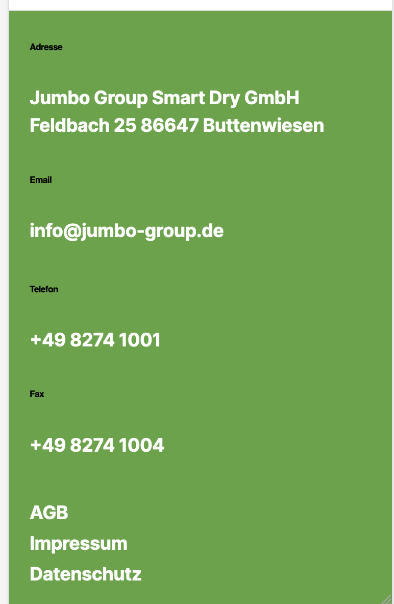
With your custom CSS removed in my browser inspector:
This second piece of CSS is causing other problems, making text way too small throughout your site, on small devices, including the headings in the screenshot above (Email, Telefon, etc.)
Try resetting this to the theme’s defaults, wherever you modified it – perhaps somewhere in your page builder’s settings? This should fix the original size issue with your headings in the footer widget area.
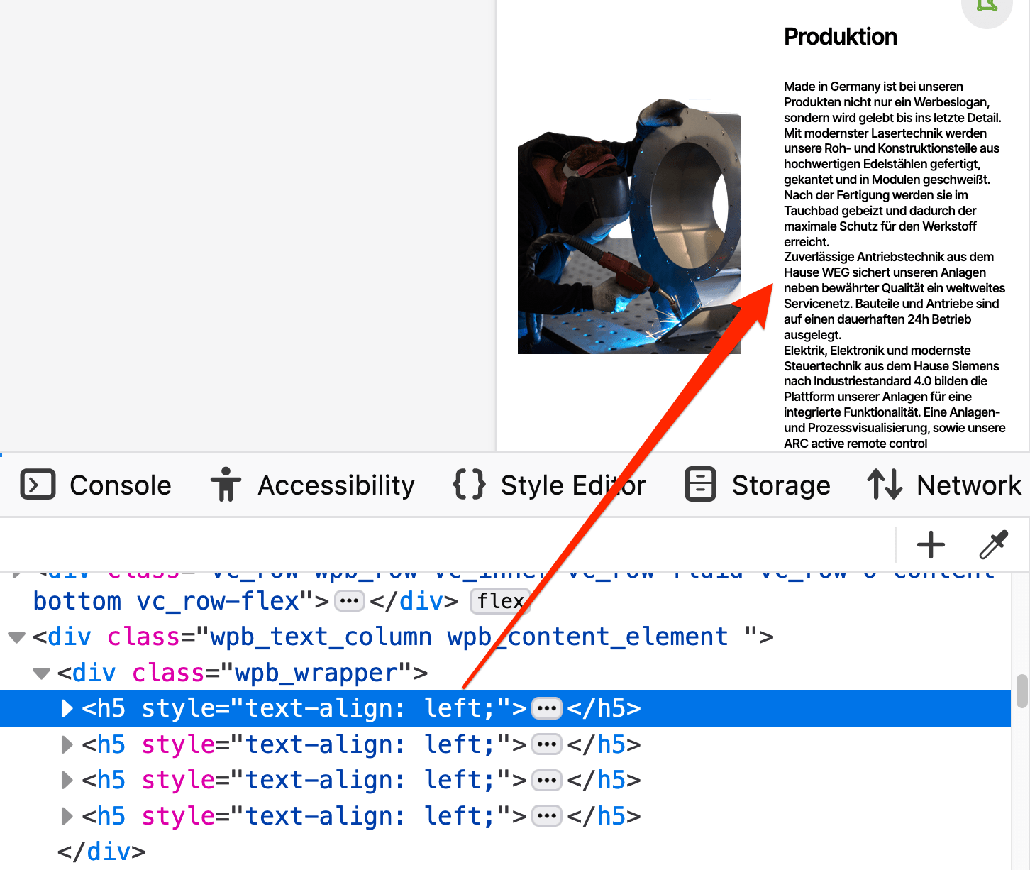
Finally, this wasn’t part of your original question, but just a heads-up that body text shouldn’t be assigned as a heading. This will cause issues for anyone using a screen reader, and is also not good for SEO. (It also, in its current state, makes the text unreadable – way too tiny – on mobile.) Here’s an example of what should be Paragraph blocks, and not h5 Heading blocks:
The problem still is that I would like to ste the menus and text to a costume text font and size etc. over css. I am going to try that.
Thanks for your replay about text in phone view with h5. The problem there is that WP Bäcker won’t support responsive texts so I had to come up with an idea. But it is an easy fix changing the font size there.
Maybee you have an alternative besides h5, but with the same code (clamp)
@kulius Here are a few general tips for writing custom CSS for a “classic theme” like this one. (A classic theme is one that does not use the Site Editor.)
To set a different size on smaller devices you can use a media query with your CSS. Media queries allow you to target different screen widths.
Get more specific (in CSS terms) with your selectors, so you’re not targeting all h2 headings, for example, but only the h2 headings in a specific part of your site, such as the footer.
p.s. the code above is just one example for the headings in the footer widgets, but you can use it as a base for targeting other elements as well. You can combine multiple CSS declarations in one media query, so there’s no need to repeat the media query multiple times.
Interesting to know. I have tried some things with your code and I will use it to improve the website. The Problem on the footer would be that although the Menus are h2 and I would like to change that to a smaller h.
Although I would like to get the footer more compact. I thing there is a lot of margin in it. Would you have a better idea the me setting every margin to 0 via css.
I could although give you a user login to have a easier look on the website, if you want to.
So far so good, thank you very very much for having a look on it an helping me.
It would be great if I could get it in one row but the customizer won’t let me use the full page.
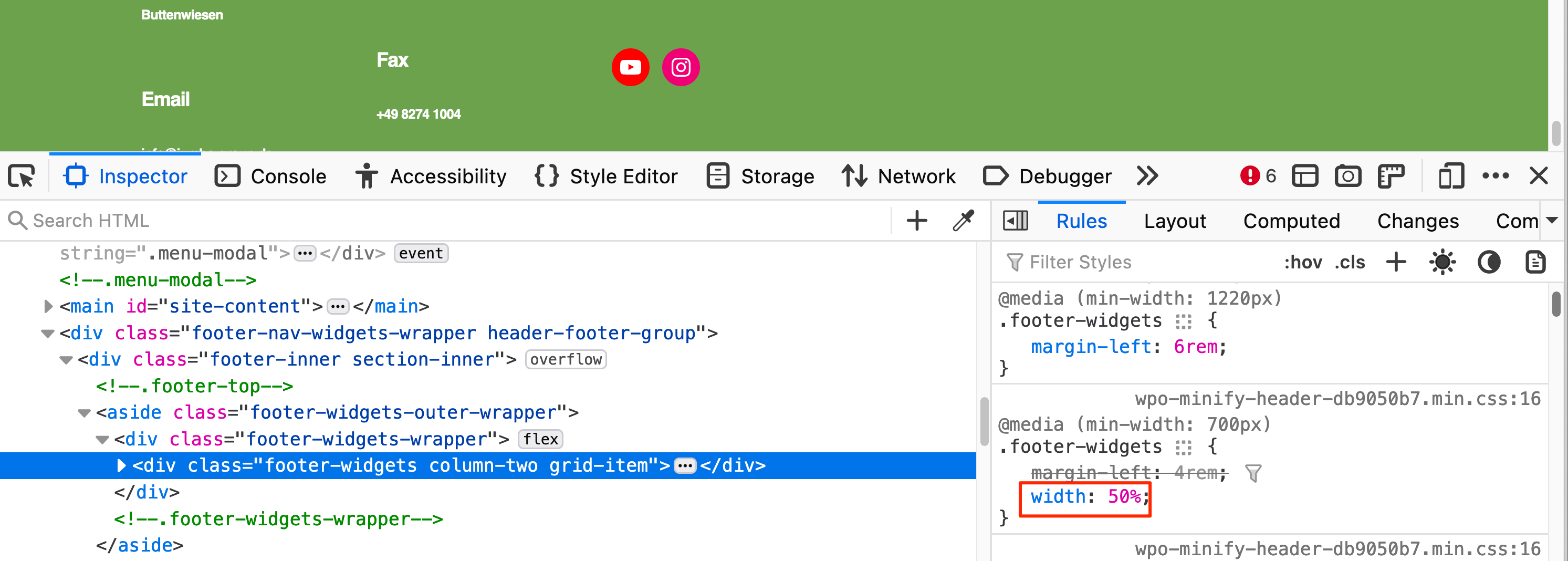
Your footer widget area is currently set up to use only half (50%) of the footer area:
It looks like you’re only using the “Footer #2” widget area, so that’s why it’s only taking up half the page width. Try putting some of your widgets in “Footer #1” to better balance the bottom of the page.
I could although give you a user login to have a easier look on the website, if you want to.
Thanks for the offer, but forum volunteers are not allowed to request back-end site access.
The Problem on the footer would be that although the Menus are h2 and I would like to change that to a smaller h.
Although I would like to get the footer more compact. I thing there is a lot of margin in it. Would you have a better idea the me setting every margin to 0 via css.
Before changing margins, could you please clarify what you mean by “a smaller h”?
Somewhere in your site you’ve either added the following CSS, or perhaps your WP Bakery page builder plugin generated the CSS based on your settings in the plugin:
I’m marking this as resolved since all the outstanding issues with your footer have been sorted. For any new questions, please start a new topic. Cheers!
Viewing 11 replies - 1 through 11 (of 11 total)
The topic ‘Footer Responsive Problem’ is closed to new replies.