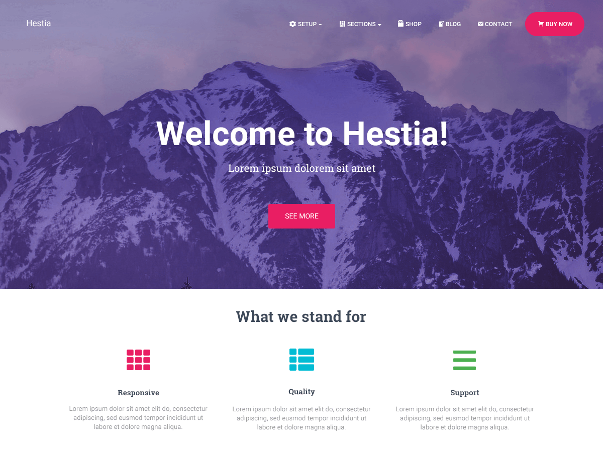
Header
-
Hey, I’m using the Hestia Theme on https://www.notwellbehavedwomen.com/
for a charity anthology I’m helping out with. It looks great except on
mobile.1. First, the header, I added this CSS and it improved the image on
mobile quite a bit, but now the very top of it cuts off. So I figured I’d just get rid of the menu and also the overlay on the header image because it looks better without it. The code works in the previewer, but when I look at the published site the menu is still there and so is the overlay. This is the code I’m using:.home #carousel-hestia-generic {height:700px;}
.home .header-filter {height:700px;}
@media all and (min-width:320px) and (max-width: 768px) {
.home #carousel-hestia-generic {height:300px;}
.home .header-filter {height:300px; }
}
.header-filter::before {background-color: unset !important;
}
.navbar {display:none;}In addition, I have a few other minor issues on mobile only:
2. The Shop section only contains ONE product because this is more or
less a landing page. However, on both desktop and mobile, the product is
not centered. It’s left-aligned.3. On the Shop section on mobile the heading that I title as ‘Pre-Order’
is not centered. (Only on mobile.)4. The Testimonial Heading that I title as ‘Reviews’ is not centered on
mobile either. (Only on mobile.)`The page I need help with: [log in to see the link]


The topic ‘Header’ is closed to new replies.