
Description
Open a few WooCommerce stores on block themes and you’ll see the same add to cart button, the same gallery and the same product cards, whatever they sell. The blocks are good. They all start out looking alike, though.
Purplish is a block design toolkit for WooCommerce. It gives those blocks, and the patterns you build from them, the design options they don’t have on their own. Select a block in the Site Editor, open the Purplish panel, and decide how it looks and moves. You need no page builder and no custom CSS, and nothing of WooCommerce’s gets replaced.
Think of a product page that takes the color of the variation a shopper picks, a gallery that tilts toward the mouse or slides in like a film reel, or a shop page where product cards fan out and hang from a clothes line. That’s the kind of store Purplish is for.
Built to stay out of your way
- Works on WooCommerce’s own blocks: Purplish adds a panel to the Product Gallery, Add to Cart + Options, Product Collection, Accordion and Group blocks. It replaces nothing.
- Each template keeps its own look: your choices are saved on the block in the template, so two templates can look different.
- Off means off: deactivate Purplish and your store looks exactly as WooCommerce draws it.
- Loads only where it’s used: the color script loads on variable products only, and each effect loads only on pages that use it.
- Your photos stay on your server: no outside requests, no tracking and no account to sign up for.
- Quiet admin: no banners, notices or upsells.
Product page colors
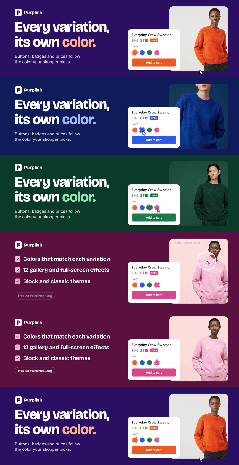
When a shopper picks another color on a WooCommerce product page, the photo changes and nothing else does. The button, the sale badge and the price look the same for the orange sweater and the navy one.
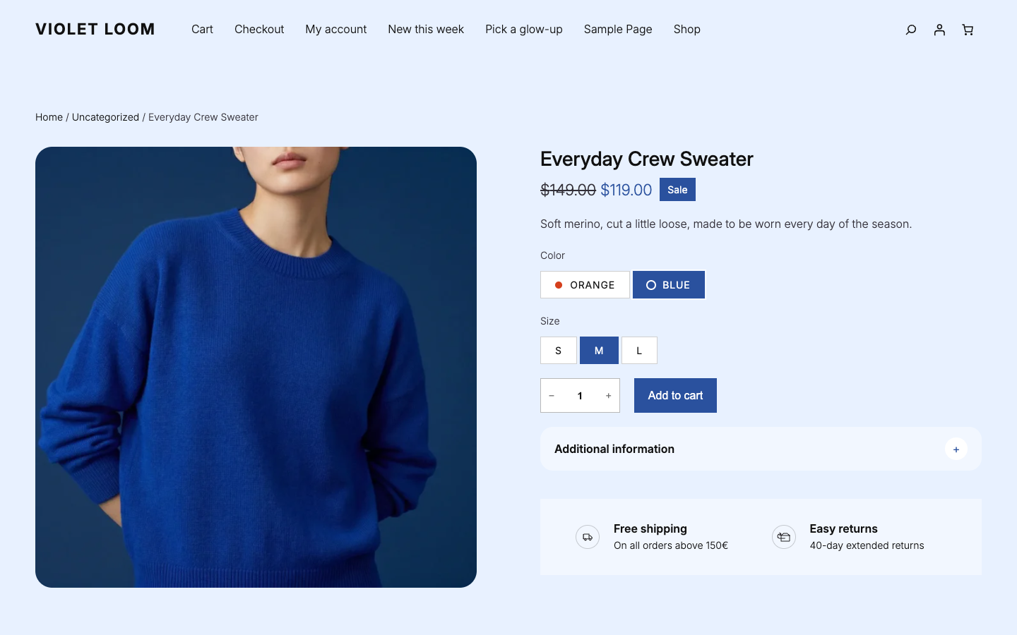
With Purplish, the page follows the color. Pick blue, and the add to cart button, the selected option and the sale badge turn blue. Pick orange, and they turn orange. Each variation has a Page color setting:
- Automatic: the default. Purplish finds the product in the photo, not the wall behind it, and takes its color. If the color attribute has a swatch color, that comes first.
- Custom: pick a color or type a hex code. Purplish uses it exactly as you set it.
- Off: the variation keeps your theme’s colors.
A color taken straight from a photo is often too dark or too pale for a button. Purplish keeps the hue and adjusts it for each use: a button color with readable black or white text, a deeper shade for the sale price and a pale tint for the background. Simple products get one color for the whole page.
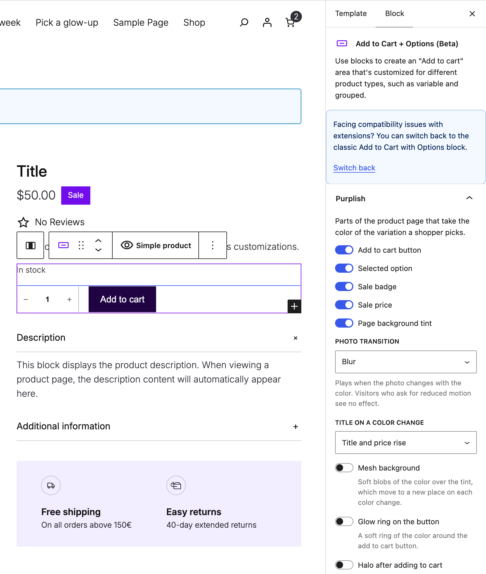
You pick what takes the color: the add to cart button, the selected option and the sale badge (all three on by default), the sale price and a soft background tint. The page opens in the default variation’s color, so there’s no flash of your theme’s colors first.
When the color changes, the photo changes with a transition: Blur (the default), Fade, Zoom, Slide, Flip, Wipe, Circle reveal, Color wash or None.
Product gallery
Select the Product Gallery block and choose how the photos behave:
- Hover style: 3D tilt leans the photo toward the mouse, Zoom magnifies the spot under it, and Loupe shows a round magnifier. Lift, Parallax, Glare and Slow zoom add softer motion. Any hover style replaces WooCommerce’s own hover zoom, and touch screens skip it.
- Full-screen style: the view that opens when a shopper clicks the photo. Snap stack is tinted to the page color, Zoom from photo grows out of the photo, Filmstrip adds small photos along the bottom, Cinema uses a dark screen, and Classic fade keeps it plain. It needs the gallery’s “Open pop-up when clicked” setting.
- Slide style: how the next photo comes in. 3D media gallery turns like a cube, Circular slider swings like a wheel, Reel slider runs like film, and Image tunnel comes out of the distance.
- Layout: hide the thumbnail strip, round the photo’s corners, and add frosted arrows that show on hover.
Product cards
On shop and collection pages, select the Product Collection block:
- Add to cart on the photo: a small frosted button sits on the photo, and the title and price share one line. It shows on hover, and always on touch screens.
- Button motion: a bag icon slides in on hover, and the button fills and pops after adding to cart.
- Effect color: one color for the button fill and the card effects. On a product page with a variation color, the variation color wins.
- Card effect: one of 14 effects for the whole collection.
Effects on hover:
- Spotlight: the card under the mouse grows while the rest blur and fade back.
- Color reveal: the photos sit in a color wash until the mouse brings one to full color.
- Fan deck: the cards rest slightly tilted. The one under the mouse straightens and its neighbors lean away.
- Expanded cards: each photo shows as a narrow band and opens to full size under the mouse.
- Magnetic panel: a soft panel in the effect color slides under the card.
- Card folder: each card sits in a soft folder with a tab, and the photo lifts out.
Effects in a carousel (a grid stays as it is):
- Deck: the cards at the edges turn away, and the one under the mouse faces you.
- Arc: the cards sit on a curve, highest in the middle.
- Spotlight carousel: the middle card is full size and the rest fade back.
- Grow: cards grow as they reach the middle.
- Tilt: cards lean as they travel across.
Effects as cards scroll into view:
- Clothes line: each card hangs from a peg and swings as it comes in, or when the mouse touches it.
- Parallax: the photo moves slower than its card.
- Zoom reveal: each card grows in as it appears.
Small details
On the Add to Cart + Options block:
- Title and price rise: after the photo changes, the title and price rise into place. Or pick Title comes into focus, and the title sharpens into view.
- Glow ring: a soft ring in the page color around the add to cart button.
- Halo: a ring leaves the button and fades each time a product goes into the cart.
- Mesh background: soft blobs of the color sit over the background tint and move each time the color changes.
- Color dots: each color option shows a dot in its own color, like Orange or Blue. Sizes, and options that come in several colors, get no dot.
On other blocks:
- Accordion, Soft style: each item becomes a soft card, and the plus turns into an x that fills with the page color when the item is open.
- Group, Take the page color: on product pages, the section’s background becomes a soft version of the color the shopper picks.
Nothing moves on its own. Every effect plays on a hover, a scroll, a color change or an add to cart, then stops. Visitors who turn on reduced motion on their device get the colors without the animation.
Block and classic themes
Purplish is built for block themes and tested with the free Purple theme. On a block theme, every option sits in a Purplish panel on the block it changes, in the Site Editor.
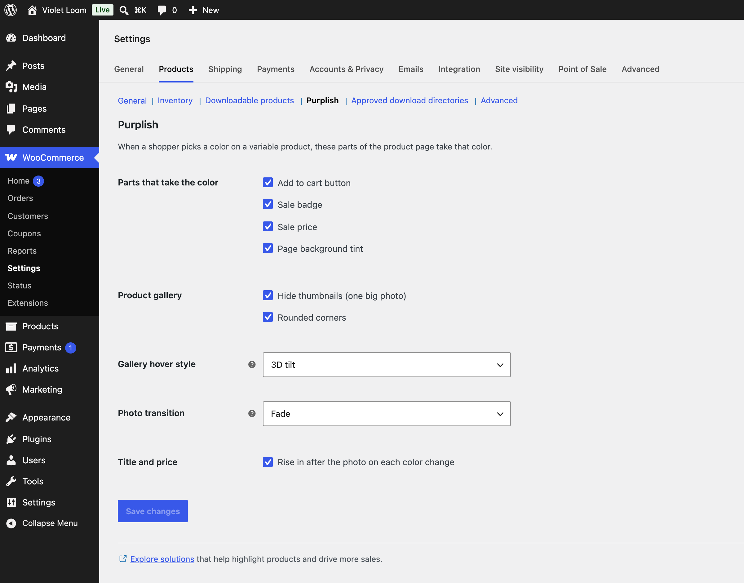
Classic themes get a smaller set under WooCommerce > Settings > Products > Purplish: the page colors (except the selected option, since classic themes show a dropdown), the photo transition, the title and price rise, and three gallery options: hide thumbnails, rounded corners and the hover style.
Why I made it
Purplish started with one small idea from a chat on X: let the product page take the color of the variation a shopper picks. Building it showed me how much more WooCommerce’s blocks can do with a few good options, so I kept going. The Purplish website runs on WooCommerce, the Purple theme and Purplish itself.
Shameem Reza
Source code
The code is on GitHub. The readable source of the scripts ships in assets/src, next to the built files in build. To build them, run npm ci and npm run build.
Privacy
Purplish doesn’t collect, store or send personal data. It sets no cookies and makes no outside requests.
Credits
Thanks to Luigi Teschio for the idea, from a discussion on X: set each variation’s color by hand, or read it from the photo.
Screenshots


Installation
- Make sure WooCommerce 11.0 or later is active.
- Go to Plugins > Add New, search for Purplish, then install and activate it. Purplish reads the colors of your variation photos in the background.
- To change a variation’s color, edit the product, open Variations and use the Page color field. For a simple product, it’s on the General tab.
- On a block theme, open the Single Product template in the Site Editor, select the Add to Cart + Options, Product Gallery, Product Collection, Accordion or Group block, and open the Purplish panel. On a classic theme, go to WooCommerce > Settings > Products > Purplish.
FAQ
-
Install Purplish. Each variation takes its color from its photo by default, and the add to cart button follows the variation the shopper picks. To set a color yourself, edit the variation and set Page color to Custom.
-
Does Purplish work with my theme?
-
Yes. Block themes get every option through WooCommerce’s product blocks. Classic themes get the page colors, the photo transition, the title and price rise, and three gallery options.
-
Does it work with simple products?
-
Yes. A simple product gets one Page color for its whole page, read from its photo or set by hand.
-
Do I need color swatches?
-
No. Purplish works with WooCommerce’s plain dropdowns and option buttons. If you set swatch colors on the color attribute, Purplish uses those first. To show a dot of each color on the option buttons, turn on Color dots.
-
How do I add a hover effect to the WooCommerce product gallery?
-
On a block theme, open the Single Product template in the Site Editor, select the Product Gallery block, and pick a Hover style in the Purplish panel. The full-screen and slide styles are in the same panel. On a classic theme, pick the hover style under WooCommerce > Settings > Products > Purplish.
-
Can I change how product cards look on the shop page?
-
Yes, on block themes. Select the Product Collection block on your shop or collection template and open the Purplish panel. You can put add to cart on the photo, add button motion and pick one of 14 card effects.
-
A color Purplish found looks wrong. What do I do?
-
Set the variation’s Page color to Custom and pick the color. A busy photo, like a model in a furnished room, can point Purplish at the wrong area.
-
An option gets a dot only when every variation with it has the same color. A size, or an option that comes in several colors, has no single color to show. On the picked option, the dot turns the button’s text color so it stays visible.
-
Can I turn it off for one variation or product?
-
Yes. Set its Page color to Off, and it keeps your theme’s colors.
-
What about visitors who turn off motion?
-
Visitors who turn on reduced motion on their device get the colors without any animation.
-
Will Purplish slow down my store?
-
No. Photos are read in the background and the color is saved with the product. The product page loads a small stylesheet. The color script loads only on variable products, and each effect loads only on pages that use it.
-
Do my product photos leave my site?
-
No. Purplish reads the photos on your own server, with the image tools PHP already has, and never sends them anywhere.
-
Does it change WooCommerce’s blocks or templates?
-
No. Purplish adds a panel to WooCommerce’s own blocks and styles the parts you choose. Deactivate it, and your store looks exactly as it did before.
-
Where do I report a security issue?
-
Please report it privately through the security policy on GitHub, not in the support forum.
Reviews
There are no reviews for this plugin.
Contributors & Developers
“Purplish – Block Design Toolkit for WooCommerce” is open source software. The following people have contributed to this plugin.
Contributors
Translate “Purplish – Block Design Toolkit for WooCommerce” into your language.
Interested in development?
Browse the code, check out the SVN repository, or subscribe to the development log by RSS.
Changelog
1.0.0
- New: Page color field on each variation and simple product: Automatic, Custom or Off.
- New: Colors read from product photos in the background, adjusted into a button color, a sale price color and a page tint. Swatch colors come first.
- New: The product page follows the color a shopper picks, on block and classic themes.
- New: Parts that take the color: add to cart button, selected option, sale badge, sale price and page background tint.
- New: Photo transition: Blur, Fade, Zoom, Slide, Flip, Wipe, Circle reveal, Color wash or None.
- New: Purplish panel on WooCommerce’s blocks in the Site Editor, and a settings section for classic themes.
- New: Gallery options: hide thumbnails, rounded corners and frosted arrows on hover.
- New: Gallery hover styles: 3D tilt, Zoom, Lift, Parallax, Glare, Loupe and Slow zoom.
- New: Gallery full-screen styles: Snap stack, Classic fade, Zoom from photo, Filmstrip and Cinema.
- New: Gallery slide styles: 3D media gallery, Circular slider, Reel slider and Image tunnel.
- New: Product card options: button on the photo, button motion, an effect color and fourteen card effects.
- New: Title and price rise, title focus, glow ring, halo after adding to cart, mesh background and color dots on options.
- New: Soft style for the Accordion block, and Take the page color for Group blocks.