
Description
Groundworx Carousel is a flexible Gutenberg block that transforms any WordPress content into beautiful, responsive carousels. Built on the lightweight Embla Carousel engine and the WordPress Interactivity API, it offers advanced responsive controls, multiple design templates, and extensive customization options—all within WordPress’s native block editor.
Perfect For
- Image galleries and photo carousels
- Testimonial and review sliders
- Product showcases and e-commerce displays
- Hero sections and featured content
- Client logo carousels
- Team member presentations
- Portfolio galleries
- Content marketing sliders
- Blog post carousels
- Before/after comparisons
Key Features
🎨 Nine Professional Templates
Choose from carefully designed templates to match your content style:
* Default & Default Alt – Classic carousel layouts with external navigation
* Simple, Simple Left, Simple Right – Clean minimalist designs with flexible content positioning
* Overlay & Overlay Alt – Modern content overlaid on images with gradient backgrounds
* Partial Overlay & Partial Overlay Alt – Balanced layouts with partial content overlays
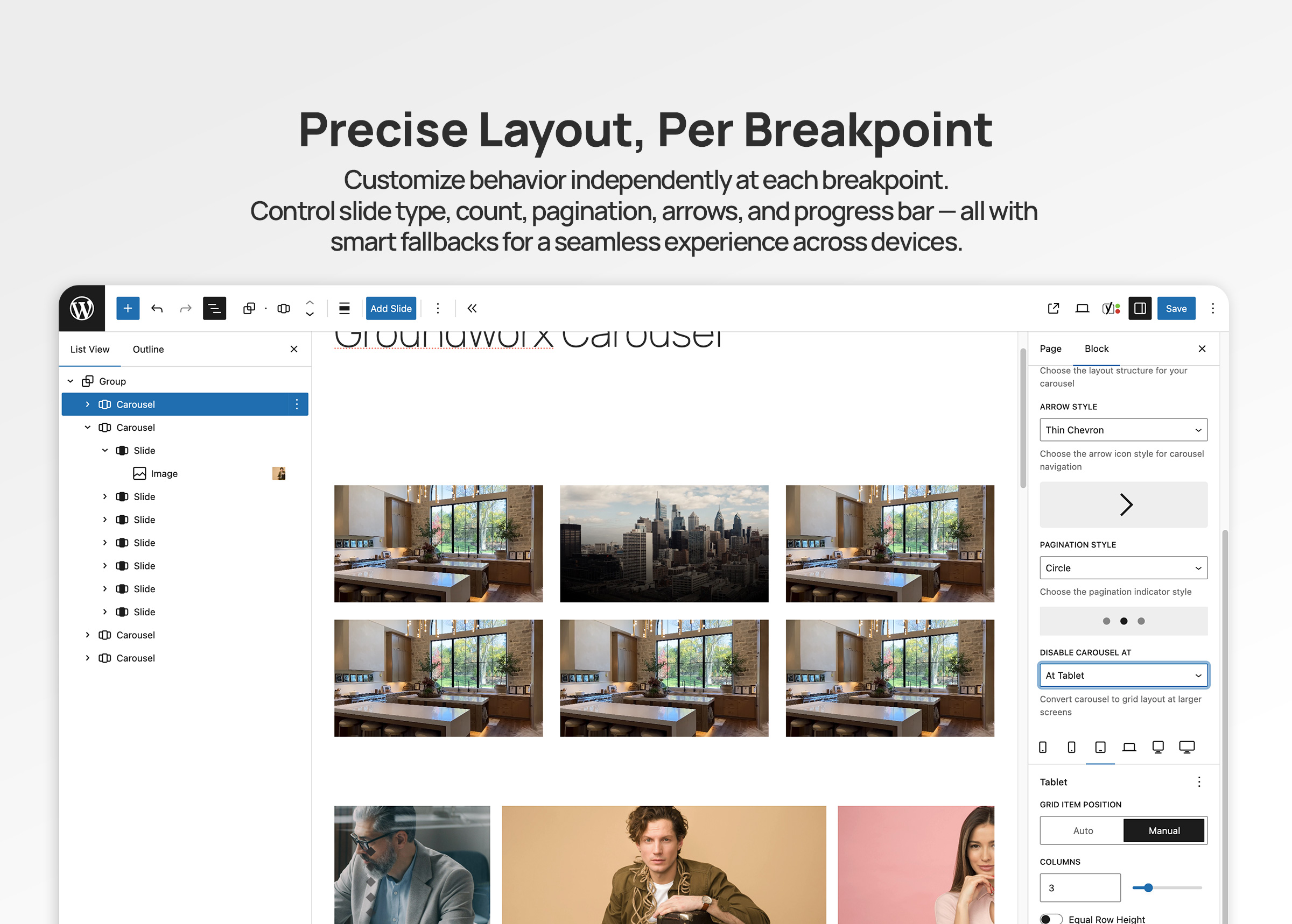
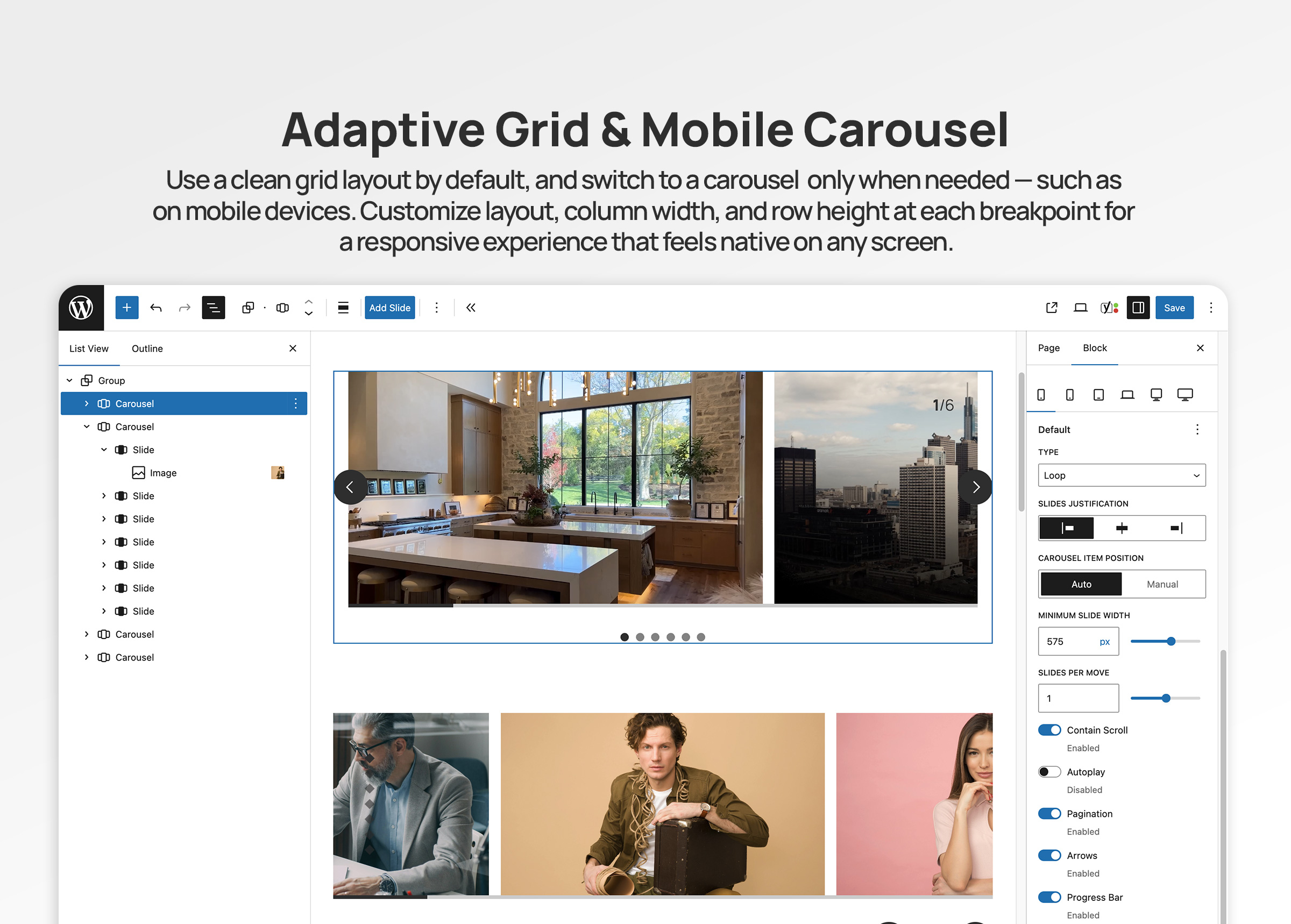
📱 Advanced Responsive Controls
* Configure carousel behavior per breakpoint (mobile, large-phone, tablet, laptop, desktop, large-desktop)
* Responsive grid fallback – destroy carousel at specific breakpoints to display slides as a grid
* Mobile-first breakpoint system with inheritance
* Full touch and swipe gesture support for mobile devices
* 6 total breakpoint levels for precise responsive control
🎯 Carousel Types & Transitions
* Slide mode – Classic horizontal sliding carousel
* Loop mode – Infinite continuous scrolling with clones
* Drag and swipe gesture support with momentum
⚙️ Flexible Display Options
* Multiple slides per page with responsive settings
* Variable slide width (auto) or fixed width options
* Start, center, or end alignment
* Customizable gap spacing between slides
* Autoplay
🎚️ Navigation & UI Controls
* 11 Arrow Styles: arrow, chevron, chevronRounded, halfArrow, play, playRounded, sharpChevron, thinChevron, thinChevronRounded, triangle, triangleRounded
* 9 Pagination Styles: circle, circleOutline, square, squareOutline, diamond, diamondOutline, rectangle, rectangleOutline, number
* Progress bar indicator
* Slide counter display (e.g., “3 / 10”)
* Hide/show controls per breakpoint
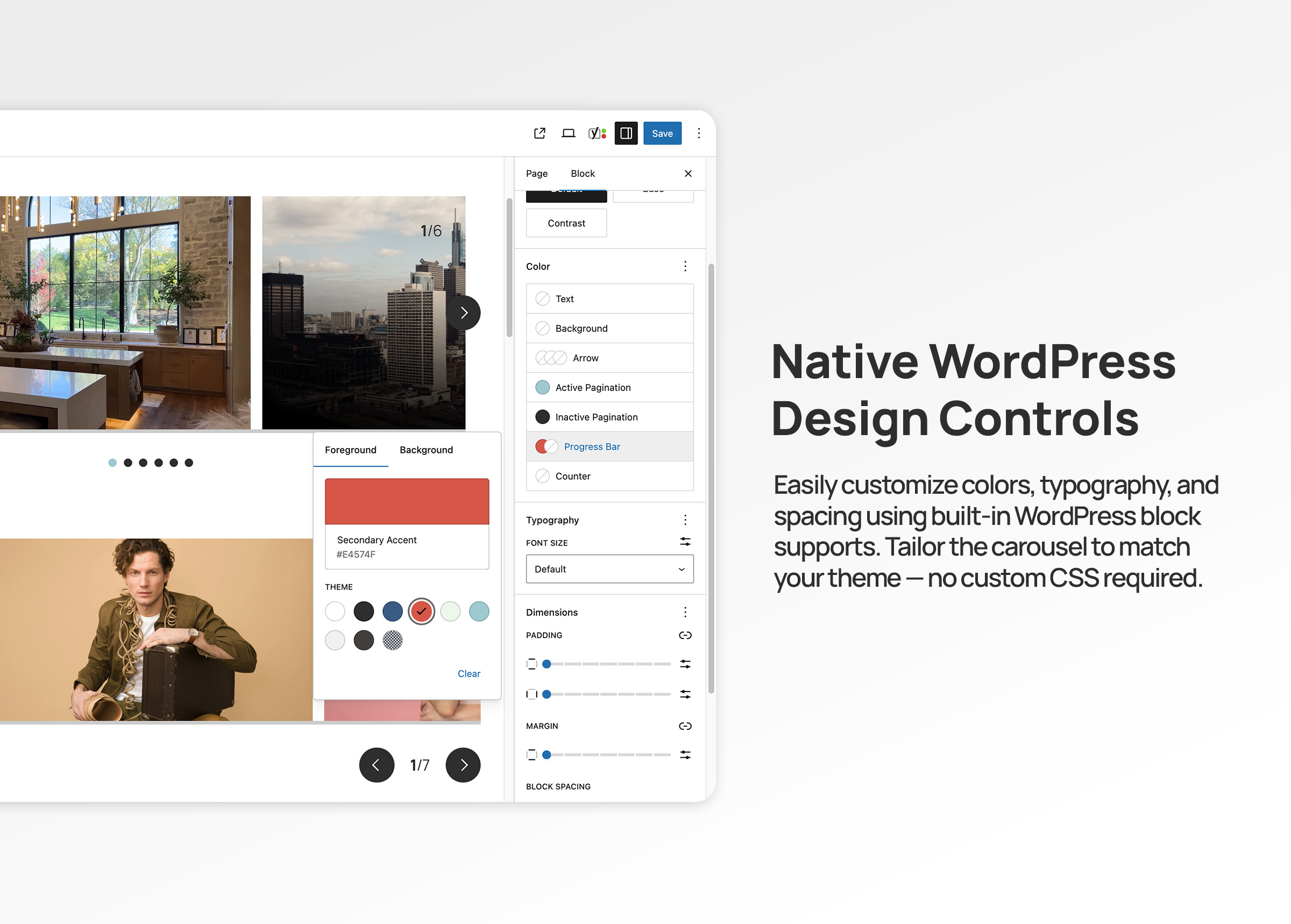
* Color customization for all UI elements
🎨 Advanced Color Controls
Customize every UI element with full WordPress color palette support:
* Arrows: text, background, border colors
* Active Pagination: text, background, border colors
* Inactive Pagination: text, background, border colors
* Progress Bar: foreground and background colors
* Counter: text color
* Uses WordPress preset color classes and custom inline styles (no CSS custom properties)
♿ Accessibility First
* ARIA labels and semantic HTML structure
* Keyboard navigation support (arrow keys, Enter, Space)
* Screen reader friendly with live regions
* WCAG compliant markup
* Focus management and visible focus states
🔧 Developer Features
* WordPress Interactivity API for reactive frontend behavior
* Block variations support via wp.blocks.registerBlockVariation()
* Carousel options via carouselOptions attribute (legacy splideOptions auto-migrated)
* Extensible template system with WordPress hooks
* Breakpoint configuration via JSON file
* React hooks for responsive state management
* Standard WordPress color classes for theme integration
* Well-documented, modular code structure
Works With Any Block
The Carousel block is a container that accepts any WordPress block as slides:
* Core Image block
* Core Paragraph block
* Core Heading block
* Core Group block
* Core Cover block
* Core Buttons block
* Custom blocks from other plugins
* Your own custom blocks
Each slide is fully customizable using WordPress’s native block editing tools.
Built on Embla Carousel
Powered by Embla Carousel 8.x – a lightweight, extensible, and performant carousel library. No jQuery required. Optimized for modern browsers with the WordPress Interactivity API for reactive state management.
Part of Groundworx Core
This carousel block is part of the Groundworx Block Suite—a modular collection of high-performance, design-focused blocks built for modern WordPress development. Uses Groundworx Foundation components for consistent, professional UI controls.
Need More? Check Out Groundworx Showcase
Groundworx Carousel is a self-contained carousel block — you add slides manually, and navigation (arrows, pagination, etc.) is built into the block itself. It’s a great fit for static content like testimonials, feature highlights, or image galleries where you control every slide.
Groundworx Showcase takes a fundamentally different approach: a modular block system where every piece — the carousel, the slides, and each navigation control — is its own independent block. 12 blocks, 4 flow types, and full query support.
Query & Content:
- Query-driven carousels — Pull slides automatically from posts, pages, custom post types, or WooCommerce products. Filter by taxonomies, date, authors, keyword, and post formats. Set max items and sort order. Or switch to Curated mode to hand-pick specific posts.
- Block pattern support — Design your slide layout with blocks (title, excerpt, image, buttons — whatever you want), and every queried post fills that pattern. Works just like WordPress’s Query Loop block — pick a pattern, change it later, every slide updates.
- 4 Flow types — Dynamic Flow (query carousel), Static Flow (manual carousel), Dynamic Content (query grid/flex), and Flow Template (reusable slide pattern). Dynamic Content outputs the same query to grid or flex layouts instead of a carousel.
Modular Controls:
- Independent navigation blocks — Arrows, pagination, progress bar, and counter are separate blocks inside the carousel. Wrap them in groups, columns, or any container block to build your own layout — they’re not locked to fixed positions.
- More control over every component — Each piece is its own block with its own settings, spacing, and layout options.
Carousel Options:
- More modes — Fade transitions, vertical slides, auto-scroll (continuous scrolling), and RTL text direction — in addition to slide and loop.
- Fine-grained timing — Customizable slide animation duration, autoplay with configurable interval, auto-scroll with configurable speed, and pause-on-hover for both autoplay and auto-scroll.
- Video support — Videos automatically pause when their slide is not active.
- Per-breakpoint layout switching — Switch between carousel, grid, and flex at every breakpoint independently. For example: carousel on mobile, grid on tablet, carousel again on desktop. Carousel only supports a one-way break to grid — once destroyed, it stays grid at all larger breakpoints.
Carousel vs. Showcase at a glance:
- Carousel: One block, manual slides, built-in navigation, slide/loop modes, one-way grid fallback — simple and self-contained
- Showcase: 12 modular blocks, query-driven or curated, slide/loop/fade/auto-scroll modes, vertical slides, RTL, per-breakpoint carousel/grid/flex switching — flexible and composable
Showcase is ideal when you need:
- Carousels that populate automatically from your content
- Block patterns applied to query-driven slides — like the Query Loop block, but for carousels
- Full control over navigation layout — wrap controls in any block container
- The same query powering both carousel and grid views
Learn more about Groundworx Showcase
Developer Notes
Registering Custom Block Variations
You can register custom carousel variations using wp.blocks.registerBlockVariation() and pass carousel configuration options via the carouselOptions attribute.
Example: Carousel with Grid Fallback at Tablet
wp.blocks.registerBlockVariation('groundworx/carousel', {
  name: 'carousel-to-tablet',
  title: 'Carousel / Grid Tablet',
  attributes: {
    template: 'default',
    carouselOptions: {
      type: 'loop',
      perPage: 1,
      arrows: true,
      pagination: true,
      containScroll: 'trimSnaps',
      breakpoints: {
        tablet: {
          destroy: true
        }
      }
    },
    breakpoints: {
      tablet: {
        layout: {
          type: 'grid',
          columnCount: 3
        }
      }
    }
  },
  scope: ['block', 'inserter', 'transform']
});
Example: Auto-Width Carousel
wp.blocks.registerBlockVariation('groundworx/carousel', {
  name: 'auto-width-carousel',
  title: 'Auto Width Carousel',
  attributes: {
    carouselOptions: {
      type: 'loop',
      fixedWidth: '300px',
      align: 'center',
      gap: '1rem'
    }
  }
});
Adding Custom Templates
Use the groundworx.carousel.templates filter to add custom templates:
wp.hooks.addFilter(
  'groundworx.carousel.templates',
  'my-theme/add-custom-template',
  (templates) => [
    ...templates,
    {
      label: 'My Custom Template',
      value: 'my-custom'
    }
  ]
);
Then add your template styles in your theme:
.wp-block-groundworx-carousel.template-my-custom .gwx-carousel__slide {
  /* Your custom styles */
}
Supported Breakpoints
The carousel supports 5 configurable responsive breakpoints plus a mobile/default base, following a mobile-first approach:
- Mobile/Default: 0-479px (base configuration)
- large-phone: 480px and up
- tablet: 680px and up
- laptop: 1080px and up
- desktop: 1280px and up
- large-desktop: 1440px and up
Settings cascade from mobile to larger screens. Override at any breakpoint to change behavior.
Grid Fallback Breakpoints:
For grid fallback functionality, you can use any of the 5 breakpoints: large-phone, tablet, laptop, desktop, or large-desktop.
Carousel Options
Carousel options are configured via the carouselOptions attribute. Common options:
type: ‘slide’ or ‘loop’perPage: Number of slides per pageslidesToScroll: Number of slides to scroll per action (default: 1)fixedWidth: Fixed width for each slide (e.g., ‘300px’)gap: Space between slidesalign: Slide alignment — ‘start’, ‘center’, or ‘end’containScroll: Trim empty scroll snaps — ‘trimSnaps’ or falseautoplay: Enable/disable autoplayarrows: Show/hide arrowspagination: Show/hide paginationprogressBar: Show/hide progress barcounter: Show/hide slide counterdestroy: Disable carousel and display as grid
Breakpoint-specific overrides are supported via the breakpoints attribute. Legacy splideOptions are automatically converted on render.
Color System
All UI element colors use the standard WordPress color pattern:
- Preset colors apply WordPress utility classes (
has-text-color,has-{slug}-color,has-background,has-border-color) - Custom colors apply inline styles
Pagination dot colors toggle dynamically between active and inactive states using the WordPress Interactivity API (data-wp-class for presets, data-wp-style for custom colors).
Elements with color support:
- Arrows: text, background, border
- Pagination (active): text, background (number style), border (number style)
- Pagination (inactive): text, background (number style), border (number style)
- Progress bar: track background, bar foreground
- Counter: text
Template Classes
Each template adds a class to the carousel wrapper:
.template-default.template-default-alt.template-simple.template-simple-left.template-simple-right.template-overlay.template-overlay-alt.template-partial-overlay.template-partial-overlay-alt
Use these for template-specific styling.
Privacy
This plugin does not collect, store, or transmit any user data. It operates entirely within your WordPress installation and does not make external API calls except for loading assets from your own server.
Credits
- Built with Embla Carousel by David Jerleke – A lightweight, extensible carousel library
- Developed by Groundworx Agency LLC
- Created and maintained by Johanne Courtright
- Part of the Groundworx Core framework
- Website: https://groundworx.dev
- Support: https://ko-fi.com/groundworx
Additional Resources
Screenshots
Blocks
This plugin provides 1 block.
- Carousel Display content in a carousel, with blocks added to each slide.
Installation
Automatic Installation
- Log in to your WordPress admin dashboard
- Navigate to Plugins > Add New
- Search for “Groundworx Carousel”
- Click Install Now and then Activate
Manual Installation
- Download the plugin ZIP file
- Log in to your WordPress admin dashboard
- Navigate to Plugins > Add New > Upload Plugin
- Choose the downloaded ZIP file and click Install Now
- Activate the plugin through the Plugins menu
Getting Started
- Create or edit a post or page
- Click the “+” icon to add a new block
- Search for “Carousel” or find it under the “Design” category
- Add the Carousel block to your content
- Click “Add Slide” to insert slides
- Add any blocks inside each slide (images, text, buttons, etc.)
- Customize carousel settings in the sidebar panel
- Configure responsive behavior for each breakpoint
- Choose arrow and pagination styles
- Customize colors for UI elements
- Preview and publish
FAQ
-
Can I use any WordPress block inside the carousel?
-
Yes! The Carousel block supports all Gutenberg inner blocks. Add images, text, buttons, groups, covers, or any custom blocks as slides. Each Slide block is a flex container that accepts any inner content.
-
Does it work on mobile devices?
-
Absolutely. The carousel includes full touch and swipe support for mobile and tablet devices powered by Embla Carousel. You can also configure different behaviors per breakpoint or disable the carousel entirely on larger screens.
-
Can I turn off the carousel at certain screen sizes?
-
Yes! Use the responsive grid fallback feature. In the block settings, configure each breakpoint (tablet, laptop, desktop) to display as a grid instead of a carousel. This is perfect for responsive design strategies where you want a carousel on mobile but a grid layout on desktop.
-
How do I customize the carousel behavior?
-
Use the block settings panel (sidebar) to configure:
* Carousel type (slide or loop)
* Number of slides to show per page at each breakpoint
* Slide width (manual count or auto width)
* Autoplay toggle
* Navigation arrows and pagination visibility
* Arrow style (11 options)
* Pagination style (9 options)
* Progress bar and counter toggles
* Colors for all UI elements
* Responsive behaviors per breakpoint -
What templates are available?
-
The plugin includes 9 professionally designed templates:
* Default – Classic layout with standard navigation
* Default Alt – Alternative classic layout
* Simple – Minimalist design, center-aligned content
* Simple Left – Minimalist with left-aligned content
* Simple Right – Minimalist with right-aligned content
* Overlay – Content overlaid on images with gradient
* Overlay Alt – Alternative overlay design
* Partial Overlay – Split layout with partial overlay
* Partial Overlay Alt – Alternative partial overlayDevelopers can add custom templates using the
groundworx.carousel.templatesfilter hook. -
How do arrow and pagination styles work?
-
Choose from professionally designed options:
Arrow Styles (11 options):
arrow, chevron, chevronRounded, halfArrow, play, playRounded, sharpChevron, thinChevron, thinChevronRounded, triangle, triangleRoundedPagination Styles (9 options):
circle, circleOutline, square, squareOutline, diamond, diamondOutline, rectangle, rectangleOutline, numberEach style can be customized with your theme colors.
-
What are the breakpoint values?
-
The carousel uses 5 responsive breakpoints plus a mobile/default base with a mobile-first approach:
* Mobile/Default: 0-479px (base styles)
* Large Phone: 480px and up
* Tablet: 680px and up
* Laptop: 1080px and up
* Desktop: 1280px and up
* Large Desktop: 1440px and upSettings cascade from mobile to larger screens. Configure each breakpoint independently or let settings inherit from smaller breakpoints.
-
Can I create custom carousel variations?
-
Yes! Developers can register custom block variations using
wp.blocks.registerBlockVariation()and pass carousel configuration options via thecarouselOptionsattribute. See the Developer Notes section for examples. -
Is the carousel accessible?
-
Yes. The carousel follows accessibility best practices:
* Proper ARIA labels and roles (aria-label,aria-live,role="presentation")
* Keyboard navigation support (arrow keys, Enter, Space, Tab)
* Focus management with visible focus indicators
* Screen reader compatibility with live regions
* Semantic HTML structure
* WCAG 2.1 AA compliant -
Does it affect site performance?
-
The plugin is optimized for performance:
* Lightweight Embla Carousel engine with minimal footprint
* WordPress Interactivity API for efficient reactive updates
* Conditional asset loading (only loads on pages with carousels)
* Support for lazy loading images
* No jQuery dependency
* Modern ES module architecture -
Can I use it with page builders?
-
Yes! The Groundworx Carousel Block works with any theme or page builder that supports WordPress’s native block editor (Gutenberg), including:
* Full Site Editing (FSE) themes
* Block themes
* Classic WordPress themes
* Kadence, GeneratePress, Astra, Blocksy, and other popular themes
* Any page builder with Gutenberg support -
How do I disable the carousel on desktop but keep it on mobile?
-
In the block settings:
1. Go to the Tablet, Laptop, or Desktop breakpoint tab
2. Set the layout type to Grid
3. Configure grid columns (manual count or auto width)
4. Optionally enable Same Height for uniform grid itemsThe carousel will display normally on mobile but switch to a grid layout at your chosen breakpoint.
-
Can I style the carousel with custom CSS?
-
Yes! The carousel uses standard WordPress color classes for all UI elements. Preset theme colors apply utility classes (e.g.,
has-text-color,has-{slug}-color,has-background,has-border-color), and custom colors use inline styles. This integrates seamlessly with WordPress themes.You can also target template-specific classes like
.template-overlayor.template-simple-left. -
How do I update from a previous version?
-
Version 3.0 maintains full backward compatibility with existing carousels. The
splideOptionsattribute is automatically migrated tocarouselOptionswhen blocks are opened in the editor. Unedited blocks continue to render correctly via PHP fallback. After updating:
1. Your existing carousels will continue to work without changes
2. Opening a carousel in the editor will auto-migrate its settings to the new format
3. Review carousel settings to take advantage of new features
4. Test on all devices to ensure optimal displayWe recommend creating a backup before major updates.
-
Where can I get support?
-
For support, feature requests, or bug reports:
* Visit: https://groundworx.dev
* GitHub: https://github.com/groundworx-dev/groundworx-carousel
* WordPress.org Support Forums: https://wordpress.org/support/plugin/groundworx-carousel/
Reviews
Contributors & Developers
“Groundworx Carousel” is open source software. The following people have contributed to this plugin.
Contributors
Translate “Groundworx Carousel” into your language.
Interested in development?
Browse the code, check out the SVN repository, or subscribe to the development log by RSS.
Changelog
3.0.2
Release Date: April 2026
- Consolidated all block assets into central editor/style handles (removed per-block file references)
- Refactored all block registrations to use central entry point pattern
- Improved accessibility: progress bar now has
role="progressbar"with dynamicaria-valuenow - Improved accessibility:
aria-roledescriptionis now translatable - Hardened output escaping for color values and spacing presets in block render callbacks
- Updated README documentation and PHP version badge
3.0.1
Release Date: March 2026
- Fixed: Carousel UI elements (pagination, progress bar, counter) showing on frontend even when disabled in block settings
- Fixed: PHP 7.4 compatibility — replaced
str_starts_with()andstr_contains()(PHP 8.0+) withstrpos()equivalents - Changed: Minimum PHP requirement lowered from 8.2 to 7.4
3.0.0
Release Date: February 2026
Major Update – New Carousel Engine & WordPress Interactivity API
New Carousel Engine:
* Migrated from Splide.js to Embla Carousel 8.x
* Lighter, more extensible carousel engine
* Improved drag and swipe behavior with momentum
* Better overflow detection and non-overflow centering
WordPress Interactivity API:
* Full frontend integration with the WordPress Interactivity API
* Reactive state management via data-wp-interactive store
* Dynamic pagination dots rendered with data-wp-each directive
* Responsive breakpoint resolution with automatic carousel reinit
* Slide visibility and inert management for accessibility
Color System Overhaul:
* Eliminated all CSS custom properties for colors
* Preset colors now use standard WordPress utility classes (has-text-color, has-{slug}-color, has-background, has-border-color)
* Custom colors now use inline styles
* Pagination dot colors toggle dynamically between active and inactive states via Interactivity API directives
* Consistent color handling across arrows, pagination, counter, and progress bar
Improved Responsive System:
* Streamlined to 5 breakpoints plus mobile default (large-phone, tablet, laptop, desktop, large-desktop)
* Mobile-first cascade with per-breakpoint option resolution
* Carousel destroy/grid mode with automatic Embla cleanup and rebuild on breakpoint change
Accessibility:
* Tab panel pattern for pagination dots with full keyboard navigation (arrow keys, Home, End)
* Slide inert attribute management for off-screen slides
* ARIA roles (tablist, tab, tabpanel) on pagination and slides
* Live region for slide counter updates
Attribute Migration:
* Renamed splideOptions attribute to carouselOptions with Embla-native key names
* Key renames: perMove slidesToScroll, omitEnd containScroll, focus align
* Removed unused keys: autoHeight, mediaQuery, rewind
* Existing blocks auto-migrate when opened in the editor
* Unedited blocks render correctly via PHP fallback conversion
* Block deprecation handler registered for WordPress serialization compatibility
Code Cleanup:
* Removed legacy Splide-to-Embla conversion utilities
* Removed unused editor components (splide-carousel.js, carousel-preview.js)
* Removed legacy frontend script (script.js) from pre-Interactivity API era
Breaking Changes:
* Carousel engine changed from Splide.js to Embla Carousel
* splideOptions attribute renamed to carouselOptions (auto-migrated, see above)
* CSS custom properties for colors removed (use WordPress color classes or inline styles)
* Fade transition type removed (Embla supports slide and loop)
* Breakpoints reduced from 7 to 5 (phone and large-tablet removed)
* Requires WordPress 6.5+ with Interactivity API support
2.0.0
Release Date: November 12, 2024
Major Update – Complete Redesign
New Features:
* Added 9 professional design templates (Default, Default Alt, Simple variants, Overlay variants, Partial Overlay variants)
* Introduced comprehensive responsive control system with 7 breakpoint levels
* Added responsive grid fallback option (destroy carousel at specific breakpoints)
* New advanced color controls for all UI elements with multi-color picker
* Added 11 arrow style options (arrow, chevron variants, play variants, triangle variants)
* Added 9 pagination style options (circle, square, diamond, rectangle, with filled/outline variants, plus numbers)
* Implemented progress bar indicator
* Implemented slide counter display
* Added per-breakpoint visibility controls for all UI elements
* Template system with WordPress hooks for developers
Enhanced Responsive System:
* 8 breakpoint levels (mobile/default + 7 configurable breakpoints: phone, large-phone, tablet, large-tablet, laptop, desktop, large-desktop)
* Per-breakpoint configuration for all carousel options
* Inheritance system – settings cascade from mobile to larger screens
* Grid layout options per breakpoint (manual column count or auto width)
* Same height toggle for grid layouts
UI/UX Improvements:
* Complete redesign of block inspector controls
* Improved color customization with dedicated color panels
* Better visual feedback for arrow and pagination style selection
* Enhanced responsive controls with clear inheritance indicators
* Streamlined settings organization
Developer Features:
* Extensible template system via WordPress hooks
* Custom Splide.js options support (renamed to carouselOptions in 3.0)
* React hooks for responsive state management (useResponsiveState, useCarouselOptions)
* Modular component architecture
* CSS custom properties for styling
* Block variation support
Performance:
* Optimized code structure with modular components
* Improved asset loading
* Better carousel initialization and destruction handling
* Reduced unnecessary re-renders
Accessibility:
* Enhanced ARIA labels and roles
* Improved keyboard navigation
* Better screen reader support
* Focus management improvements
Breaking Changes:
* Minimum WordPress version increased to 6.5
* Minimum PHP version increased to 8.2
* Removed deprecated features from v1.x
* Updated to Splide.js 4.x
1.0.4
- Fixed: Removed extra scripts library to reduce redundant dependencies
- Tested up to WordPress 6.9.0
- Improved compatibility with latest WordPress version
1.0.3
- Fixed: Adjusted editor canvas width detection for iframe-less block editor in WordPress 6.8+
- Improved editor experience in WordPress 6.8
1.0.2
- Fixed: Breakpoint configuration loading from plugin path
- Resolved issues with responsive breakpoint detection
1.0.1
- Fixed file exclusions for packaging
- Updated metadata for WordPress.org compliance
- Improved plugin repository structure
1.0.0
- Initial release
- Basic carousel functionality with Splide.js
- Arrow and pagination controls
- Support for inner blocks
- Mobile touch/swipe support
- Responsive breakpoint configuration