

Description
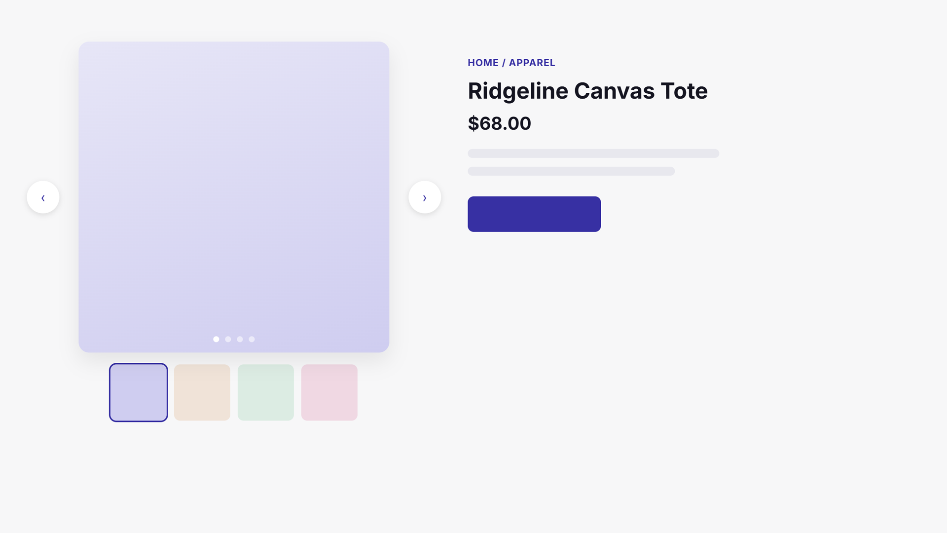
SazKit – Product Gallery for WooCommerce swaps the default WooCommerce single-product image gallery (FlexSlider + zoom) for a clean Swiper slider.
Features:
- Main slider with arrow and dot navigation, fade transition, and adaptive height.
- Optional synced thumbnail navigation slider below the main image.
- Full-screen lightbox with keyboard navigation, focus trapping, and click-to-magnify.
- Hover zoom (inner magnify) on the main image for desktop pointers.
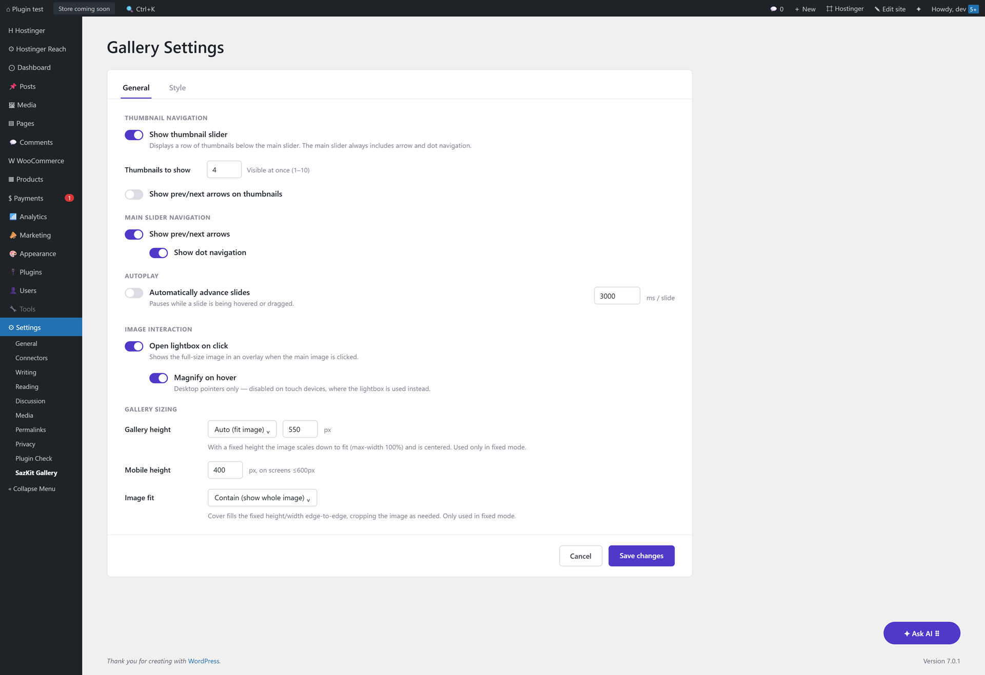
- Configurable gallery height — a fixed pixel height (default 550px) that scales images down and centers them, or auto height that fits each image.
- Image fit for fixed-height mode — Contain (show the whole image) or Cover (fill and crop edge-to-edge).
- Configurable thumbnail count (1–10 visible at once).
- Toggle arrows and dots independently on the main slider.
- Optional arrows on the thumbnail slider.
- Autoplay for the main slider with a configurable interval (pauses on hover/focus).
- Tabbed settings screen: General and Style.
- Style tab: pick the arrow color and dot color with the native color picker.
- Variation support — the main image updates when a variation with its own image is selected.
- RTL aware.
- Uses your site’s existing Swiper assets if a theme or another plugin already registers them; otherwise it loads its own bundled copy.
- HPOS (High-Performance Order Storage) compatible.
- Developer friendly: filter hooks for the image IDs, image sizes, and Swiper arguments.
Filter hooks
sazkit_settings— filter merged plugin settings at runtime.sazkit_gallery_image_ids— filter the attachment IDs used in the gallery.sazkit_main_image_size/sazkit_thumb_image_size— filter the registered image sizes.sazkit_swiper_main_args/sazkit_swiper_thumbs_args— filter the Swiper configuration.sazkit_swiper_handles— override the detected Swiper script/style handles.sazkit_zoom_level— filter the hover-zoom magnification factor (default2.0).sazkit_slide_badges— filter to add badge overlays (e.g. Sale/New ribbons) to a gallery slide.sazkit_before_main_slides/sazkit_after_main_slides— actions for add-ons to inject extra.sazkit-slideelements (e.g. video) into the main slider.sazkit_before_thumb_slides/sazkit_after_thumb_slides— matching actions for the thumbnail slider, to keep both sliders’ indexes in sync.sazkit_gallery_wrapper_classes— filter to add extra classes to the gallery wrapper (e.g. add-on layout classes).sazkit_disable_main_slider— filter to skip Swiper initialization entirely, for add-ons rendering their own layout (e.g. a grid).sazkit_main_image_attrs/sazkit_thumb_image_attrs— filter the<img>attributes per slide (e.g. lazy-loading control).-
sazkit_main_image_html/sazkit_thumb_image_html— filter the final<img>HTML per slide (e.g. to wrap it in a<picture>element for WebP/AVIF).render_gallery_for_product( WC_Product $product ) and
enqueue_gallery_assets()are public methods add-ons can call directly to render/enqueue the gallery for an arbitrary product outside the single product page (e.g. a shortcode or block). -
sazkit_settings_nav_tabs— action to add extra tab links to the settings page’s nav (so an add-on doesn’t need its own separate admin menu item). sazkit_settings_panels— action to render extra tab panel(s) inside the settings card, after the built-in General/Style tabs’ own<form>closes. Forms can’t nest, so add-on panels needing to save fields must wrap themselves in their own<form>with their own save button — the built-in Cancel/Save changes footer only submits the General/Style tab and hides itself automatically while a non-native tab is active. Panels should use the same.sazkit-tab-panel/#sazkit-tab-{slug}markup convention as the built-in tabs so the shared tab-switching JS shows/hides them correctly.
The gallery wrapper also fires two jQuery events add-ons can listen for: sazkit:zoom (hover zoom activated on a slide) and sazkit:lightbox-open (the lightbox opened for a slide), both passed the attachment ID.
Third-Party Libraries
This plugin bundles the Swiper library (v11.2.10) by Vladimir Kharlampidi, licensed under the MIT license. See https://swiperjs.com.
Screenshots
Installation
- Upload the
sazkit-galleryfolder to/wp-content/plugins/, or install it through the Plugins screen in WordPress. - Activate the plugin through the Plugins screen.
- Make sure WooCommerce is active.
- Visit Settings SazKit Gallery to configure the gallery under the General and Style tabs.
FAQ
-
Does this require WooCommerce?
-
Yes. WooCommerce 8.0 or newer must be active. The plugin does nothing on its own.
-
Is it compatible with variable products?
-
Yes. When a variation with its own image is selected, the first slide updates to that image and returns to the original when the selection is reset.
-
Is it multilingual / WPML ready?
-
Yes. All plugin strings are internationalized, and a translation template (
languages/sazkit-gallery.pot) is included. Product images and titles themselves are WooCommerce data, so WPML/Polylang translate them automatically — no extra configuration is required. -
Can I keep my theme’s Swiper version?
-
Yes. If your theme or another plugin already registers a Swiper script/style handle, this plugin uses it instead of loading a second copy.
Reviews
There are no reviews for this plugin.
Contributors & Developers
“SazKit – Product Gallery for WooCommerce” is open source software. The following people have contributed to this plugin.
Contributors
Translate “SazKit – Product Gallery for WooCommerce” into your language.
Interested in development?
Browse the code, check out the SVN repository, or subscribe to the development log by RSS.
Changelog
1.0.6
- Renamed the plugin folder and main file to match the slug assigned by WordPress.org during review (
sazkit-product-gallery-for-woocommerce), resolving a Text-Domain/slug mismatch flagged by Plugin Check. The Text Domain and all translation strings now correctly match the assigned slug. Also removed a stray.claudedirectory (an AI-assistant config folder) that had been flagged as not belonging in a production plugin.
1.0.5
- Removed the Custom CSS field from the Style tab. Per the WordPress.org plugin review team’s policy against plugins accepting arbitrary user-supplied CSS/JS/PHP for output, the free-form textarea (previously piped straight into
wp_add_inline_style) has been removed entirely. The Style tab still offers the arrow/dot color pickers. - Renamed the main class from
SazKit_GallerytoSazkit_Galleryto resolve a plugin-review prefix-consistency flag (the capitalized “K” didn’t match the lowercasesazkit_prefix used everywhere else — hook names, filters, the option key). No functional change; only affects code that referenced the class name directly (e.g. the Pro add-on, updated to match).
1.0.4
- Changed the Text Domain to
sazkit-product-gallery-for-woocommerce(wassazkit-gallery) and updated every translation string to match. The admin menu slug, enqueued script/style handles, and the.sazkit-galleryCSS class are unchanged — only the translation domain moved.
1.0.3
- Fixed the arrow icons still losing their
positionto a theme’s own!importantrule even after 1.0.2’s hardening: when both sides declare a property!important, it comes down to plain specificity, and a theme selector likebutton:not(.fa):not(.close-style)::beforeout-specifies a doubled class. The affected rules (main/thumbnail/lightbox arrow icons) now triple the class instead of doubling it, which reliably exceeds that kind of theme selector regardless of load order.
1.0.2
- Hardened the gallery’s structural CSS (layout, image sizing, arrows, dots, thumbnails, and the lightbox overlay) with
!importanton every property that would visibly break if a theme’s own generic styling overrode it — not just the arrow icons fixed in 1.0.1. Purely cosmetic details are left as-is; this only covers things that would otherwise stop working correctly.
1.0.1
- Fixed the main/thumbnail/lightbox arrow icons becoming invisible or mispositioned on some themes at narrower viewport widths (seen with a Divi-style button “shine” hover effect that repurposes every
<button>element’s::before/::afterfor its own decorative overlay below ~991px). The arrow icons’ properties are now set with!importantthroughout to guarantee they win regardless of what a theme’s generic button styling does.
1.0.0
- Initial public release.