• Resolved skyewelse

    (@skyewelse)


    Hi Ceslava!

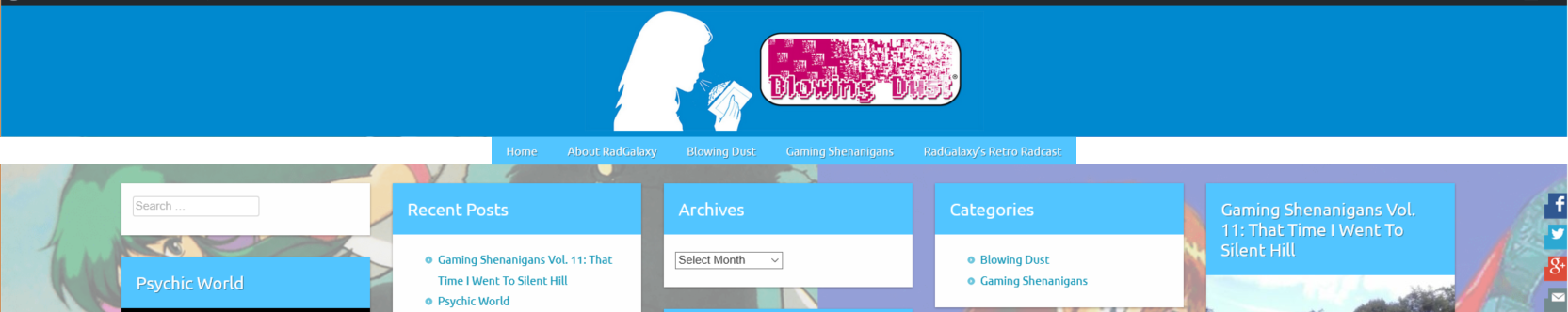
    First, I’d like to say thank you very much for creating such a wonderful theme for WordPress. I generally don’t like using WordPress… I guess I’m a bit more oldschool and enjoy HTML pages, but for blogs and posts, you just can’t beat WordPress as a powerful tool. Your theme Marla has such a fantastic way of showing off new content posts and I used it to revive a friend of mine’s Retro Gaming blog located at: http://retro-type.com/blowingdust/

    I’ve looked through a lot of the other posts for some various modifications, some of which I have applied as a custom CSS code for changing the width of the content / post area, centering the Nav Bar, changing it’s hover color, etc.

    @media only screen and (min-width : 1070px) {
    #header .logo{
    	width:800px;
    }
    #content, .slider, .entry-content img, .entry-content iframe, .entry-content object, .entry-content embed, .author-bio, #content .widget, .btn
    { width: 777px;}
    
    }
    
    #sidebarcompartir, #site-navigation .searchform {display:none !important};
    
     .wp-caption .wp-caption-text {
     font-size: small;
    
     margin: 0.8075em 0;
    
     }
    
    /* navigation items hover background */
    #site-navigation li:hover {
        background-color: #2e2e2e;
    }
    @media only screen and (min-width:777px) {#site-navigation {
    width: 777px;
    margin: 0 auto;
    }}

    I saw one other thread here where they were able to get the navigation bar centered just like I have, but they lost the background bar (which I made as a white bar originally when everything was originally left-aligned) and that has happened to me as well. I think having the navigation centered and placed ontop of the full page width background bar is what some of us were trying to figure out how to do and were unsuccessful so far.

    The other tweak I wanted to make if possible is to see if I can disable the opacity that happens to all other surrounding articles when you hover over any one particular article or div. I tried to figure it out, but I was unsuccessful. I do however notice that it seems to stop doing this behavior as you scroll down the page a bit more and new articles populate the screen.

    Thanks very much for your time!

    -Thomas
    SkyeWelse

Viewing 7 replies - 1 through 7 (of 7 total)
  • Theme Author ceslava

    (@ceslava)

    Hi Thomas,

    I really appreciated your kind words. Thanks a lot.

    Regarding the background bar for the menu you can try this code

    #site-navigation, #site-navigation ul {
        background: none;
    }

    And to get rid of the hover effect

    @media only screen and (min-device-width: 1024px) and (min-width: 768px)
    .todocontenido div.focus-post {
        opacity: 1;
    }

    Please let me know if this is what you needed.

    Best regards,
    ceslava.com

    Thread Starter skyewelse

    (@skyewelse)

    Sweet! Thank you very much. The code for disabling the hover effect works very well. I can see the hover being very useful for matted backgrounds that are one color, but the way I’ve got it setup split between two images that would be on either side of published article posts, it was more jarring than anything else, so I’m very happy you were able to help with disabling it. It makes this particular site look a lot cleaner I think in terms of functionality. 🙂

    I tried the code for the background bar and I see what it does, with removing the color from the bar when scrolling further down the page. It’s kind of neat so I’m going to keep that code in there for now, but I guess what I was looking to see if it were possible to have the navigation look a bit more like this by default (not necessarily with scrolling down the page, where it jumps back to being left aligned with a background bar.

    <—White-BG-Bar — Centered-Nav-Menu — White-BG-Bar —> Full width 100%.

    Right now I have the pixels of the nav bar being set at 777px, because that is the exact size of the nav bar menu (with my nav options anyway) without going over. If I had the background bar color set to white and I set the pixel size of the nav bar to say… 800 pixels, it would display something like this:

    <—No-BG-Bar — Centered-Nav-Menu — White-BG-Bar (for 23 pixels only) —>

    If this is too much trouble, no worries, I can definitely live without the white BG bar, but I thought it might help add a nice transition from the header to the content frame having a full width BG bar behind the navigation like it does by default only when it is left-aligned. 🙂

    Thanks again for your help! My friend is very excited to be able to continue writing gaming articles for the site.

    -Thomas
    SkyeWelse

    Theme Author ceslava

    (@ceslava)

    Hi Thomas,

    Sorry if I didn´t understand what you mean.

    If you can have a background only when the menu is fixed at the top you can add this

    #site-navigation.fixed {
    background-color: #FFF;
    }

    I hope this help

    Regards

    Thread Starter skyewelse

    (@skyewelse)

    Hi Ceslava,

    No worries! I wasn’t able to get the code above to really do much more than what the earlier code does:

    #site-navigation, #site-navigation ul {
        background: white;
    }

    But to best explain a bit more I put together a screenshot and an edited screenshot from photoshop that should show a little more what I and one other poster here was hoping to accomplish.

    Screenshot1: What the site shows currently when the Nav bar is centered (which is exactly 777 pixels in total length for the nav buttons alone) and given a width of 1000 pixels.

    http://retro-type.com/blowingdust/images/bar01.png

    You’ll see that for the remaining 233 pixels, it will begin to fill in the white BG nav color starting from the right of the nav menu which left-aligns the nav menu options while keeping the entire 1000 pixel div centered.

    Screenshot#2 – What I was hoping to accomplish, and again if this is not possible or too much trouble, please do not worry. I can certainly live without a full extended nav bg. Having the nav menu centered is already working for me since I can align it’s size to the content post width. 🙂

    http://retro-type.com/blowingdust/images/bar02.png

    Again, thank you very much for your help!

    -Thomas
    SkyeWelse

    Theme Author ceslava

    (@ceslava)

    Hi and sorry again,

    Let´s see if I finally understood what you need. You want to center the menu with no background surround it.

    To accomplish this centered and responsive menu we can use flexbox instead of the old float. We must use some prefixes, so the code will be

    #site-navigation ul {
    display: -ms-flexbox;
    display: -webkit-flex;
        display: flex;
        -webkit-flex-wrap: wrap;
        -ms-flex-wrap: wrap;
        flex-wrap: wrap;
        float:none;
       justify-content: center;
    
    }
    
    @media only screen and (min-width: 777px)
    #site-navigation {
        width: 100%;}
    
    #site-navigation, #site-navigation ul {
        background: none;
    }

    I hope this is what you need

    Regards

    Thread Starter skyewelse

    (@skyewelse)

    Hi Ceslava!

    Okay, so what you said here, but the opposite. 🙂

    Let´s see if I finally understood what you need. You want to center the menu with no background surround it.

    What I was hoping to achieve was a full background bar, but with a centered navigation on top. But thanks to your new code I was able to figure it out and it now looks exactly how I was hoping, which tests fine for desktop and mobile devices. Hurray! 🙂

    Here’s the new version of the navigation on the site:
    http://retro-type.com/blowingdust/

    And the custom CSS code I have in place is as follows. It could probably be cleaned up some I’m sure, but it’s working for now at least!

    #sidebarcompartir, #site-navigation .searchform {display:none !important};
    
    @media only screen and (min-width : 777px) {
    #header .logo{
    	width:800px;
    }
    }
    
     .wp-caption .wp-caption-text {
     font-size: small;
    
     margin: 0.8075em 0;
     }
    
    /* navigation items hover background */
    #site-navigation li:hover {
        background-color: #52c5ff;
    }
    .todocontenido div.focus-post {
        opacity: 1;
    }
    
    #site-navigation ul {
    display: -ms-flexbox;
    display: -webkit-flex;
        display: flex;
        -webkit-flex-wrap: wrap;
        -ms-flex-wrap: wrap;
        flex-wrap: wrap;
        float:none;
       justify-content: center;
    
    }
    
    #site-navigation {
        width: 100%;}
    
    #site-navigation, #site-navigation ul {
        background: #2e2e2e;
    }
    
     #site-navigation div > ul > li {
    
     background: #2e2e2e;
    
    }
    
    #content, .slider, .entry-content img, .entry-content iframe, .entry-content object, .entry-content embed, .author-bio, #content .widget, .btn
    { width: 777px;}
    }

    Thank you very much again for your help! The site looks amazing. Definitely my favorite WordPress theme so far. It’s perfect for what we needed!

    -Thomas
    SkyeWelse

    Theme Author ceslava

    (@ceslava)

    Glad to hear it Thomas !!! Great !!!

    Thanks for your words again.

    If you want you can write some review

    I really appreciated 😉

    Best regards

Viewing 7 replies - 1 through 7 (of 7 total)
  • The topic ‘Some questions for how to best customize Marla’ is closed to new replies.