• Resolved MsLake

    (@mslake)


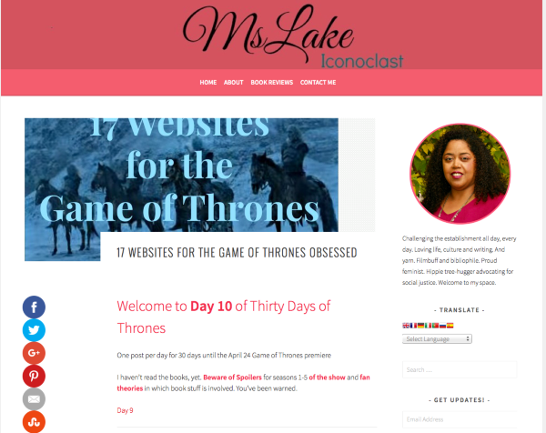
    I haven’t used featured images in my posts before but I want to start to in order to make some grid pages for different categories. When I insert the featured image, it overlaps the post Title and gets cut off. How can I fix this?

    FYI: I have made some adjustments to the width of the theme via my css editor recently, but I don’t think this is a factor as it’s the height that isn’t working, not the width.

    Also would like to extend the width of the theme almost all the way across, with maybe a centimeter of padding on either side. I’ve tried looking at the css in my css editor but I can’t figure it out. Ever since the theme update the post area and sidebar are almost up against each other. I want to widen the them and move both areas further away from each other.

    My site is MsLake.me

    I also need to know how to adjust the margin between the content and the outer edges of the content area. I want to cut the margin all the way around by 1/4 inch or more. I am using site origin css to make the changes, thank you.

Viewing 15 replies - 1 through 15 (of 21 total)
  • Moderator Kathryn Presner

    (@zoonini)

    When I insert the featured image, it overlaps the post Title and gets cut off. How can I fix this?

    Please provide a link to one or two example post where this is an issue.

    As I mentioned in your other post, you’ll need to turn off your right-click prevention script to allow people to user their browser inspectors to help you. Thanks.

    Thread Starter MsLake

    (@mslake)

    I removed the featured image because I don’t want my site to look wonky. I have set a featured image in this post

    http://mslake.me/best-game-of-thrones-websites/

    so that you can see what’s happening. The top of the image also cuts off, which I hadn’t noticed before.

    The right-click protection is disabled.

    Thank you.

    Moderator Kathryn Presner

    (@zoonini)

    Looks like you’ve added a large negative margin on entry titles, which is shifting them over so they overlap with the featured images:

    .entry-title {
        font-size: 24pt;
        font-weight: 300;
        margin-left: -150px;
    }

    Removing the line margin-left: -150px; should fix the problem, as you can see here:

    View post on imgur.com

    Moderator Kathryn Presner

    (@zoonini)

    Ever since the theme update the post area and sidebar are almost up against each other.

    The theme update shouldn’t have affected this, and may be related to your customizations or a plugin issue. You can see on the Sela demo that the spacing between the main column and sidebar hasn’t changed:

    https://selademo.wordpress.com/blog/

    Again, I can see with a browser inspector that it looks like one of your custom CSS pieces is widening the main column so that it’s too close to the sidebar:

    View post on imgur.com

    I’d suggest you change 725px to a smaller number, so the gutter between the two columns is reduced.

    Moderator Kathryn Presner

    (@zoonini)

    Also please keep in mind that when you alter things like column widths in custom CSS, you need to be careful not to damage the site’s responsiveness.

    Right now your site does not display properly at smaller screen sizes, as you’ve declared a fixed 725px width, which overrides the theme’s built-in responsive styles.

    To overcome this problem, you need to put these types of CSS overrides in media queries. You can learn more about using media queries that target certain screen sizes here:

    http://en.support.wordpress.com/custom-design/custom-css-media-queries/
    http://css-tricks.com/snippets/css/media-queries-for-standard-devices/
    http://webdesignerwall.com/tutorials/responsive-design-with-css3-media-queries

    Media queries are a simple concept but powerful in practice, and can take some experimentation and testing to get right.

    Thread Starter MsLake

    (@mslake)

    Ok I understand. I just removed all my CSS edits to start from scratch again. The theme is back to its orginal parameters.
    I need is to extend the main content area to the left. On the home page I have about 2 inches of white space on the left, and on the post pages it’s about three inches, which makes the content area much too narrow.

    Thank you.

    Thread Starter MsLake

    (@mslake)

    Hi I just wanted to let you know that I fixed the css code that you mentioned but the headline is still over-lapping the featured image on this page.

    http://mslake.me/best-game-of-thrones-websites/

    so I’m not sure what is going on.

    Moderator Kathryn Presner

    (@zoonini)

    Hi I just wanted to let you know that I fixed the css code that you mentioned but the headline is still over-lapping the featured image on this page.

    http://mslake.me/best-game-of-thrones-websites/

    I’m not seeing any overlapping there – have you tried clearing your browser cache to make sure you’re seeing the latest version of the page?

    17 Websites for the Game of Thrones Obsessed MsLake 3

    Moderator Kathryn Presner

    (@zoonini)

    I need is to extend the main content area to the left. On the home page I have about 2 inches of white space on the left, and on the post pages it’s about three inches, which makes the content area much too narrow.

    Keep in mind that in the world of the web, inches, centimetres, and other traditional analogue units aren’t used to reference layout dimensions. This is because only pixels have meaning on digital devices – for example, what looks like an inch on your device may look like two on someone else’s, depending on the screen resolution and window size of the device.

    You also need to be careful not to mess with a site’s responsiveness. Modern themes are designed to automatically adjust to devices of all sizes, from desktop to tablets to phones. So any width adjustments should go into media queries, as I explained above.

    The overall width of Sela’s content area is set to a maximum of 1180px, as you can by using a browser inspector or by looking at the theme’s CSS file:

    .site {
        margin: 0 auto;
        max-width: 1180px;
        padding: 0;
    }

    This ensures that the main column remains easy to read, even on large screens.

    If for some reason you want to widen that, you could add something like this in your custom CSS, to limit the change only to wider browser windows:

    @media screen and (min-width: 1200px) {
      .site {
        max-width: 1300px;
      }
    }

    You can adjust the width of the main column in similar fashion – make sure you put it in a media query so it doesn’t negatively affect other screen sizes.

    Keep in mind that modifying the width of the page affects the display of your featured images, which now no longer expand the width of the column. Adjusting that is another, more complicated project, requiring a custom function in a child theme – it can’t be done with CSS alone.

    Thread Starter MsLake

    (@mslake)

    Hi Kathryn, thanks for your detailed responses about adjusting the width of the theme.

    In the meantime, the featured image problem is still happening. The title overlaps the featured image or vice-versa. I cleared my cache so that’s not the problem. The page I linked to before

    http://mslake.me/best-game-of-thrones-websites/

    shows it plainly. I have no customized code in the theme now because I reinstalled from scratch.

    Moderator Kathryn Presner

    (@zoonini)

    I’m still not seeing any overlapping on http://mslake.me/best-game-of-thrones-websites/

    I checked in:

    Firefox 45.0.2
    Chrome 50.0.2661.75
    Safari 9.1

    What browsers and versions are you seeing the issue in? Have you tried more than one browser?

    You could turning off all your browser extensions/plugins/add-ons to see if something is causing this.

    Thread Starter MsLake

    (@mslake)

    I wish I could upload a screenshot of what I’m seeing. I have the latest version of Chrome. Just to make sure I tested the featured image in another post and got the same result. The image goes to the top of the page but the bottom is overlapped by the headline. I’m moving around some plugins that may be affecting the layout to see what happens. Now the image is flush to the left edge of the post (if only the text would go that way as well, lol) but is still overlapped at the bottom edge by the headline. I will go through all my plugins until I figure it out.

    Moderator Kathryn Presner

    (@zoonini)

    Have you tried more than one browser, as I asked before? That would help narrow down the source.

    If you do only see the issue in one browser, it may be an extension you’re running that’s conflicting. You can turn off all extensions temporarily in Chrome by following the instructions under “Turn extensions on or off” here:

    https://support.google.com/chrome_webstore/answer/2664769?hl=en&rd=2

    Moderator Kathryn Presner

    (@zoonini)

    I wish I could upload a screenshot of what I’m seeing.

    You can upload a screenshot – in a graphic format like JPG, PNG, or PDF – in your Media Library, and provide a link so I can see it, or upload it with a service like Cloudup, Imgur or Snaggy.

    Thread Starter MsLake

    (@mslake)

    Okay so I updated Chrome to the latest verson, and no change. So I uploaded a screenshot to my blog here: http://mslake.me/featured-image-weirdness/

    the password is techstuff

    In the meantime I’ll check in another browser

Viewing 15 replies - 1 through 15 (of 21 total)
  • The topic ‘Post Featured Image overlaps Title’ is closed to new replies.