There is a new template in “page attributes”, which is under the “update” button in pages or post, changes to “elementor canvas” by the “default template”, since templates of most wordpress themes Are compatible with “elementor”, with this new canvas template, you will no longer have compatibility problems. You will have to resize the size of your template, because this canvas template covers the ends of the page, removing the header and footer.
The problem is not about the page template, but the elements that are inserted into the page.
Even changing the template to Elementor Canvas still causes the problem.
Greetings!
I believe your issue maybe related to my issue also. It appears, in the inspector, that the tablet media query size of 1024px never gets superseded by the mobile media query. This results in mobile settings being overruled by tablet settings. I have no idea how it could do this tbh but it seems we may be shouting in to the darkness here… I hope someone from the dev team is seeing these.
My post is https://wordpress.org/support/topic/tablet-display-issues/
I really think there’s an issue with the media querries somehow in the last update.
Hi!
I also hope the staff can check our request!
Plugin Author
 ArielK
(@arielk-1)
Hi
What you describe is not supposed to happen, can you share the link with the problem?
If you are using a cache plugin, try to clear the cache, after that please go to > Dashboard > Elementor > Tools > Regenerate CSS, and let me know if your problem solve
Our breakpoints are (since v0.8):
Mobile: max-width: 767px
Tablet: max-width: 1024px
Desktop: All the rest
For now, you can not set custom breakpoints, we plan to add this option in the future, you can follow about this issue in the GitHub: https://github.com/pojome/elementor/issues/78
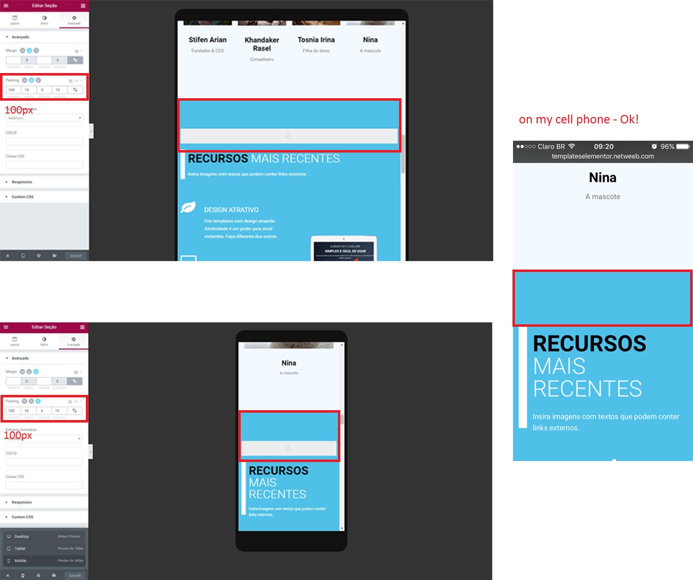
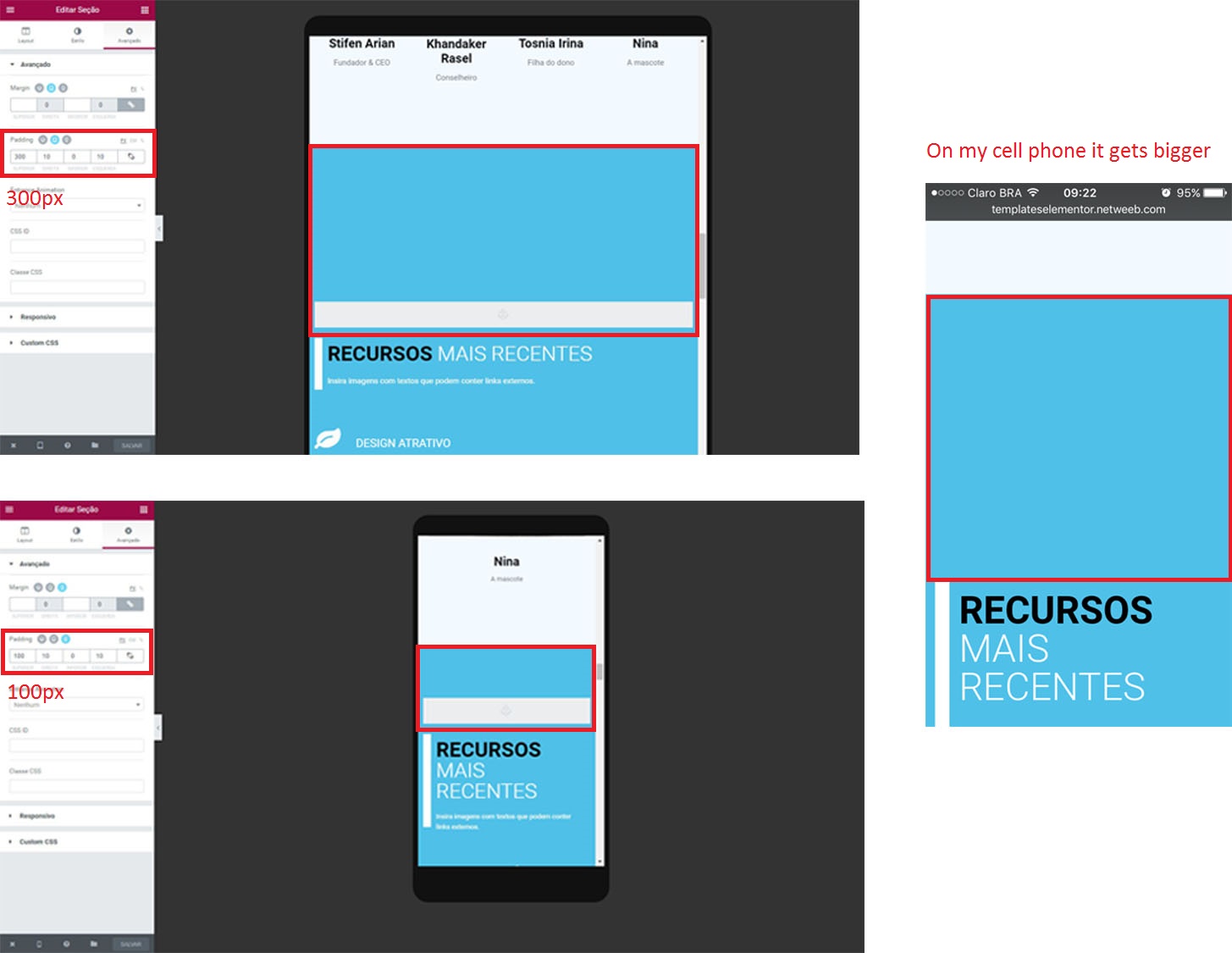
Hi!
I will regenerate the CSS and not solved.
Follow the pictures.
Plugin Author
ArielK
(@arielk-1)
@eder-tuffic I see that you are using the Pro version of Elementor, so I would recommend that you contact the official support of Elementor Pro and we will be glad to help you
No Arielk, I use the free version!
Plugin Author
ArielK
(@arielk-1)
Custom CSS available only in E-Pro. Anyway please send the link to this page, We will try to figure out what wrong
This page is http://cursoelementor.netweeb.com/template/
Custon CSS link appears but is not available 🙂
He states this is padding set inside Elementor using Elementor. Nothing about custom CSS and not the pro version. He even shows this in the provided screenshots….
Hi @eder-tuffic,
Could you please contact us here?
Thanks