 sacredpath
(@sacredpath)
Automattic Happiness Engineer
Hi there, let’s try this CSS solution first and see what you think before we head into the theme files to modify things. This targets the blog page, archive type pages (date archive, tag and category pages), and the single post pages.
@media screen and (min-width: 850px) {
body.rtl.blog .site-content #secondary, body.rtl.archive .site-content #secondary, body.rtl.single .site-content #secondary {
	float: right;
}
body.rtl.blog .site-content #primary, body.rtl.archive .site-content #primary, body.rtl.single .site-content #primary {
	float: left;
}
}
Hi,
Thank you very much for your fast reply. I have applied the CSS solution, and it looks very good.
I noticed one detail left: the post’s info (date + leave a comment) should also move to the left side of the screen.
Since it’s still displaying in a left-to-right reading logic, it’s ending up in the middle of screen and disturbs the natural arrangement.
Here are before and after screenshots.
Thank you again for your support;
-
This reply was modified 5 years, 11 months ago by
 MiraKitani.
sacredpath
(@sacredpath)
Automattic Happiness Engineer
We can do that. Add this to that media query, before the last closing curly bracket.
.entry-body {
float: right;
padding-right: 0;
padding-left: 146px;
}
.entry-meta {
left: 0;
right: auto;
}
Hello,
Thank you for your support.
I think the theme elements are starting to get all over the place.
They aren’t aligned and don’t follow the original Sela structure.
Here the before and the new after.
Not sure if it’s me. Here is the code that I pasted as you said in the CSS :
@media screen and (min-width: 850px) {
body.rtl.blog .site-content #secondary, body.rtl.archive .site-content #secondary, body.rtl.single .site-content #secondary {
	float: right;
}
body.rtl.blog .site-content #primary, body.rtl.archive .site-content #primary, body.rtl.single .site-content #primary {
	float: left;
}

.entry-body {
float: right;
padding-right: 0;
padding-left: 146px;
}
.entry-meta {
left: 0;
right: auto;
}

}
Thank you again
sacredpath
(@sacredpath)
Automattic Happiness Engineer
Wow, this had gotten a bit complex. Remove what you have and replace with the following.
@media screen and (min-width: 850px) {
body.rtl.blog .site-content #secondary, body.rtl.archive .site-content #secondary, body.rtl.single .site-content #secondary {
	float: right;
}
body.rtl.blog .site-content #primary, body.rtl.archive .site-content #primary, body.rtl.single .site-content #primary {
	float: left;
}

body.rtl.blog .entry-body {
  float: right;
  padding-right: 0;
  padding-left: 146px;
	width: calc(100% - 196px);
	position: relative;
}
body.rtl.blog .entry-meta {
  left: 0;
  right: auto;
	text-align: right;
}
body.rtl.blog .without-featured-image > .entry-header {
margin-right: 0;
margin-left: 146px;
}
}
The arrangement is now on point ! Thank you very much !
Except I don’t know where this line came from ?
I have checked the original again and realized it didn’t have it.
That line makes the elements of the sidebar and posts look crowded/overlayed and forced on each other.
If it can be removed, then it’s going to be perfect ! Thank you very much.
Do I understand that we still need to to modify the theme files after this last part?
Thank you again for your support
-
This reply was modified 5 years, 11 months ago by MiraKitani.
-
This reply was modified 5 years, 11 months ago by MiraKitani.
-
This reply was modified 5 years, 11 months ago by MiraKitani.
-
This reply was modified 5 years, 11 months ago by MiraKitani.
-
This reply was modified 5 years, 11 months ago by MiraKitani.
sacredpath
(@sacredpath)
Automattic Happiness Engineer
Hi, that line can be removed. It is in hte original CSS, set using an after pseudo selector. Add this to your custom CSS to remove it.
.hentry::after {
    background: none;
}
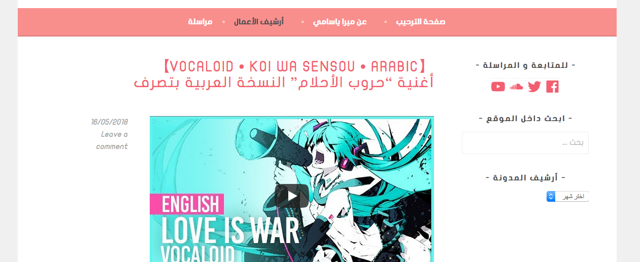
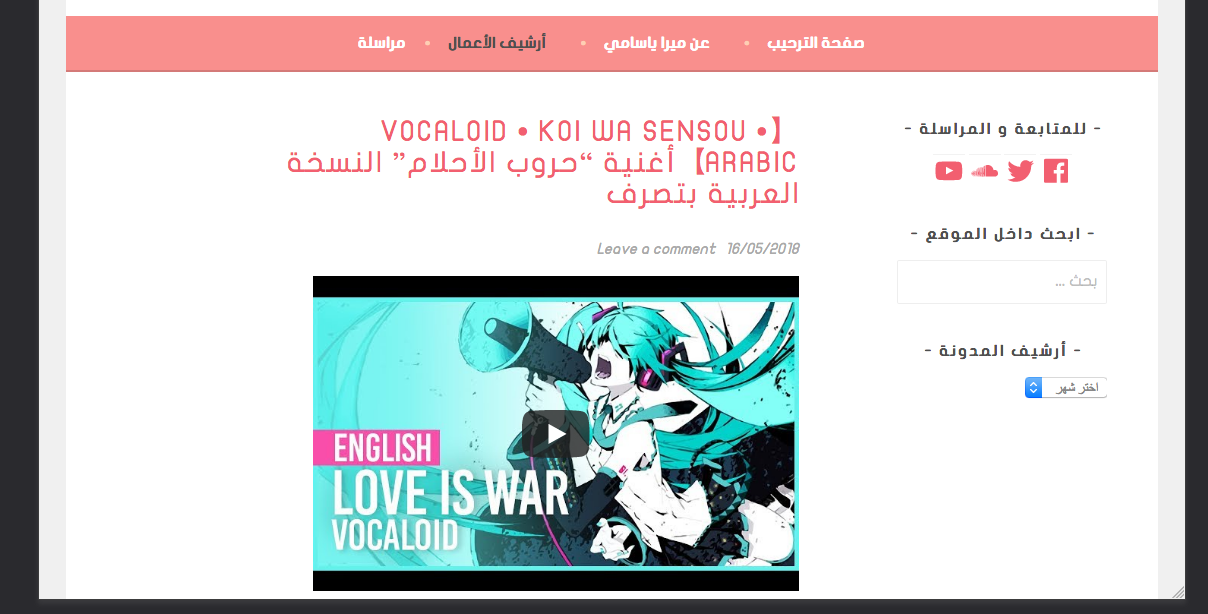
Hello,
Perfect ! The blog outlook looks exactly like the original.
One issue appeared when I was trying to browse the blog and make sure everytihng is coherent :
When you go to the post itself, the info (date + leave a comment) turn back to the middle of the screen, like what happened first when we were trying to fix the blog.
Here is a screenshot when you go to the post.
-
This reply was modified 5 years, 10 months ago by MiraKitani.
sacredpath
(@sacredpath)
Automattic Happiness Engineer
Hi there, I’m getting a default backend - 404 error when I try and go to your site. Is it down right now?
Hi, I’m sorry. I forgot I have just registered a domain name.
Here is the correct website now: http://www.mirayasami.com/
sacredpath
(@sacredpath)
Automattic Happiness Engineer
Ah, cool, thanks for the new link. Looking at your single posts, it looks like you have gotten this taken care of.
On wider screens: https://cldup.com/7mkK7gNI3N.png
On slightly narrower screens: https://cldup.com/9Qa6eiFvnL.png
After the sidebar moves to below the content, the date/leave a comment text stays in a position similar to on the slightly narrower screenshot above.
Hi,
I’m afraid the issue isn’t solved yet.
The blog outlook is perfect, but when you go to the post itself, the info link goes to the middle between the sidebar and the post content (screenshot).
I’ve tried on two different computers. The result I linked stays the same.
Is there a way to keep the page contents the same as when you view the whole blog ?
Thank you;
sacredpath
(@sacredpath)
Automattic Happiness Engineer
Ah, sorry, Add this for the single post pages.
@media screen and (min-width: 1170px) {
  .single .entry-meta {
	 width: 100%;
	 text-align: right;
	 position: initial;
  }
	.single .entry-header {
		margin-right: 0 !important;
	}
	.single .entry-body {
		padding-right: 0;
	}
}
Thank you !
I think this is the last issue : while the arrangement and distance between the sidebar, permalink and posts have been fixed, the gap still persists in the comments section.
Here are Screenshot 1 with comment form / Screenshot 2 with a test comment
Thank you for your patience again and all the support !
