• Resolved fbadal

    (@fbadal)


    Hello!

    I am currently trying to work on the homepage for my website, and it looks great on deskptop, but when you do mobile, the frontpage looks bad.

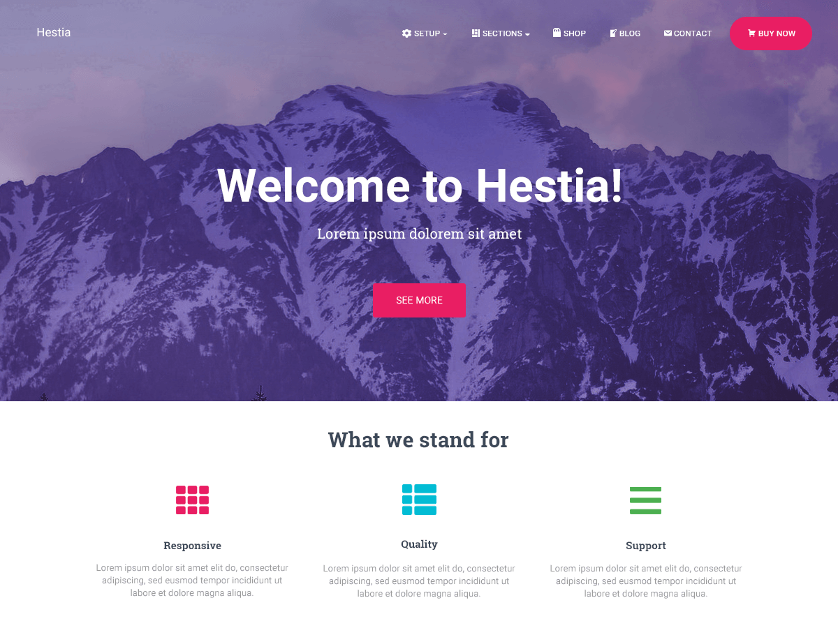
    The Homepage is Divided by:

    1. Big Title
    2. Our Approach
    3. Recetn Articles
    4. Subscribe

    For Mobile, is there any way to make the “Our Approach side” into like one bar, so users can immediately see the recent article section?

    On a related note, the only reason I have the “Recent Article” side under “Our Approach” is because on Hestia, the about section on the homepage is the ONLY part I can i clude my articles using Elementor, and for aesthetic reasons I had to but the white “Our Approach” section.

    The page I need help with: [log in to see the link]

Viewing 3 replies - 1 through 3 (of 3 total)
  • Hi @fbadal,

    Hestia is designed to show the elements from your “Our approach” section like this on the mobile version, one under the other, not to look too cramped. To make this in one line, it would be necesary pretty much custom code.
    However, I saw that you have a big padding between the elements and you can make them look more compact by adding the following code in your Appearance -> Customize -> Additional CSS:

    .hestia-features .hestia-info {
        padding: 0px !important;
    }

    Hope that helps!

    Thread Starter fbadal

    (@fbadal)

    Hi Betty,

    Thank you for providing the additional CSS. On mobil, it looks much better. For desktop version, on the “Our Approach” section, is there anyway to move the ‘our approach’ text higher? It’s too close to the twitter emblem.

    Best,
    Fahim

    Sure!

    Add the code below in your Additional CSS section:

    .hestia-features .hestia-title {
         margin-top: 0px !important;
         margin-bottom: 20px;
    }
Viewing 3 replies - 1 through 3 (of 3 total)

The topic ‘Mobile Version Does not Format Homepage’ is closed to new replies.