Logo problem in responsive mode
-
It is the continuation of the privatization I mentioned in the previous topics. However, since it points to a different issue, I wanted to ask it separately.
I have a partially square logo.
I don’t know if I did it right: I brought the logo for the desktop to the look I wanted with the following codes.
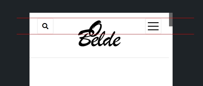
.title-container .custom-logo {
	max-width: 140px;
	max-height: 65px;
}
However, when switching to responsive mode, ie 799px and below, the logo breaks the menu. So it goes out of the menu.
https://i.hizliresim.com/tpwmkpz.jpg
I thought about adjusting the dimensions individually. But I wasn’t sure. I wanted to ask. How to adjust the responsive layout to keep the logo in the dimensions of the bars icon and search icon on the sides?
https://i.hizliresim.com/694gbeh.jpg
Finally: I saw a few codes in css files, but not know. Is it possible to change the width of the responsive mode?
Although I seem to be thanking you too much for this theme, it deserves it. Forgive me if I’m overdoing it. Thanks…
- The topic ‘Logo problem in responsive mode’ is closed to new replies.
