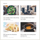
Layout 4 looks bad on mobile
-
Thank you for your plugin have been testing it and looks very promising. Keep up the good work.
Layout 4 looks good on desktop and tablet but has too much white space when using mobile view.
It would be better if the excerpt took up full screen width. Or even better if it looked like layout2 mobile view.Also on a side note it would be useful to have an exclusion taxonomy filter too. (Just like the inclusion one that’s present).
Many thanks
-
This topic was modified 3 years, 10 months ago by
.
-
This topic was modified 3 years, 10 months ago by
The page I need help with: [log in to see the link]
-
This topic was modified 3 years, 10 months ago by
Viewing 2 replies - 1 through 2 (of 2 total)
Viewing 2 replies - 1 through 2 (of 2 total)
- The topic ‘Layout 4 looks bad on mobile’ is closed to new replies.