Hello @ronijohn
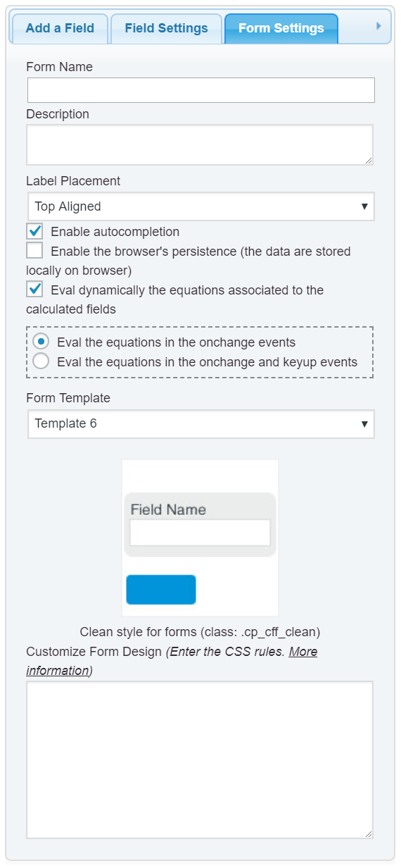
Yes, that is exactly the plugin’s behavior, in small screens the (not only in mobiles), the labels are displayed at top and the input boxes below. You simply should to select the “Left Aligned” option for the “Label Placement” attribute in the “Form Settings” tab:
and that’s all.
Best regards.
Hi
Thank you for the quick reply. I have selected Left Aligned as the label placement option in Form settings. And the label is placed on the left side on both desktop and mobile views, please refer to the below screenshots.
https://ibb.co/p2d813V
https://ibb.co/Jn1QGZs
I would like to have the label placed above the text box in the mobile view.
Thanks
Roni
Hello @ronijohn
To force the label be displayed at top of fields on mobiles, please, enter the following style definition into the “Customize Form Design” attribute in the “Form Settings” tab:
@media screen and (max-width:710px)
{
	#fbuilder .right_aligned .fields>label,
	#fbuilder .left_aligned .fields>label,
	#fbuilder .right_aligned .fields>.dfield,
	#fbuilder .left_aligned .fields>.dfield{float:none !important;width:100% !important;padding-right:0px !important;}
}
and that’s all.
Best regards.
Hi
Thanks a lot, it worked nicely and looks great now.
Thanks
Roni