Hi @gissmo85,
It’s not an easy task as that is how the document flows when reaching a breakpoint for mobile devices.
What you have to do is move the sidebars to the top of the .php file, so that all of the sidebar markup comes before any of the main page content. You can achieve this by creating a child theme, and updating the necessary templates.
For example, to move the sidebars above the main page content on the page template, you first need to create your child theme of Primer (https://codex.wordpress.org/Child_Themes). Once created, you can copy over the page.php template from the Primer theme root into your child theme directory root.
You would then just need to move #primary div element.
As an example, here is the page.php template with the sidebars moved up:
https://pastebin.com/SNDJ4mt1
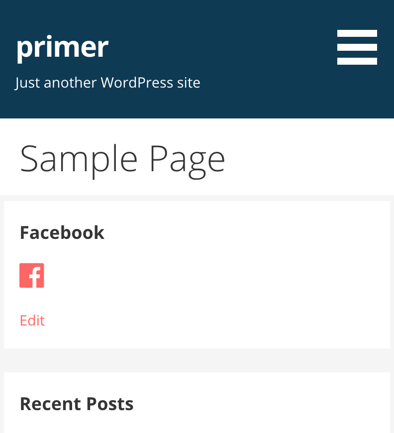
This would then cause the sidebars to display the main content on mobile devices: https://cldup.com/VEHVzhsSKB.png
If this is a bit outside of your skillset, it might not be a bad idea to outsource the task to an experienced developer. I can highly recommend https://wpcurve.com/ for some assistance in achieving something like this.
Hope this helps get you headed in the right direction!
Hi @eherman24,
thank you very much, these information will help me a lot. 🙂
best regards
gissmo85
-
This reply was modified 6 years, 4 months ago by
 gissmo85.
