Buttons misplaced
-
Hi,
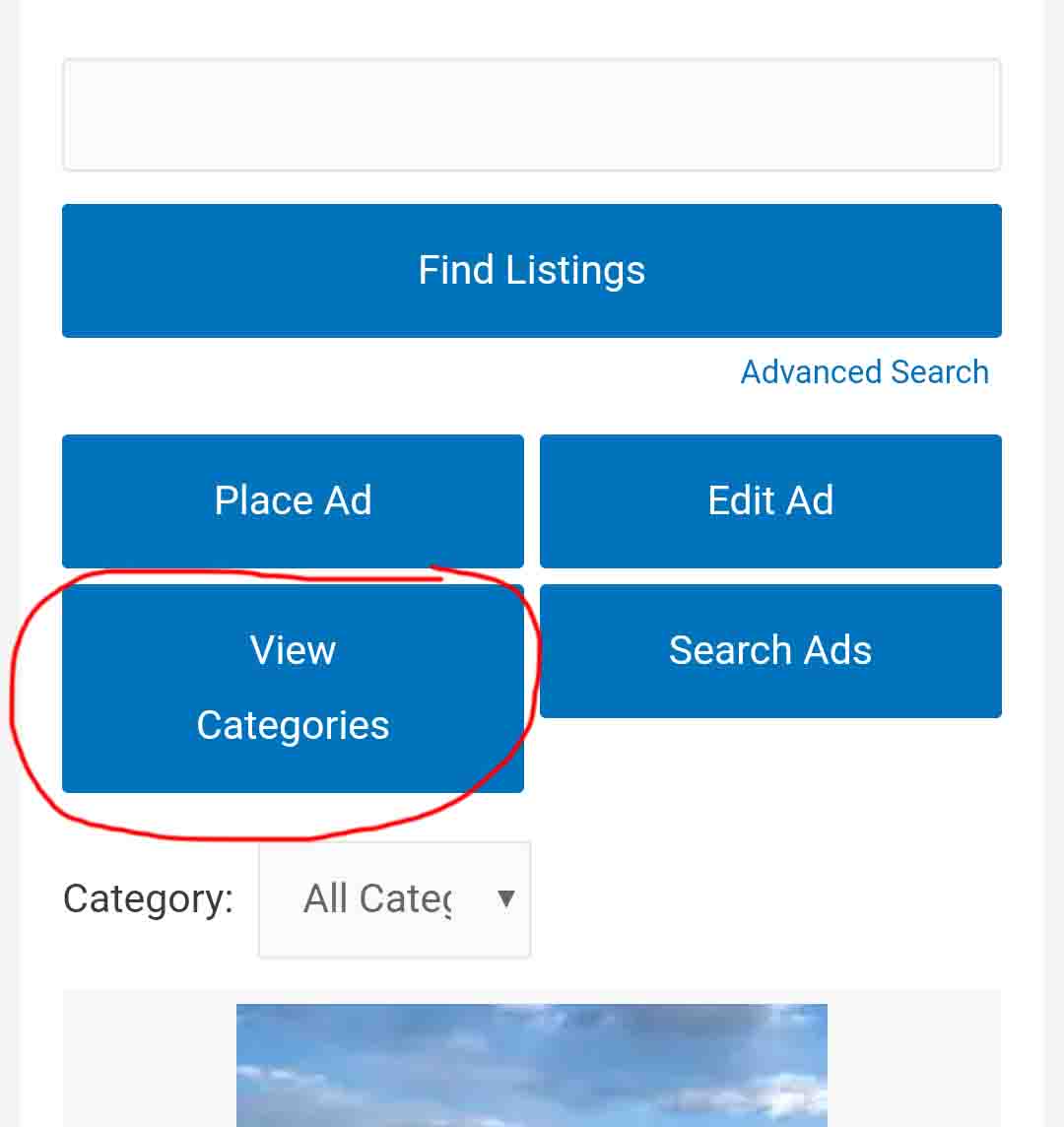
The bottons under the search field are all misplaced and not the same size in width and hight, most in mobile browsers and a little on desktop:
for example the View Category button is wider and bigger than the other ones in mobile devices:
http://s4.picofile.com/file/8369444792/11.jpgI also saw that the buttons on your demo site are misplaced in mobile devices:
http://s3.picofile.com/file/8369444926/15.jpg
http://s4.picofile.com/file/8369444876/13.png
http://s4.picofile.com/file/8369444818/12.pngalso on desktop devices they are misplaced:
http://s4.picofile.com/file/8369444968/14.jpg
(Search ad is under the other buttons)Please use responsive buttons for mobile devices which is more neat, if it’s possible.
For example I’ve provided these examples for you to understand what I mean better:
http://s2.picofile.com/file/8369444992/Untitled_1.jpg
http://s3.picofile.com/file/8369444984/4444.jpg
http://s5.picofile.com/file/8369444976/555.jpgalso you can use this layout for desktop:
http://s2.picofile.com/file/8369445000/666.jpg
(in desktop browsers all the buttons can be placed under the search field in a row)also instead of the rss icon in the related button I think it’s better to use the RSS word itself.
Thank you
- The topic ‘Buttons misplaced’ is closed to new replies.