Getting rid of blank space below footer in Mobile
-
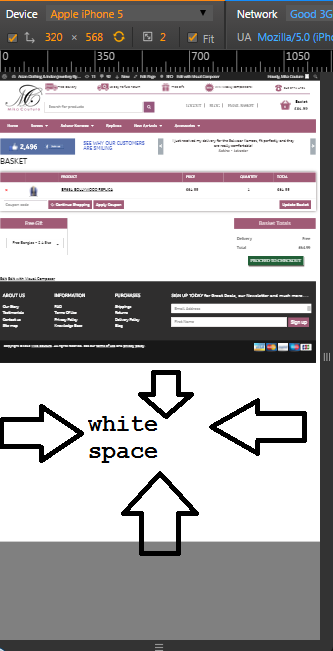
Client didn’t want to have the responsiveness from the website, so we have totally removed responsiveness from the Bootstrap based wordpress theme. Now the website is looking how it looks like in Desktop. However, on the cart page, as there are not much content or div elements, the page ends very soon, thus causing the white space which isn’t looking good.
I’ve posted the screenshot below. There is fixed footer at the end, it is also not visible on that page. Any advice will be appreciated.
Please take a look at the website here.
It contains sticky footer in pink color background, but that is also not visible.
I’ve given these two in the header.
<meta name="viewport" content="width=device-width, initial-scale=1.0">
<meta name="viewport" content="width=device-width" />
Look at the screenshot
- The topic ‘Getting rid of blank space below footer in Mobile’ is closed to new replies.