 Andrew Nevins
(@anevins)
WCLDN 2018 Contributor | Volunteer support
Which square on your site are you trying to morph? Could you also post the CSS you’ve tried for this?
Hi Andrew
Thanks for the quick response.
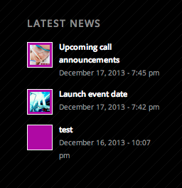
Its the .news-thumb
I have tried all the CSS in the tutorial.
.image_size_widget .news-thumb {
height: 36px;
width: 36px;
height: 100px;
width: 100px;
border-top: 30px solid #C66;
border-bottom: 30px solid #6C6;
border-left: 30px solid #66C;
border-right: 30px solid #CC6;
width: 0;
border-top: 30px solid #C66;
border-bottom: 30px solid #6C6;
border-left: 30px solid #66C;
border-right: 30px solid #CC6;
width: 0;
border-bottom: 30px solid #6C6;
border-left: 30px solid transparent;
border-right: 30px solid transparent;
width: 0;
border-bottom: 30px solid #6C6;
border-left: 52px solid transparent;
border-right: 52px solid transparent;
width: 0;
border-top: 30px solid #6C6;
border-left: 52px solid transparent;
border-right: 52px solid transparent;
width: 0;
border-bottom: 30px solid #6C6;
border-left: 52px solid transparent;
border-right: 52px solid transparent;
width: 104px;
height: 60px;
background-color: #6C6;
width: 0;
border-top: 30px solid #6C6;
border-left: 52px solid transparent;
border-right: 52px solid transparent;
}
Andrew Nevins
(@anevins)
WCLDN 2018 Contributor | Volunteer support
Try this:
.news-link,
#top .news-content {
    overflow: visible;
}

#top .news-content {
    margin-bottom: 20px;
}

#top .news-thumb {
    background: red;
    width: 28px;
    height: 28px;
}

#top .news-thumb:before,
#top .news-thumb:after {
  content: " ";
  position: absolute;
  left: 0;
  width: 0;
  border-left: 18px solid transparent;
  border-right: 17px solid transparent;
}

#top .news-thumb:before {
  border-bottom: 8px solid red;
  top: -3px;
}

#top .news-thumb:after {
  border-top: 8px solid red;
  bottom: -11px;
}
http://cssdesk.com/jqWCQ
Thank you.
That is closer than I managed but still not there yet.
This is what I am aiming for http://i.imgur.com/SWBWstl.png
This is what I have now http://tinyurl.com/kz8besh
If you have any other ideas they would be very gratefully received. I have found this really really tricky.
Thanks so much
Lisa
Andrew Nevins
(@anevins)
WCLDN 2018 Contributor | Volunteer support
The easiest solution you have is to use hexagon-shaped images
Really good point.
If I can’t find another way to do it. That will have to suffice.
This http://codepen.io/brenna/pen/hbDqL looks like it might prove useful. Although I am really not sure how I am going to get it to work with the site I am making.
If you have any ideas let me know.
Otherwise … thanks so much for your help. I hope you have a great day.
Lisa