Hi there,
Could you describe what you’re seeing or post a screenshot? The colors should be unified between the admin and customizer:
https://cloudup.com/cBPGHYaRFXb
Your screenshot of the customizer looks great, but this is not what I see. The only design change that adjusts to MP6 color schemes is button styling, everything else is the same as on old WP design. I also deleted all the caches, so this isn’t the issue. Using MP6 2.0.
What I see, errors highlighted: http://bizzthemes.com/wp-content/uploads/2013/10/mp6-customize.png
Try uninstalling and reinstalling MP6, that might fix the issue. We changed a lot of things since v2.0. Also, are you seeing any errors in your browser’s console?
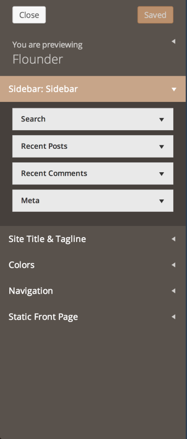
It works great on MP6 2.1 now. Though, alignment issue is still there (theme name and buttons are not in line with option names inside accordion) and lots of new bugs have appeared:
– color picker alignment on select.
– dark, semi-transparent RGBA border or no border around buttons would be better, now buttons appear blurry.
Issues outside Customizer:
– You should be able to drop widgets into closed sidebar (sidebar should open on-hover and close back on-hover-out if it is closed by default)
– Inactive widgets options are not styled correctly.
– Input field border color should be #bbb or #ccc to make it sharper, unified for all fields across admin (checkbox, select, option, textarea, …).
– Menu alerts should be square, not circle. Rounded corners should only be added to buttons and even that is questionable.
– Top menu icons are totally out of line, whereas left menu icons are perfect. On mobile, it’s even worse. It just doesn’t feel right.
There are other UI issues, but I’m not sure if this is the place to post them?