• Resolved Dean Taylor

    (@deanmarktaylor)


    Hi Dan,

    Your recent change to include a link in the explaination of the password in my opinion is the wrong thing to do.

    I know there are many arguments for it, but let me cover some for the against:

    • The inclusion of a link to a 3rd party site (wordpress.org) is seen as unprofessional and confusing. Many sites use WordPress as a CMS / blog without the user ever knowing the site is WordPress based.
    • The link will not work in closed environments where wordpress.org is unavailable (intranets, restricted environments).
    • If the link is to exist, it should open the content in a new window. i.e. target="_blank"

    These might not have been points you have considered, I would not want a developer not to select this plugin because of the inclusion of this link, they would be missing out on some very valuable functionality.

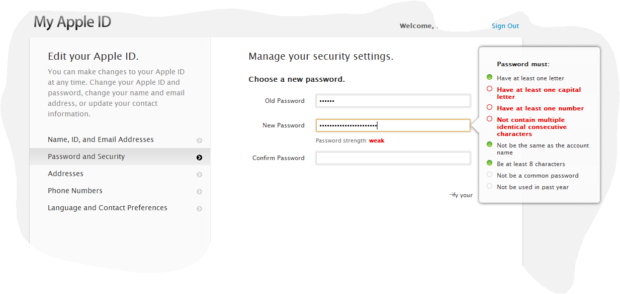
    Yes I believe the password strength indicator and this prompt text are the main things to be worked on. Again focusing on user experience, we need to ensure that the user experience is good, i.e. doesn’t drive the user away perhaps to a competitors site.

    Time doesn’t allow me to supply develop patches currently – if I had time I would.

    As usual thanks for your hard work in creating and maintaining a very good plugin.

    Cheers,
    Dean.

    http://wordpress.org/extend/plugins/login-security-solution/

Viewing 7 replies - 1 through 7 (of 7 total)
  • Thread Starter Dean Taylor

    (@deanmarktaylor)

    Hi again,

    In addition the content at the link itself it not translated into multiple languages.

    Cheers,
    Dean.

    Plugin Author Daniel Convissor

    (@convissor)

    Hey Dean:

    You make excellent points. I thought about them as well and was wary to add the link. At the same time, feel it’s important to educate people about the urgency of the matter, if only to reduce the grumbling from users about needing to have such strong passwords. What do you feel is the best means to convey this? Or do you feel it’s beyond the scope of this plugin to do that?

    As far as your saying “…and this prompt text are the main things to be worked on…” are you talking about the whole password policy text or just the exterior link? If the whole policy text, what are your ideas for improvement, please?

    Thanks,

    –Dan

    Thread Starter Dean Taylor

    (@deanmarktaylor)

    Hi Dan:

    I think it’s important this plugin gives a good example of best practices in the UX.

    Yes the both of the following are main items to be worked on in my opinion:

    • the display of the password policy text
    • the password strength indicator

    Based on your addition of the link perhaps an additional task of:

    • “Choosing a smart password” supplemental information (page or popup).

    Frankly, I would like to see the password messaging change to be more like the Google account creation / password change pages.

    Specifically, there are no intrusive long messaging about the password requirements – initial on screen messaging is kept minimal.

    Use JavaScript to simplify the page
    For the Google Create Account page when JavaScript disabled the following text is displayed under the first “Create a password” input control:

    Use at least 8 characters. Don’t use a password from another site, or
    something too obvious like your pet’s
    name. Why?

    (note the content at the link “Why?”)

    But if JavaScript is enabled (which it is for most users) this text moves into a large tooltip style popup where the strength indicator is then also displayed.
    This means the both the strength indicator and message are only displayed when the users input is focused on the password input control. Ensuring that the page doesn’t initially seem cluttered or confusing.

    Yes I do know that the password requirements are strict when LSS is used as such perhaps make the following changes in cooperation with changing the look to be more like the Google pages:

    • JavaScript disabled
    • Display the following message:

      Use at least 10 characters. Don’t use a password from another site, or something too obvious like your pet’s name. Why?

    • Link the Why? text to a specific page generated by the LSS plugin similar in content to this very
      clean page: https://accounts.google.com/b/0/PasswordHelp
    • If this is a password change then include the following:

      Note: you can’t reuse your old password once you change it!

    • JavaScript enabled
    • Don’t display the messages above when JavaScript is disabled.
    • Display the strength meter as a large tooltip styled popup, only displayed when the focus is in the
      first password input box.
    • Suggest specifically an Apple style tooltip as seen here, containing a bullet point list of requirements. As the user enters the password the bullet points change to green to indicate success for that bullet point.
    • If the users password includes 20 characters or more, hide the other requirements which are no longer required.
    • Include within the list of requirements the ones which are checked later under a the heading

      We check these too:

      . The bullet points for these should be grey / displayed differently to show changing the users input has no immediate effect.

    • If this is a password change the following text or similar shorted text should be included in the tooltip as a bullet point:

      Note: you can’t reuse your old password once you change it!

    • You could go one step further; when the user posts the password back to the server and the extra validations are done on the server-side – the dialog can highlight the bullet points it failed on last in a slightly different way to let the user know what they got wrong.

    Yes this can be complex but the user experience will be clean and clear as to the actions that need to take place.
    There are some things that can’t be tested for until submission, this should just be made clear to the user as I have tried out outline.
    It is important however that the error messages displayed on returning are clear what action/changes the user has to take/make.

    Not all of the validations that can be done in JavaScript need be done immediately, KISS …

    Keep It Simple to start off with, do the ones that are easily implemented add the rest under the heading

    We check these too:

    .

    I hope this is clear!
    Cheers,
    Dean.

    Thread Starter Dean Taylor

    (@deanmarktaylor)

    Hi again,

    I had a little think on the text for non-JavaScript enabled browsers…

    Perhaps this text can replace the current text, I believe it reads better:

    Existing text:

    The password should either be: A) at least 10 characters long and contain upper and lower case letters (except languages that only have one case) plus numbers and punctuation, or B) at least 20 characters long. The password can not contain words related to you or this website. Why is this necessary?

    Proposed alternative:

    Use at least 20 characters; or use at least 10 characters, combination of upper and lower case letters, numbers and symbols. Don’t use a password from another site, or something too obvious like your pet’s name. Why?

    Again Why? should be linked to the separate page opening in a new window.

    You should be able to use sprintf‘s %1$s, %2$s formatting to get around the reordering.

    This is supplemental to the proposal previously posted.

    Perhaps including a text filter hook so this can be overridden on a per site basis too, a filter could also handle the Why? link.

    Cheers,
    Dean.

    Plugin Author Daniel Convissor

    (@convissor)

    Dean:

    Thanks for the detailed explanation of your thoughts.

    For the record here, the external link has been removed in release 0.27.0.

    That Apple UI with the bullet points is exactly the concept I had in mind with the “check list kind of thing” mentioned in the “https and multisite problems” thread.

    I’ll reply with more details once I have time to gather my thoughts.

    Thanks,

    –Dan

    Thread Starter Dean Taylor

    (@deanmarktaylor)

    Dan:

    Yeah I noted the removal of the external link.

    I did include a link to the same Apple UI image screenshot in my post before the one where you mentioned “check list kind of thing”.

    Thought gathering is good, I had to do it myself to create the previous couple of posts.

    Feel free to share.

    Cheers,
    Dean.

    Plugin Author Daniel Convissor

    (@convissor)

    Some or all of this stuff may be getting into core:
    http://core.trac.wordpress.org/ticket/21737

Viewing 7 replies - 1 through 7 (of 7 total)
  • The topic ‘[Plugin: Login Security Solution] Password policy link to explanation’ is closed to new replies.