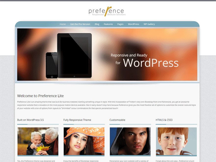
Header Image and Main Menu off centre
-
Hi,
I am looking to try and make my header full width at http://edintut.colintonwebsitedesign.com/ . Have added the following css to child-theme and it looks great on a large screen,
.span12 {
width: 1200px;
}
[class*=”span”] {
float: left;
margin-left: 15px;
min-height: 1px;
}However, when viewed on an android phone or blackberry playbook the header image is displaced to the right and out of the container. Is there a straight-forward way to make the header full width.
The main menu is also pushed to the right on the blackberry playbook – when turned portrait position the menu starts to disappear off the right hand side of the scree. I would appreciate help with this too please.
jmkt
-
First thing…remove that CSS from the child theme because you will end up with lot more problems with that group, especially the .span12 class because this is part of the framework and changing these will affect the layouts and responsiveness.
Anyway, are you wanting it to be full width and height edge-to-edge, no spacing around the image? If so, I have a solution for you.
**by the way, glad to see you are using a child theme for modifications.
Hi,
Thanks for the reply. CSS removed from child theme.
Yes, that’s exactly what I want. Would appreciate your solution.
First…copy over the header.php to the child theme.
Look for the group that starts with:<div id="showcase-wrapper" style="padding:<?php echo get_theme_mod( 'showcase_bg_padding', '10px 0' ); ?> ;Inside that you will see 3 nested containers:
<div class="container">
   <div class="row">
      <div class="span12">
Remove those and their closing tags too.
Use the theme option setting Appearance >> Customize >> Header Image >> Showcase Background Padding to adjust padding. Default is 10px 0px (10px top and bottom and 0px for left and right).
Best thing about this is if you make a mistake, you can remove the header.php from the child theme and start again without touching the parent theme.
Hi,
Excellent. This worked perfectly. I didn’t need to adjust the padding but I see it at 0px 0px so perhaps I had altered that earlier. It looks great on all devices and has solved the menu issue which I presume was caused by my CSS experiment.
Thanks again – great theme!
- The topic ‘Header Image and Main Menu off centre’ is closed to new replies.
