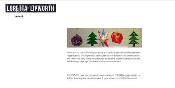
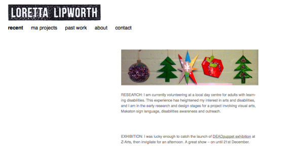
Can't align header image and menu to rest of content
-
Hi, I’m fairly new to CSS and I’ve got some issues I can’t find solutions for. My site is: http://www.lorettalipworth.com/
1st, I want the menu to align with the header (right now, there’s a big space before the first menu item) and I also want to move the header image and menu to the right so that they are over the site content underneath.
2nd, too many hyphens in my site – I have some code in the CSS which worked on my last child theme but not now… any ideas?
3rd, the menu doesn’t appear when I view my site on my iphone. Is the best solution to download the Mobile View plugin?
(I’m not sure if the 2nd and 3rd questions are supposed to be in a different topic. Sorry if so!)
-
Hi!
(I’m not sure if the 2nd and 3rd questions are supposed to be in a different topic. Sorry if so!)
It’s generally best to post unrelated questions separately, but I’ll try to have a look at them all here in this thread. I’ll answer them in separate posts.
It looks like you’ve made some substantial changes to the theme. I’m curious, how did you pick Twenty Fourteen to use?
the menu doesn’t appear when I view my site on my iphone. Is the best solution to download the Mobile View plugin?
Your menu is actually invisible in Firefox on my desktop machine as well, so it’s not a mobile-only issue. Here’s a screenshot:
It looks like you’ve added some code to make your menu links white:
.site-navigation a {
    color: #FFFFFF;
    font-size: 1.1rem;
    text-transform: lowercase;
}
(Or since you changed the background from black, that would explain why the white links are not visible against it.)
Try changing the white links to another colour code and your menu should reappear.
I want the menu to align with the header (right now, there’s a big space before the first menu item) and I also want to move the header image and menu to the right so that they are over the site content underneath.
It looks like this CSS is pulling the menu 20px further from the left on devices over 783px wide:
@media screen and (min-width: 783px) {
		    .primary-navigation {
		        float: left;
			    margin-left: 20px;
	        }
		}
You can tweak this style by changing 20px to push the menu further over to the left. For example, this is how it looks if I change that value to -40px:
You may also need to add !important just before the semicolon on the margin-left line to force the style to “take” but if it works without it, you should leave it out.
too many hyphens in my site – I have some code in the CSS which worked on my last child theme but not now… any ideas?
I think I see where you tried to remove the hyphens here:
/* removes hyphens */

.site-content article {
	word-wrap: break-word;
	-webkit-hyphens: none;
	-moz-hyphens: none;
	hyphens: none;

}
You’ve got the right idea, but you’ll need to change which element you’re targetting since that’s not what Twenty Fourteen uses. Try targetting entry-content instead:
.entry-content {
	word-wrap: break-word;
	-webkit-hyphens: none;
	-moz-hyphens: none;
	hyphens: none;

}
Result: https://cloudup.com/ckVuXxE9AFn
As above, you may need to add !important to the styles if they don’t take effect after adding them to your child theme.
Let me know how it goes!
- The topic ‘Can't align header image and menu to rest of content’ is closed to new replies.


